Agency: Moloko Creative Design Agency
–
Description:
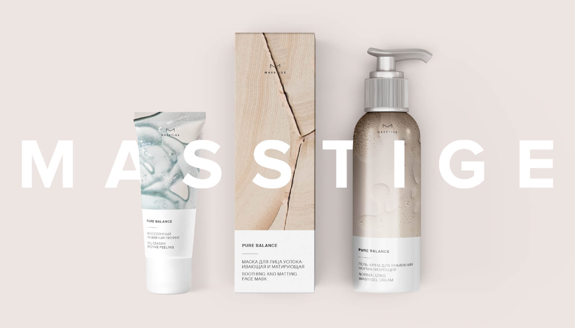
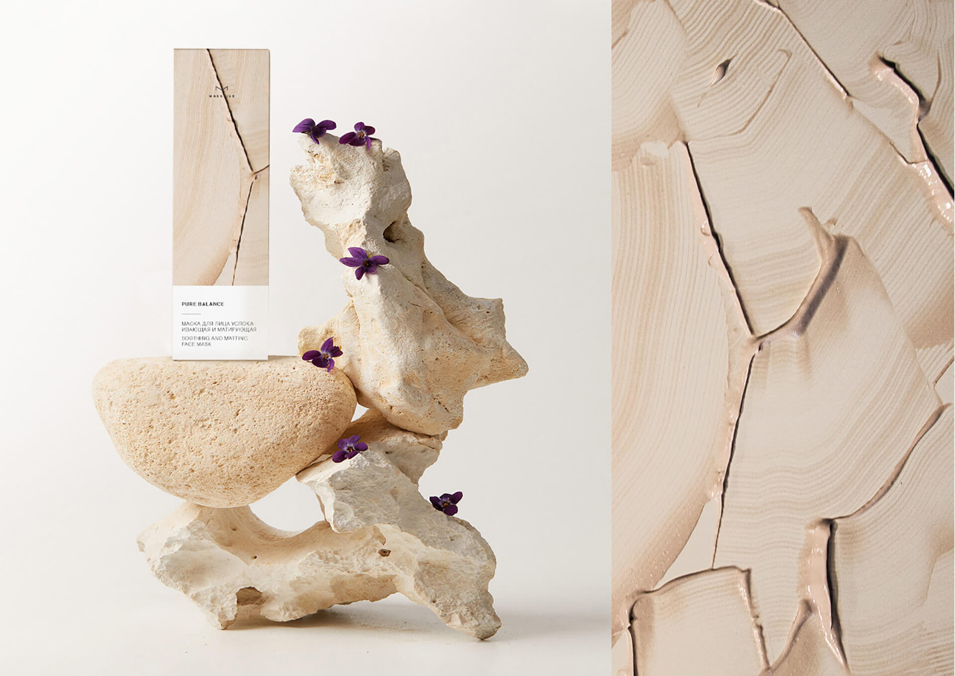
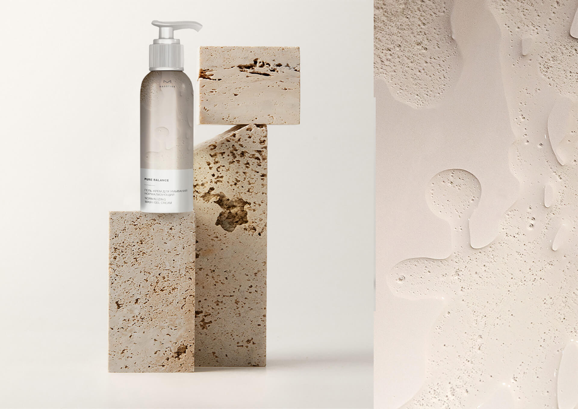
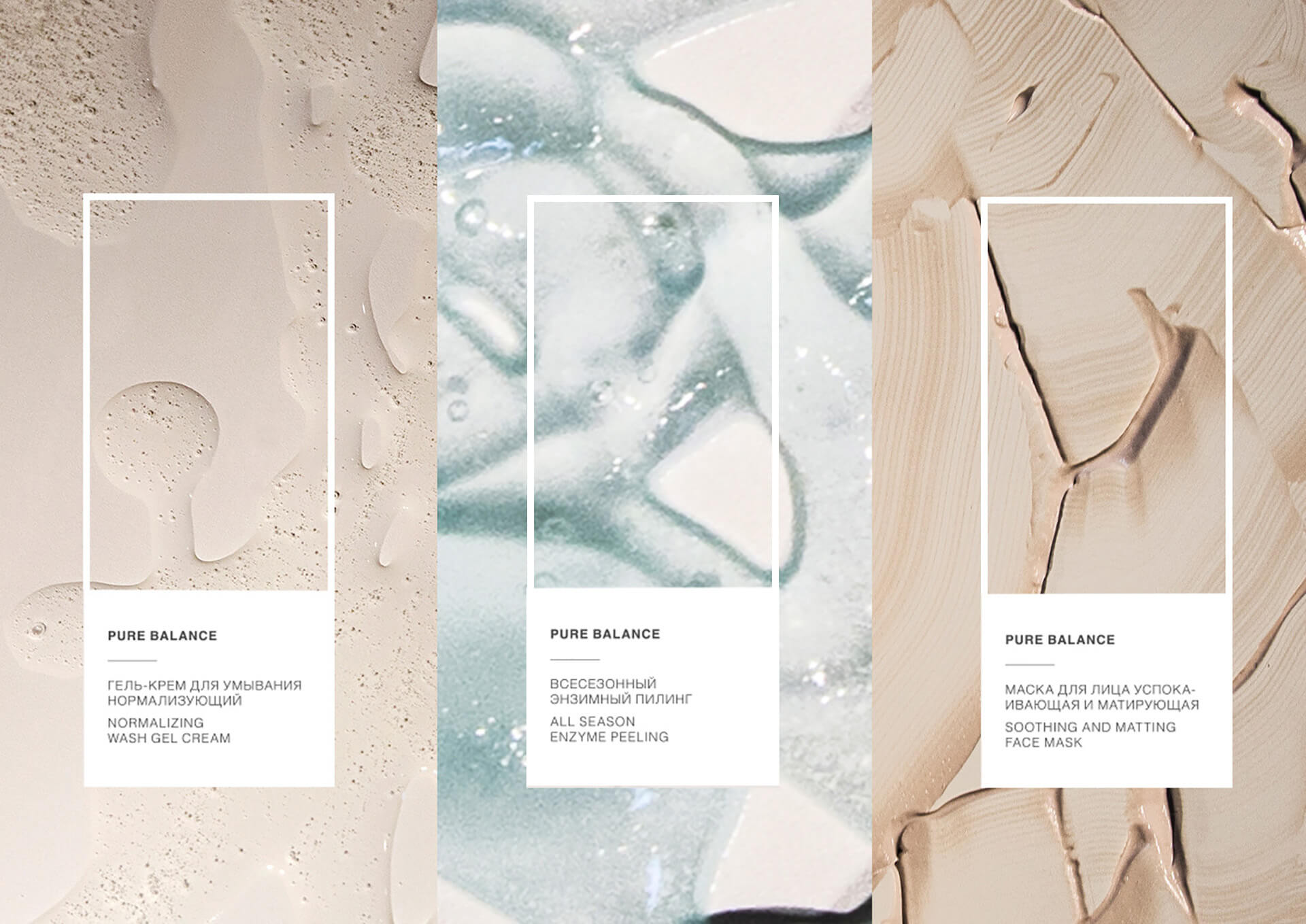
Project Description: When we created the packaging for the Masstige Pure Balance line, we used photos of the product itself as the basis for the kraft concept – the texture of the cosmetics inside each jar. We experimented with material, created chaotic patterns and photographed with different light, angles and modes. Presenting a photographic texture of each product has become one of the best solutions for visually reflecting the product inside each package. The textured photos on the packaging themselves attract customers’ eyes to the product, so we balanced the other part of the packaging with a minimalist and modern design of the text. In addition, this concept works great when expanding a line of products, allowing new products to be incorporated seamlessly, reflecting the unique visual image of each of them.
Thanks to this craft solution, we were able to create an outstanding and authentic brand. By the way, we work with the shape and texture of the packaging without limiting one graphic design. Evidence-based packaging design allows you to base your actions on facts. We analyze the competitive environment by a series of parameters and, based on statistics, show why certain elements should be present on the packaging. A series of research needs to be done to make a package that really works and increases sales. We do it according to our own method – this is our evidence-based design. Thanks to research in evidence-based packaging design, we get the data that allows us to say what color the packaging should have, what should be placed and how to distinguish the updated product from the competition. All conclusions are supported by facts from the research. We develop a practical and stylish packaging that will stand out on the shelves.

Featured on Package Inspiration