
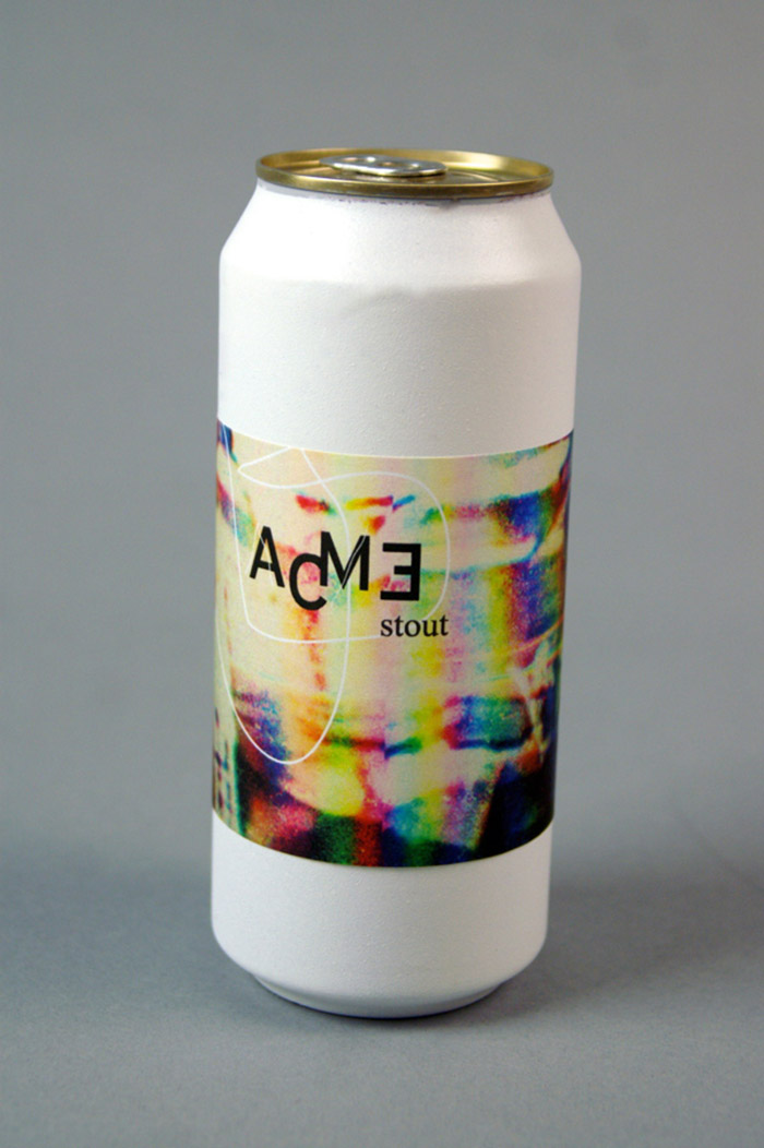
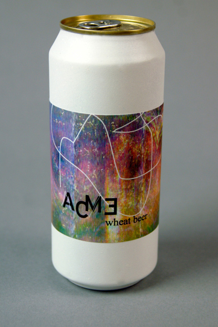
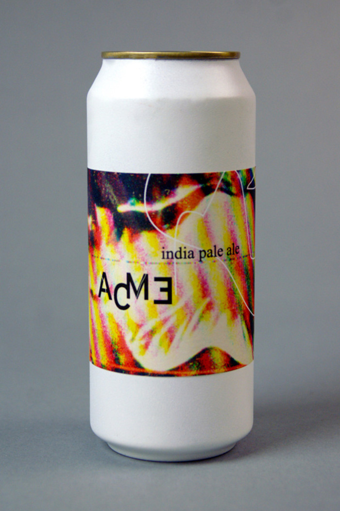
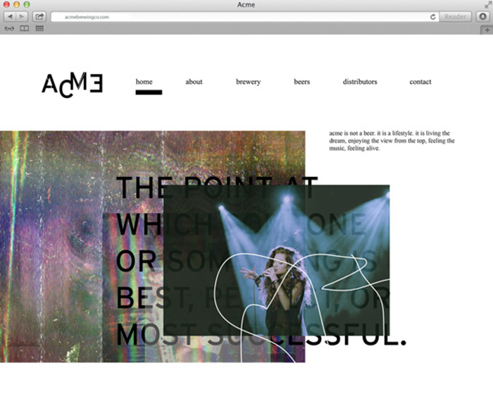
Acme is: anti-mainstream, edgy, artistic and ambiguous. I wanted to create a brand that didn’t necessarily visually communicate beer, but rather a feeling, an energy, like music.
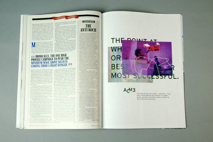
I was inspired by the definition of the word acme (the point at which someone or something is best, perfect or most successful) and used that conceptually in the use of white space, referencing the idea that acme is one point, the peak, and not necessarily a continuous state.
Designed by: Tessa Canon, USA.


Featured on Package Inspiration