
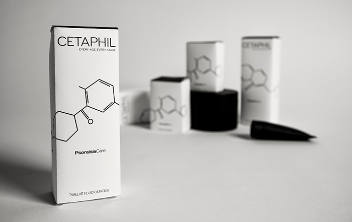
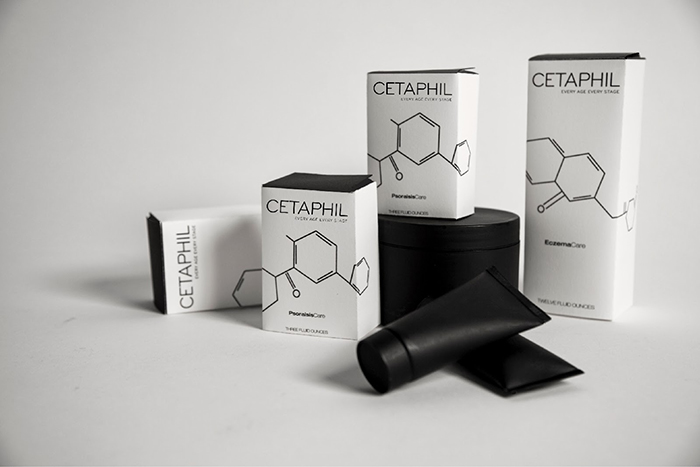
Cetaphil is a well known and trusted line of skin care sold over the counter at drugstores. The idea behind this rebrand is to give customers the feeling that this product is sophisticated, effective, and scientifically formulated for their unique skin rather than generic; taking a minimalistic approach in the maximalist market. The different molecular iconography on each product represents the main active ingredient in each formula. These iconographies create a simple recognizable system for users to find their product through the noise of other brands easily and quickly. When placed on a shelf, the icons create one fluid narrative representing a complete treatment system.
Designed by Gabriela Farina, United States.


Featured on Package Inspiration
We are young team which works to inspire packaging designers every day! Our team select the best packaging of today and shares with you.

