Agency: Mattéo Tabutieaux
–
Description:
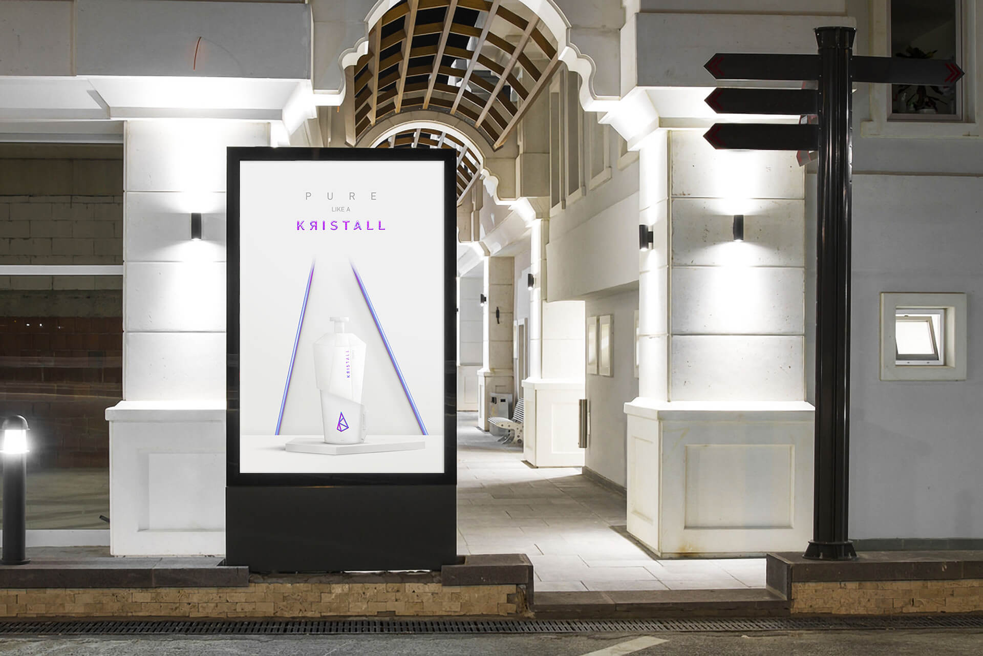
Presitge and preciousness. These two key words inspired me to create the entire project. By naming this brand Kristall, I wanted to bring together two very similar entities. Crystal: pure, unadulterated, precious and prestigious. And Kristall vodka, which takes up these same aspects.
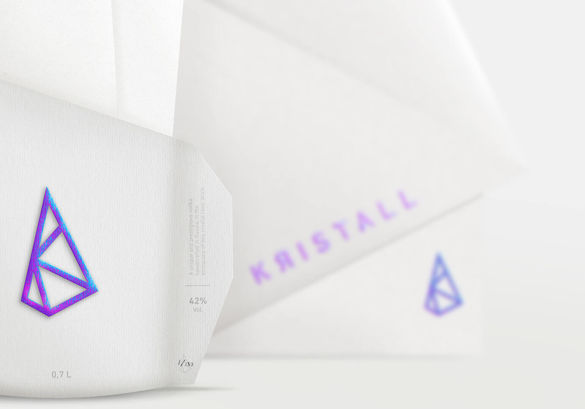
They are felt through the sharp shape of the pictogram symbolising a crystal. This sharpness of the line infuses us with the preciousness and prestige of the brand. Each letter of Kristall is inscribed inside the logo to create a link between the pictogram and the history of the brand. To add that touch of brilliance found in a crystal, I tinted the logotype with an iridescent colour. This play between purple, pink and blue gradations gives the product a rare impression. Kristall vodka, as its name suggests, is as precious and rare as a crystal.
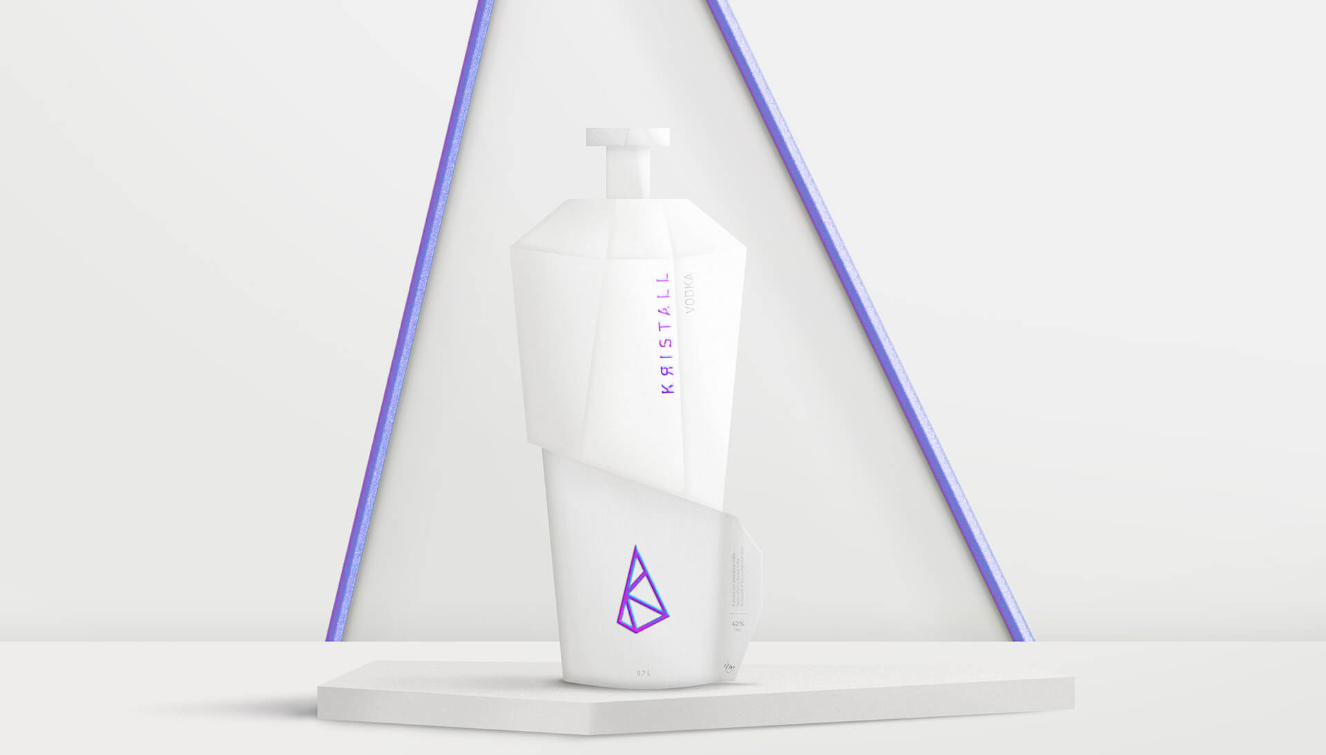
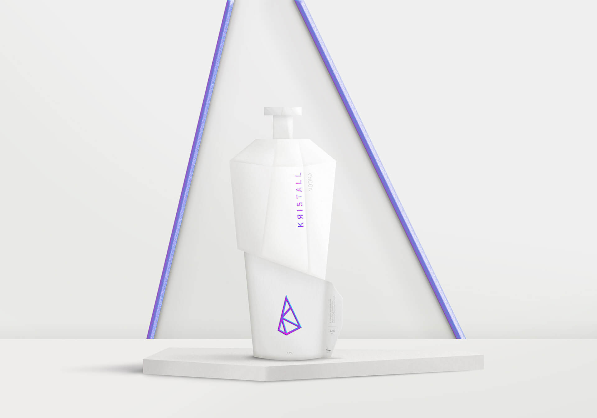
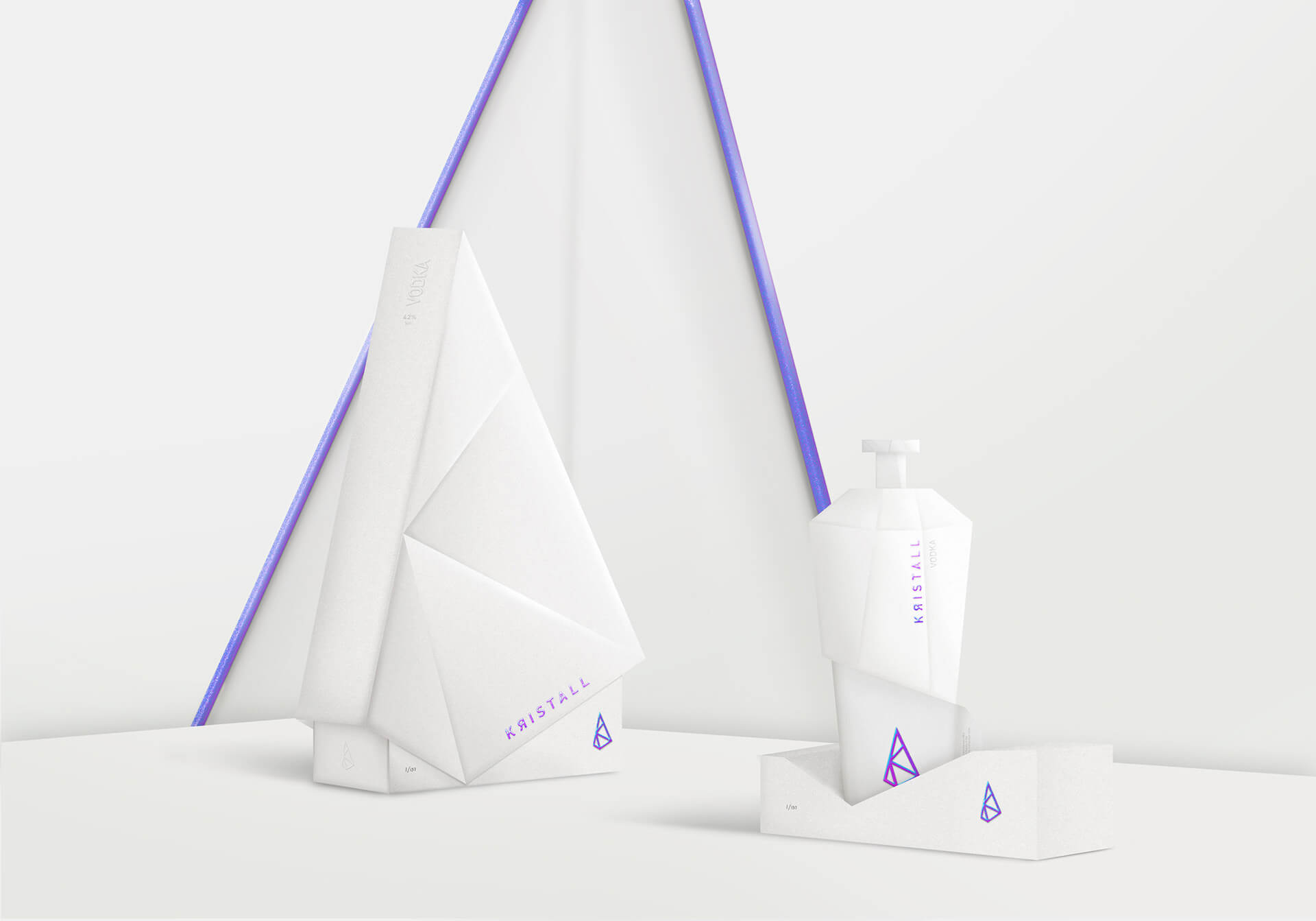
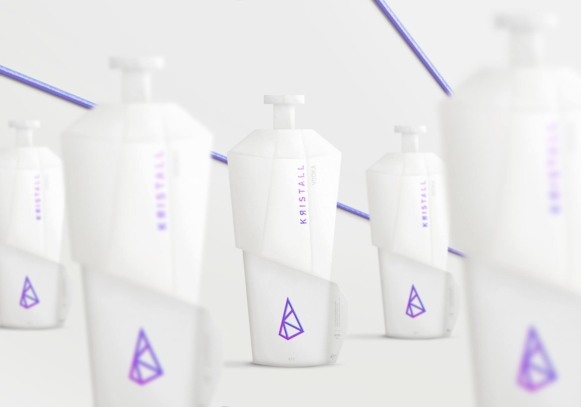
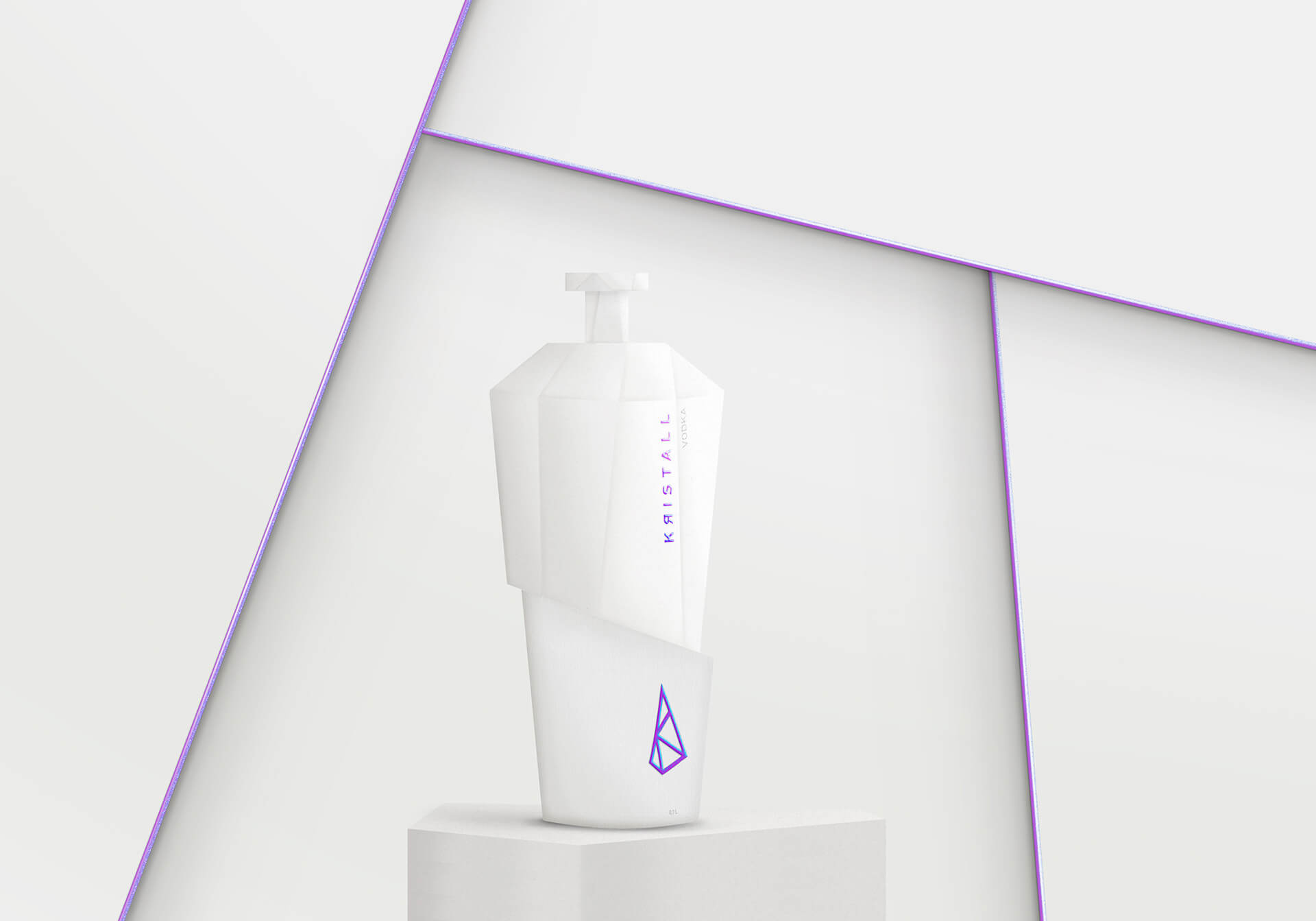
The limited edition packaging of Kristall Vodka was inspired by the shape and rarity of a crystal. Pure in its whiteness, fragmented and sharpened like a diamond, with a touch of brilliance reminiscent of the crystal colour. Such a high-end packaging must be carefully designed.
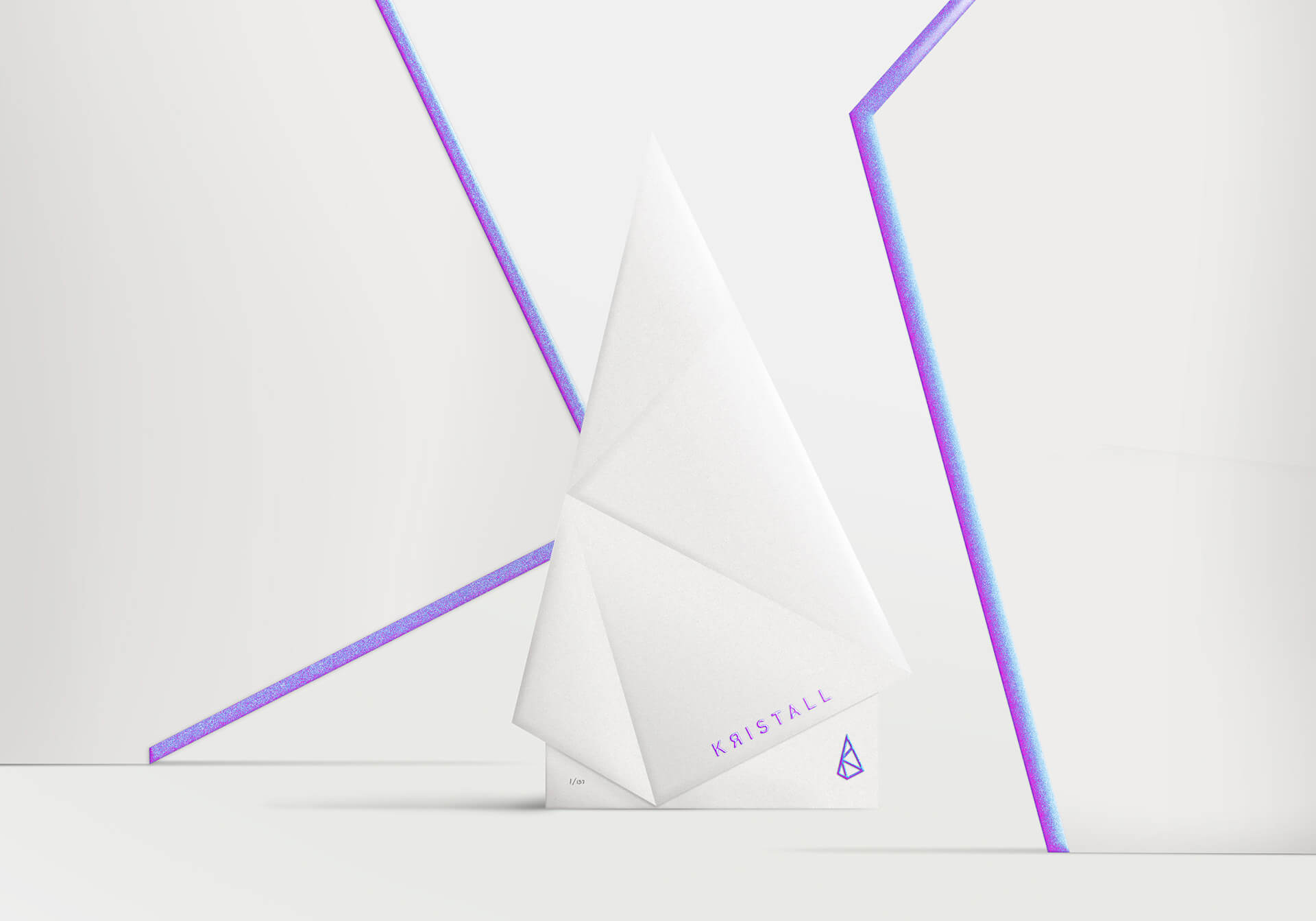
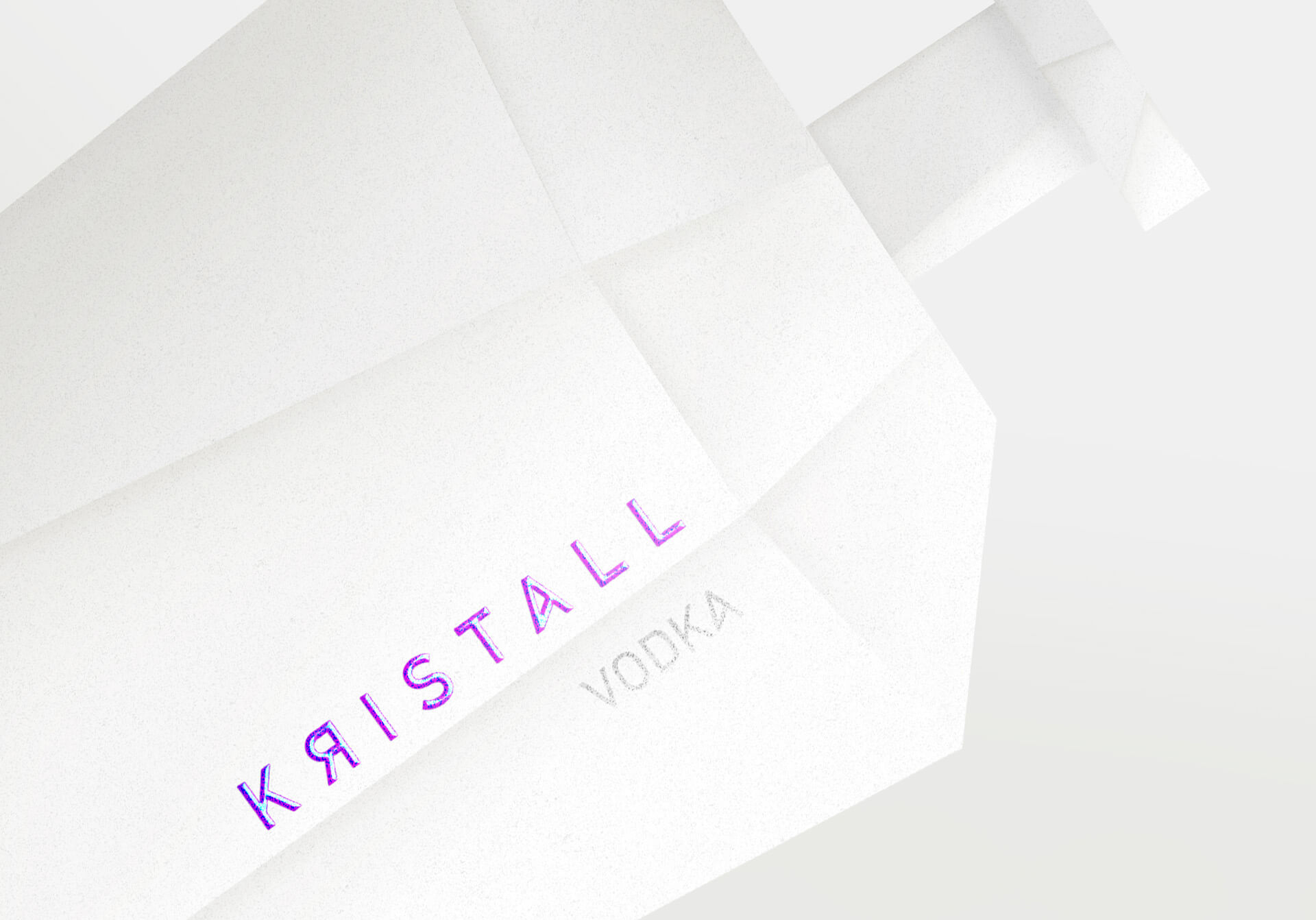
To give rhythm, a break separates the fragmented part from the part covered with laid paper. Only the embossed and iridescent pictogram appears on this part to preserve its preciousness. A label on the side containing essential information about the vodka accentuates the break. On the fragmented ceramic part, the brand name “Kristall” is silk-screened with this iridescent colour. “Vodka”, in a light grey, also appears. The case in which the packaging is placed exactly matches the shape of the pictogram and reinforces the idea of rarity, almost as if it contained a jewel. The packaging is immaculate and prestigious.
In the same vein, the advertising featuring the product is sober and conveys the brand’s values. Purity, preciousness and prestige are also present in the ad. The slogan “Pure like a Kristall” is impactful and explicit while incorporating a play on words by replacing “crystal” with the brand name “Kristall” (phonetically similar). Here again we find our links with the history of the logo and the brand.
The environment of the packaging puts it on a pedestal thanks to the support on which it is placed. It is also under the spotlight, or rather the iridescent lines. This embellishes and rarefies the packaging. Kristall’s advertisements reflect the prestige of the brand.
Featured on Package Inspiration
We are young team which works to inspire packaging designers every day! Our team select the best packaging of today and shares with you.
