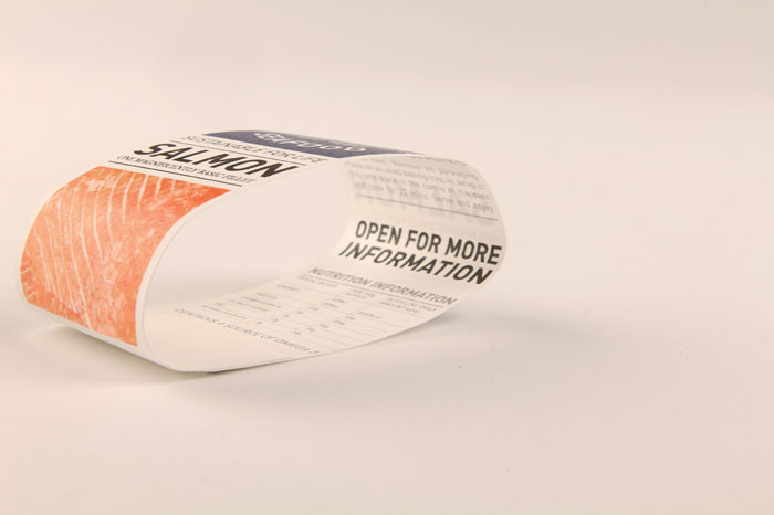
“Young’s supply approximately 40% of all fish eaten in the UK every year, making their sustainable efforts incredibly important, but despite this influence, their sustainable achievements aren’t successfully conveyed within their current brand. People also fail to relate to the brand, and it is undistinguishable from competitors. Their aim is ‘that everyone in Britain should ‘love fish’ as much as we do’ showing real passion and enthusiasm for the product, which isn’t communicated through their packaging.”
“The objective of the brief was to create a rebrand of Young’s Seafood in a breakthrough way which would be strongly recognisable and distinguishable while remaining respectful of their 200 year heritage, and the fact they are leading in their trade. Young’s impressive sustainable work played a key part in the rebrand, yet stays away from sustainable clichés. The rebrand aims to be informative and communicate hard work, honesty and sustainability.
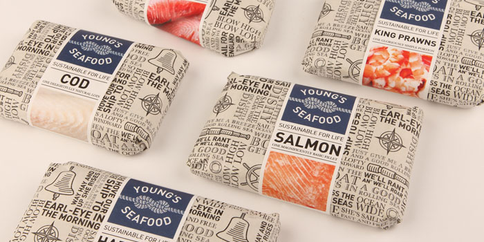
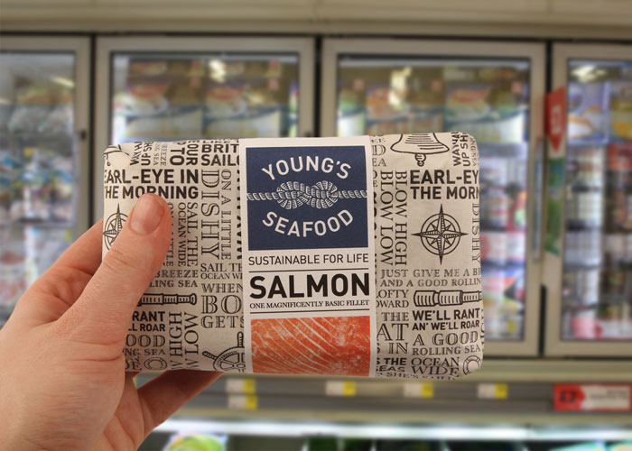
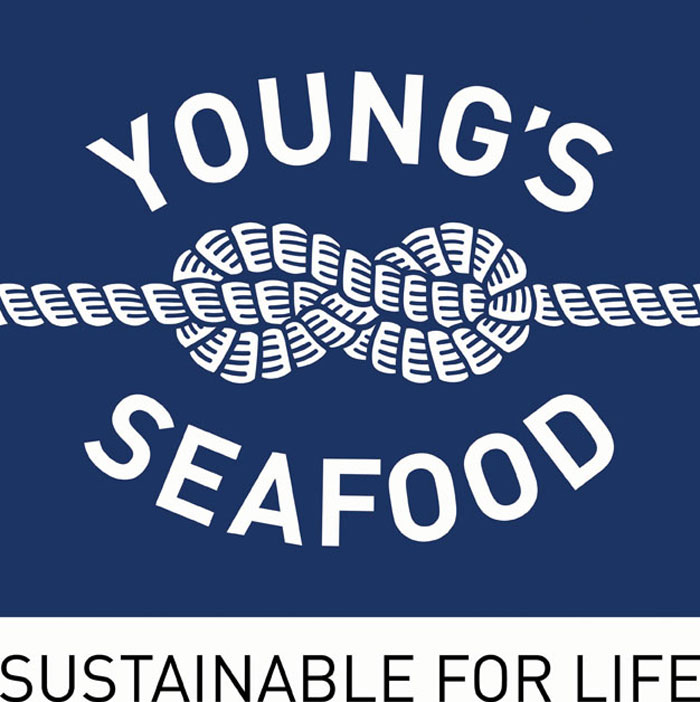
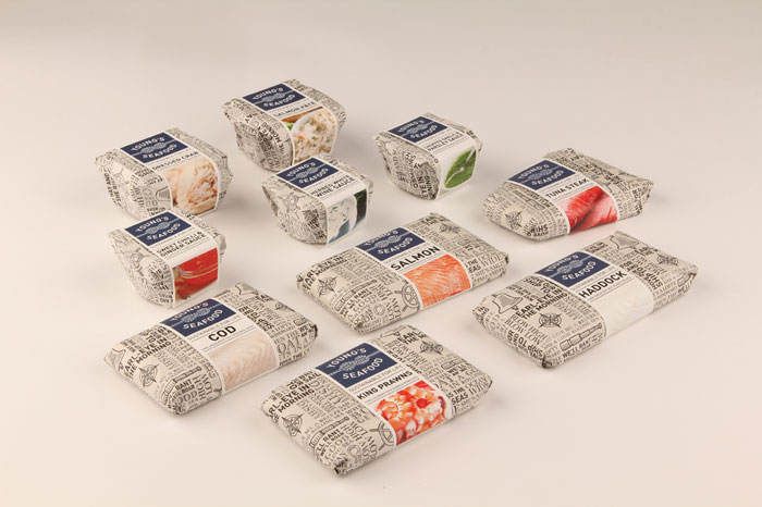
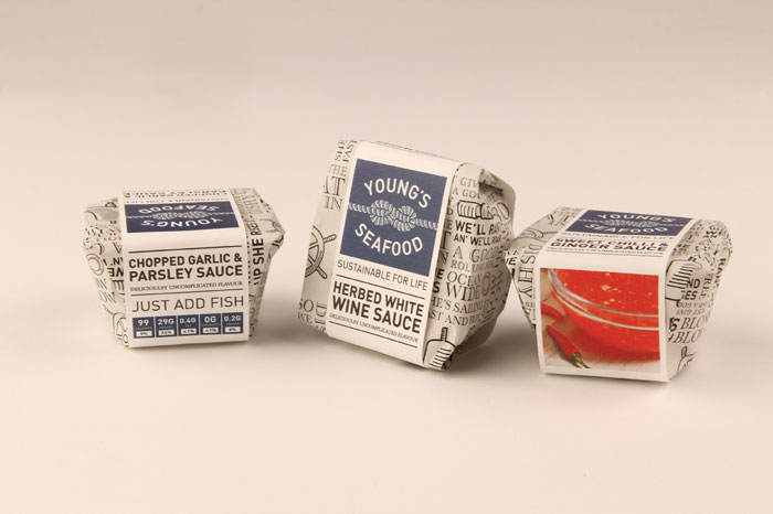
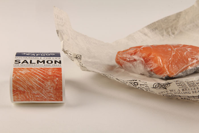
Rebrand of Young’s Seafood, the UK’s leading branded producer and distributor of seafood. With the heritage and experience of over 200 years, they understand the importance of sustainability within their trade. The logo is a Figure 8 knot, a nautical stopper knot, giving implications of protection, strength and durability, reflecting the brand’s message. The tiled pattern of sea shanties, strong and repetitious work songs, accompany Young’s Seafood in their future labour towards sustainability.”
Designed By: Emily Myers, UK

Featured on Package Inspiration
We are young team which works to inspire packaging designers every day! Our team select the best packaging of today and shares with you.