–
Designed by: Razom Studio, Sevilya Nariman-qizi, Anna Kuts, Ukraine.
–
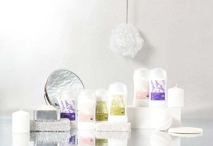
What you put on your body is just as important as what you put in it. Spruce is a brand that provide a 100% natural deodorant that actually works. The task of developing the logotype and brand identity is the transfer of unisex, purity and organicity. The developed package of deodorants is divided into three flavors: Herbal (English Lavender), Fresh (Lemongrass+Pine) and Unscened. The packaging of each of the tastes is based on a harmonious combination of hand-drawn illustrations and typography. This style was chosen for maximum transmission of the natural components of all ingredients. The color palette corresponds to the tastes of deodorants.

Featured on Package Inspiration