The brief was to create an entity of four-ness.
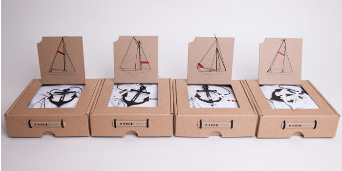
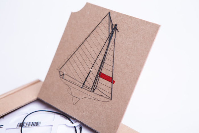
I chose to create a series of four t-shirt designs of classic sailing boats with an architectural line drawing style. Each t-shirt design was hand drawn and screen printed including a splash of red colour in each design stylized as though somebody had rolled paint onto the illustration.
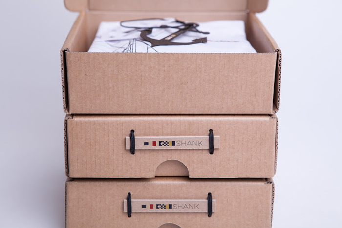
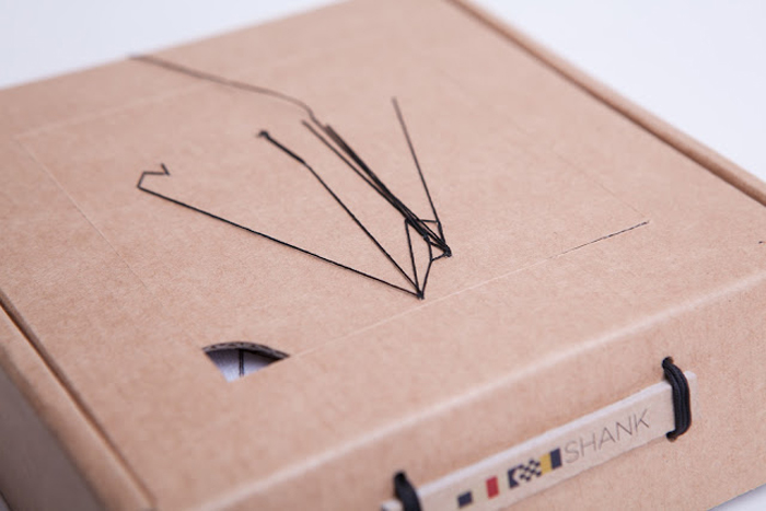
The brand name ‘Shank’ was chosen as it relates to the nautical theme of the designs, a shank is the term used for the center rode of an anchor, each t-shirt is branded with the Shank logo on the left chest panel. The logo is made up of the maritime signal alphabet to spell out Shank.
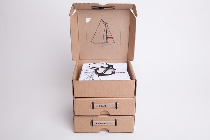
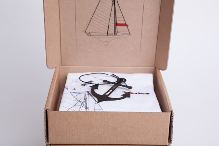
The packaging design of the boxes includes a scaled version of each boat illustration relating to the product inside, these each have hand stitched rigging. The idea behind the box logo was to recreate a Plaque like what would be found on a sailing ship or dock. Tied to the boxes and knotted with reef knots inside.
The final touch is the Anchor shaped swing tags which include the Shank logo running down the center bar.
Designed by Petra Leary, New Zealand.
Tutor: Simon Barnett


Featured on Package Inspiration
We are young team which works to inspire packaging designers every day! Our team select the best packaging of today and shares with you.
