
SEVEN POINT – Medical Cannabis Dispensary
Chicago, IL
Society itself and the health industry are quickly switching their negative position regarding the legalization of cannabis for medicinal purposes. The world witnesses an inevitable paradigm shift due to the existence of overwhelming and empirical medical evidence pointing out the benefits of marijuana. Marketers are recognizing the full economic power of an unsatisfied multi-demographic market and it becomes necessary for suppliers to build a strong foundation of responsibility and proper moral values in order to fulfill the most discriminating demands.
Such is the case with Seven Point, the outstanding high-end Chicago based state-approved medical cannabis dispensary. They provide premium individual consultation and a well-planned menu of medical cannabis varieties. Qualified individuals under the Illinois Medical Cannabis Pilot Program are now able to attain these world-class services and marijuana products from a superb dispensary. Forget about typical Rastafarian colors and Jamaican styled deco, Seven Point´s exclusive interiors were projected by the highly acclaimed Curioso Design Studio, known for creating and producing some of the best architectural experiences in the hospitality, gastronomy and retail businesses of the US.
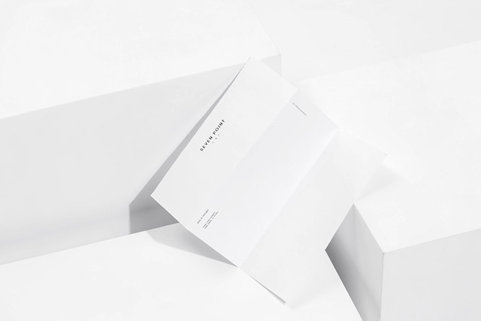
La Tortillería worked on this project alongside with Curioso, its sister agency in the US, to build Seven Point´s complete branding and visual identity. The challenging task demanded skillful design, marketing experience, full understanding of the dispensary’s public exposition levels, and of course, Chicago´s own laws and regulations regarding medical marijuana’s advertising and branding methods.
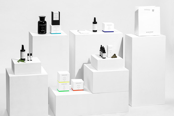
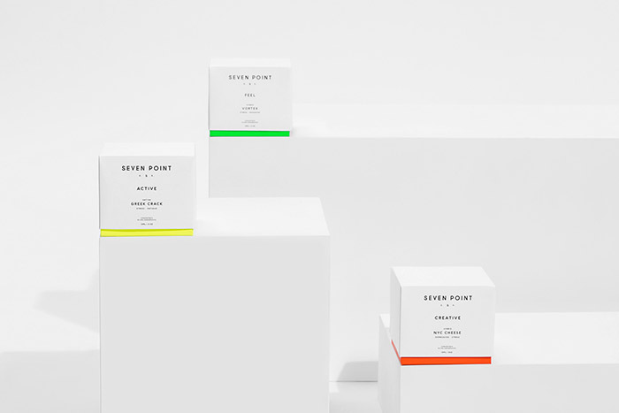
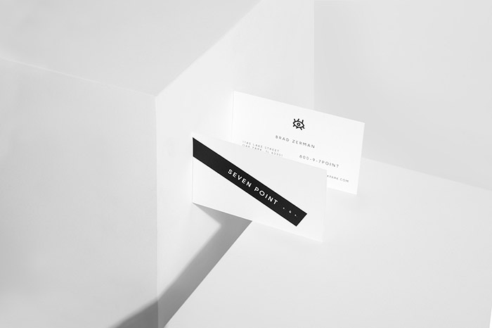
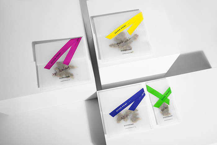
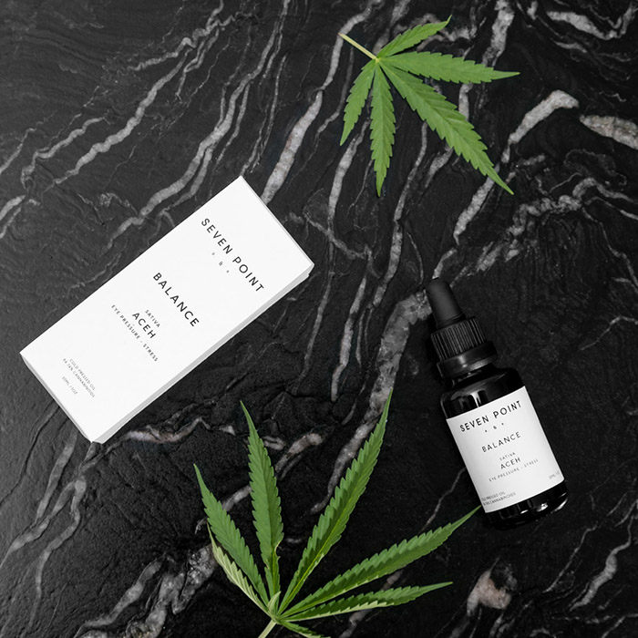
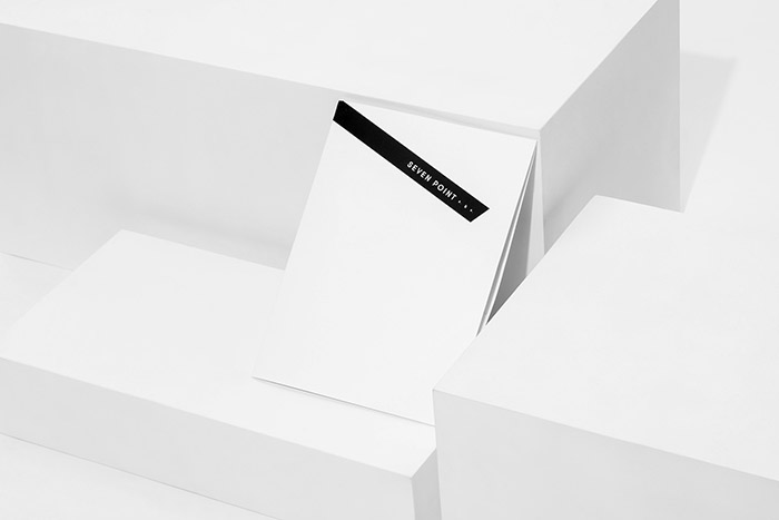
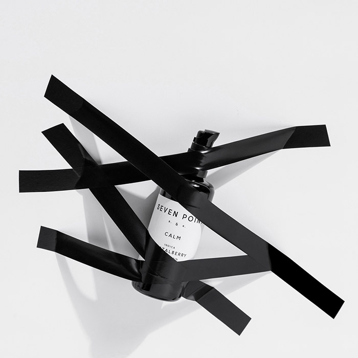
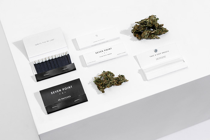
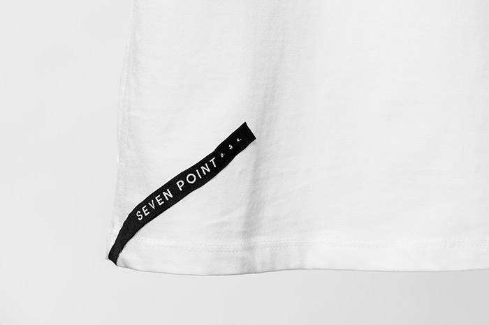
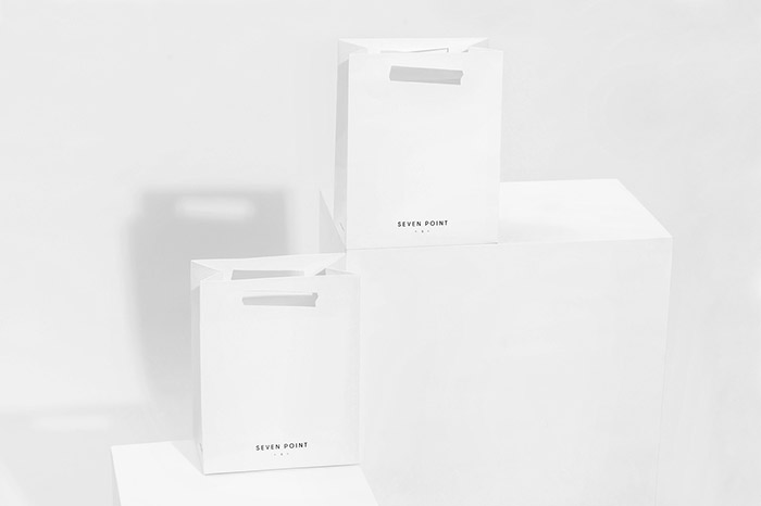
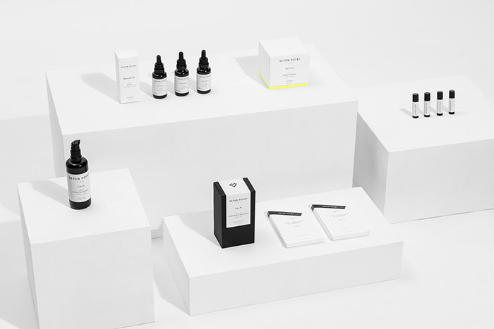
Seven Point´s logo was the starting point for its carefully styled branding. The slimmed sans serif type was meticulously deconstructed and restored, then neatly placed over a variety of colored ribbons. These will function as simple yet elegant labels for the dispensary´s different merchandising and packaging features.
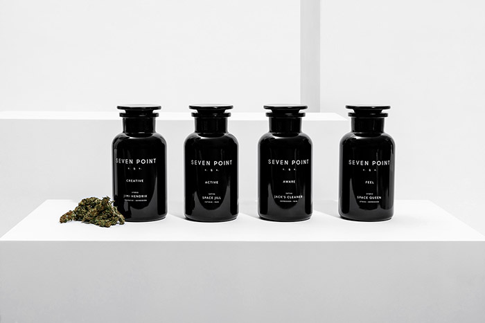
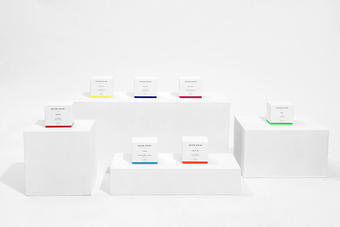
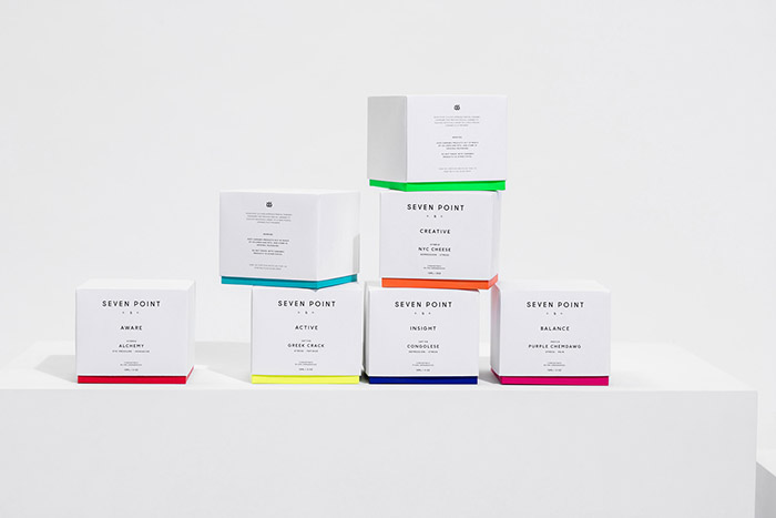
The name Seven Point, which relates to the seven characteristic leafs of the marijuana flower, was La Tortillería´s cue for building the entire brand identity. We believe that the wellbeing stemmed from the responsible use of medical cannabis is related to the ancient philosophical question of the body-mind-soul unity; a holistic experience of sorts. Thus, 7 leafs relates to 7 chakras, leading the way to a completely unified visual language for the brand. We divided each of the marijuana strains and varieties into seven categories, depending of their effect on the consumer.
Creative: These strains boast the beautiful color orange which relates to the creativity and knowledge chakra. This type of cannabis helps the customer focus on productivity.
Active: We assigned a bright yellow color to identify this particular strain related to feelings of satisfaction and happiness. Consumers who use this strain are prone to feel energetic.
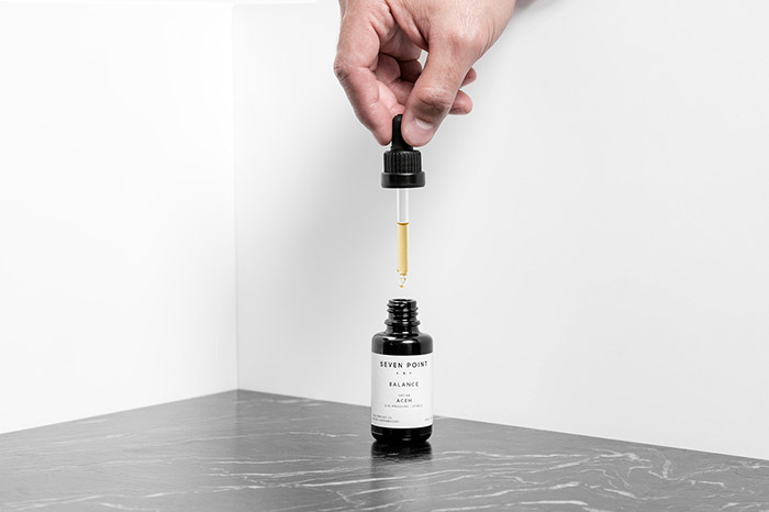
Balance: Blessed with a strong magenta tone, this strain provides a sense of harmony in the spirit.
Focus: We chose to label this strain with indigo, one of the most recognizable bluish colors of the rainbow. The strain represents the third eye, the cognitive skills.
Calm: This strain reinforces the consumer´s diplomatic and communicative abilities. We defined it with a gorgeous light blue color.
Feel: These strains help overcome insecurity and social discomfort. They proudly feature a beautiful green hue.
Aware: As its name implies, these types of cannabis strains help to maintain alertness, and represent the survival chakra. A bright red color indicates its effects on the consumer.
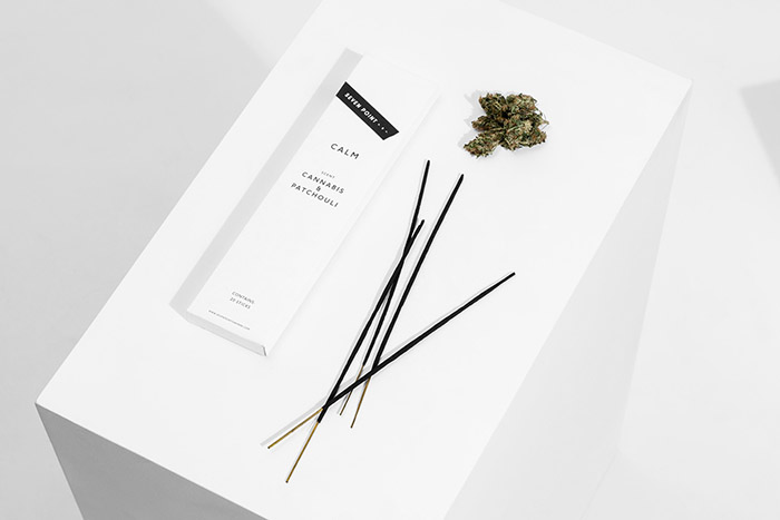
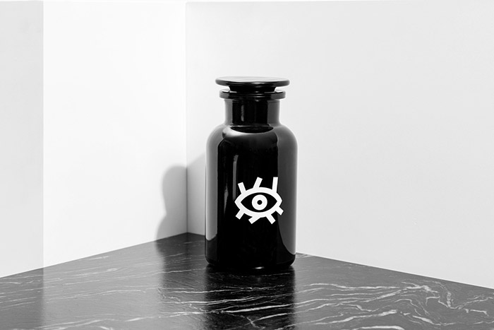
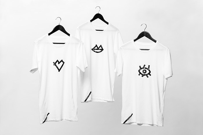
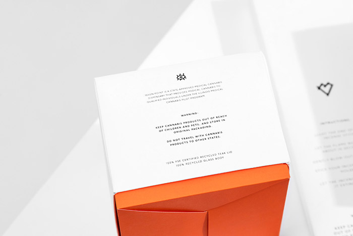
Part of the project commissioned to la Tortillería was to produce a series of icons depicting the different diseases or conditions that may afflict customers: glaucoma, osteoporosis, and skin cancer among others. We designed a complete catalogue of symbols describing these illnesses and placed them over each of the packagings we produced: tea and chocolate packs, incense boxes, sampler jars and other visual identity carriers for the brand.
A carefully thought brand for a premium high-end dispensary.
Designed by: La Tortilleria, Mexico.










Featured on Package Inspiration