Designed by: Omdesign
Omdesign was responsible for the creation of the new look of Pomares, a wine brand from Quinta Nova de Nossa Senhora do Carmo, a wine producer with more than 250 years of history. The purpose of this renewal was to highlight the range differences and to assign it a more special touch.
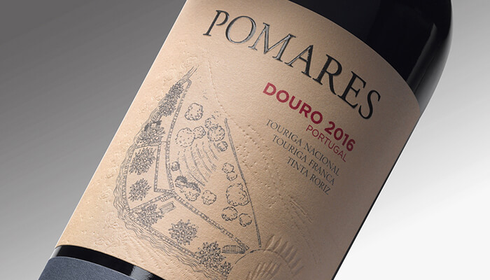
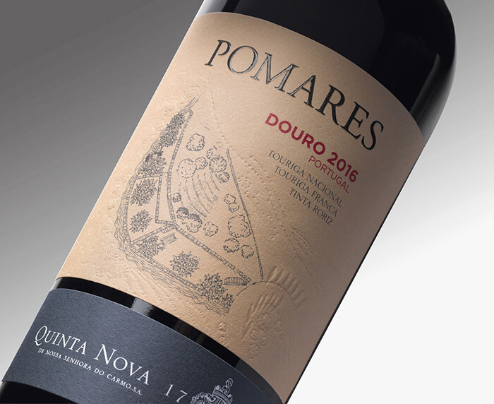
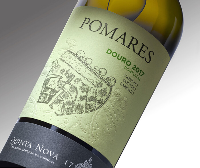
‘Pomares’ now reveals a more clear balance and harmony between the different components that integrate its new labelling graphic composition, that also highlights the illustrations of the Quinta Nova de Nossa Senhora do Carmo emblematic orchards, which is constituted by two elements. The Quinta Nova de Nossa Senhora do Carmo umbrella is kept at the bottom of the label, with a new schist grey colour, reporting to a characteristic feature of this wine region recognized as the oldest in the world.
The three wines that compose the Pomares range – two whites and one red – are now presented in pastel tones, representing the profile of each wine.
With this renewal, Pomares, a brand known by their high quality gastronomic wines, wants to bring the millennial generation closer and to meet the expectations of this generation of consumers that enjoy new experiences and flavours.


Featured on Package Inspiration
We are young team which works to inspire packaging designers every day! Our team select the best packaging of today and shares with you.
