The Brief:
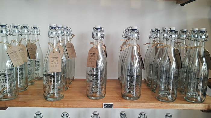
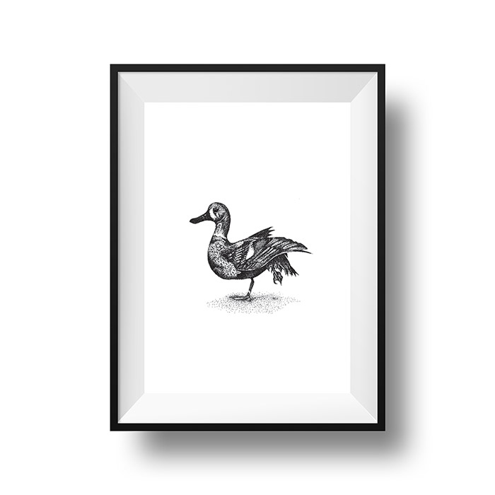
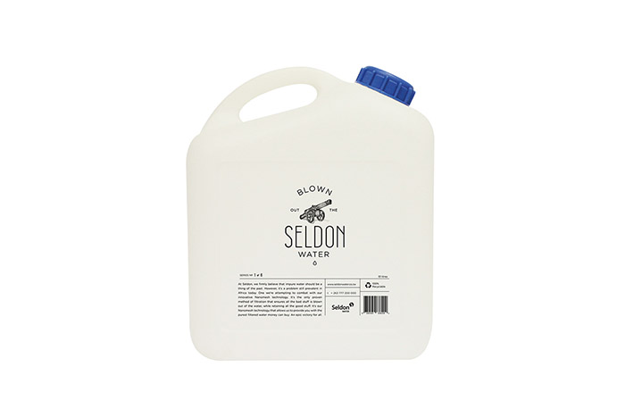
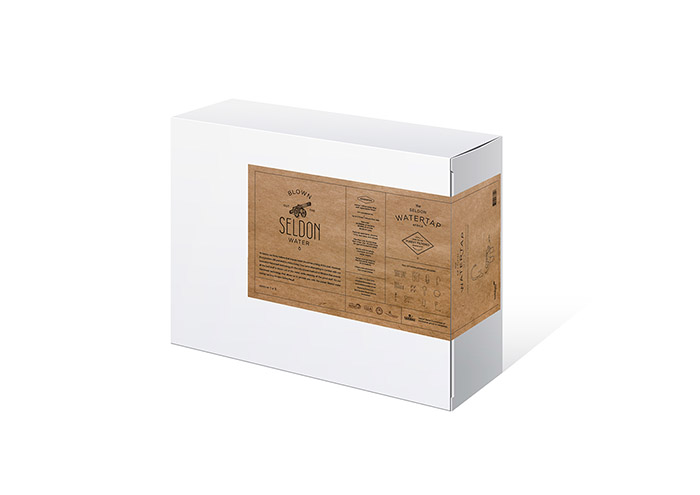
Create a distinct look and feel for Seldon Water Africa, including packaging for glass bottles, 10L and 25L containers and in-store posters in support of the brand’s launch in Zimbabwe.
The Rationale:
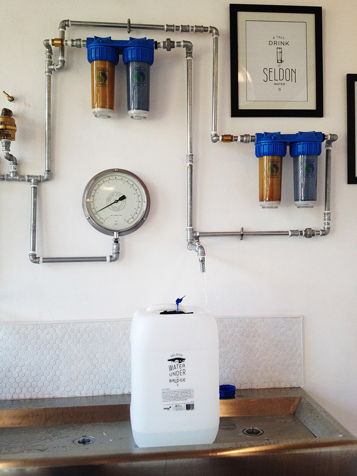
Seldon Water is a water filtration company that aims to save lives with its innovative Nanomesh purification technology, and ultimately solve the water crisis in Africa.
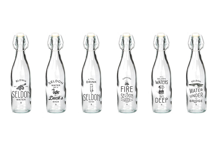
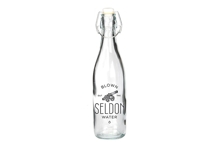
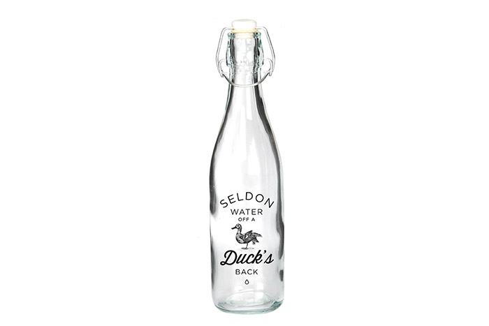
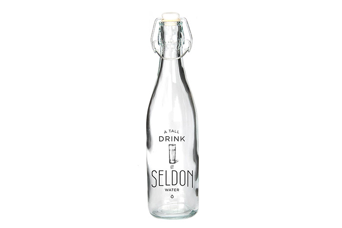
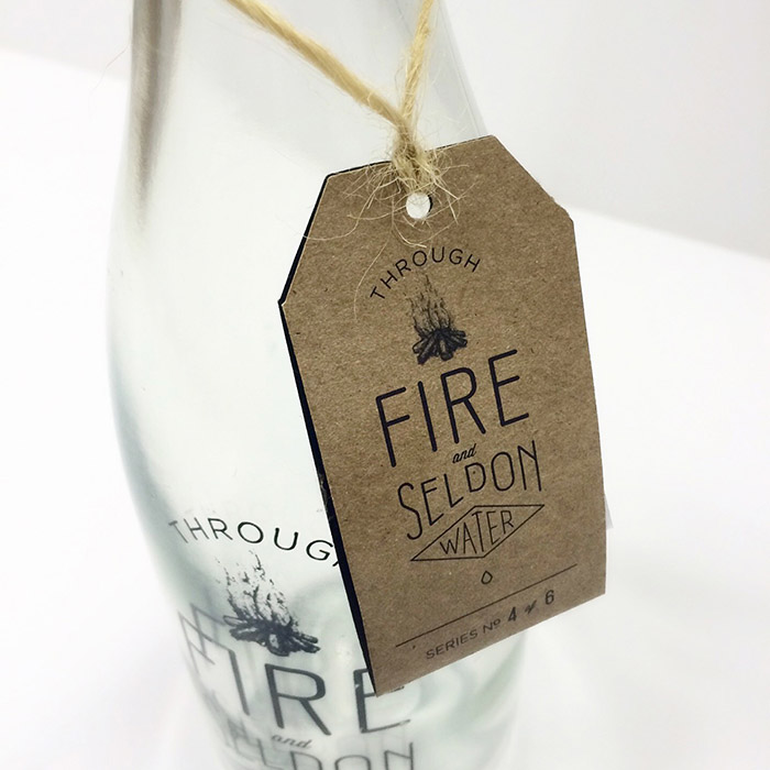
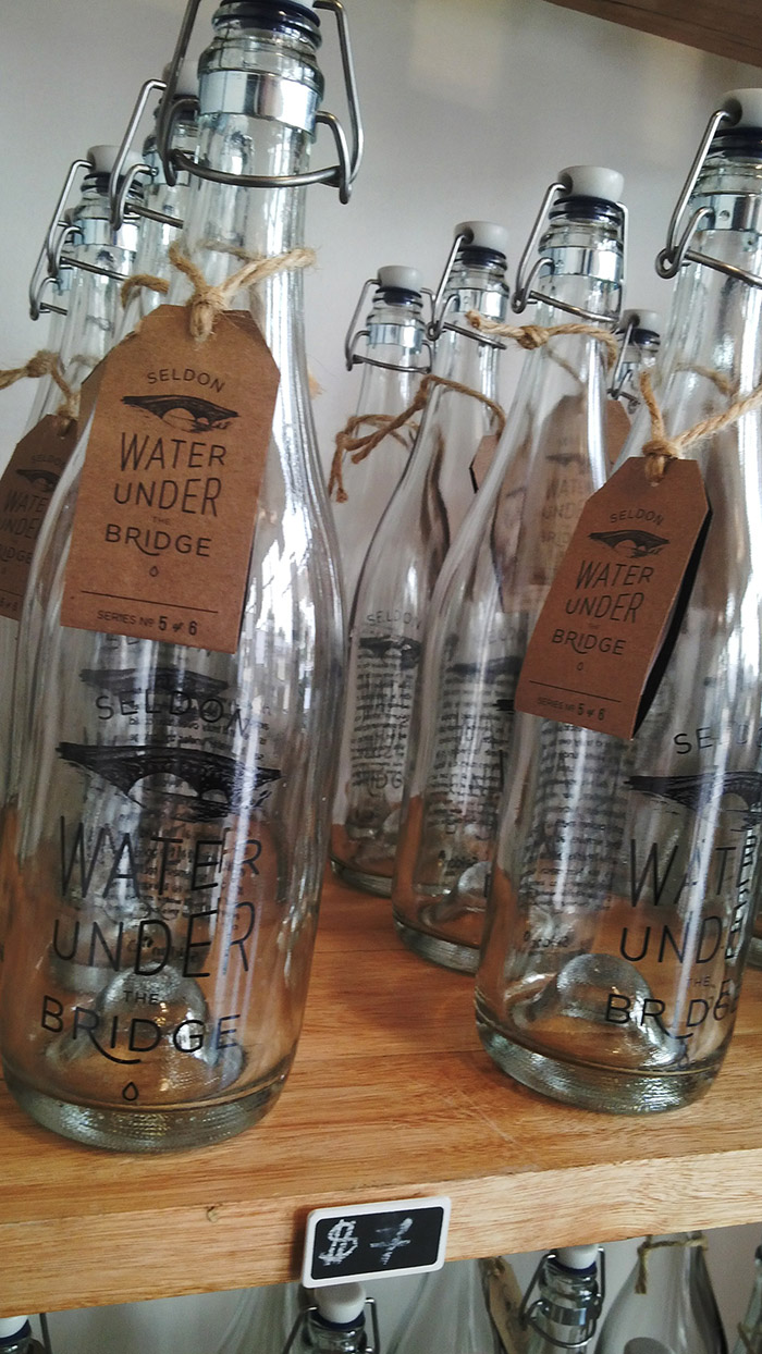
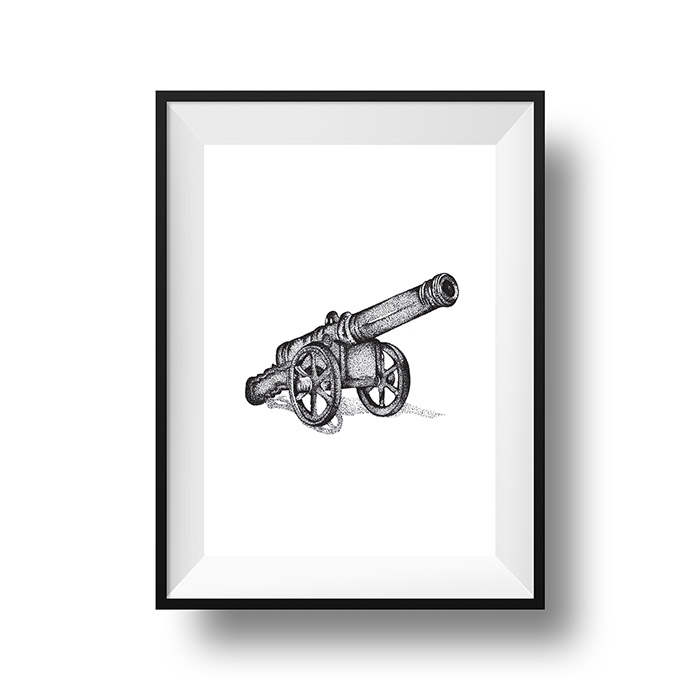
The concept was to use well-known idioms pertaining to water, illustrated in vintage-style typography. These idioms give new meaning to everyday phrases, relating them back to Seldon and its Nanomesh purification technology. With Seldon, polluted water is a thing of the past. The retro 1915-inspired type gives an old-fashioned yet contemporary appeal, while the copy speaks to the brand’s mission: saving lives.
We created a series of six bottles with the idea that they become collectable. Clean, sophisticated and timeless, the new branding stands out against the overuse of blues, mountain creeks and glaciers of competitor brands.
Designed by: Sarah Gregg-Macdonald, Tamara Isles, Sean Creighton. South Africa.




Featured on Package Inspiration