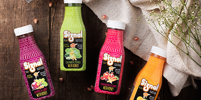
Designed by: Arjun Parikh, India.
The brief was to redesign the packaging of “Siznal” range of juices produced by Manpasand Beverages, India. These juices were targeted towards the Indian professionals leading a busy and fast paced life; something to consume on the go. The use of illustration seemed apt and was thus implemented.
My aim was to take an illustrative approach towards the design, making it stand out amongst its Indian competitors. The design aimed at being organic, reflecting on the nature of the product (The juice uses organic honey as a sweetener instead of sugar). The word “organic” was the backbone of the design process. The client stated that the product should be bold and visible from the shelves. Hence, bright neon colours along patterns were used in the background. For the foreground, a black patch was put in place to create contrast.
The design received a positive response by the client and investors. The brand was able to raise the selling price due to the reworked packaging, which was beneficial to the revenue they generated. The design was also well received at the soft launch of the product. A decision was also taken to adapt this design to a tetra pack (something that’s currently in the development stage).

Featured on Package Inspiration