Agency: Robot Food
–
Description:
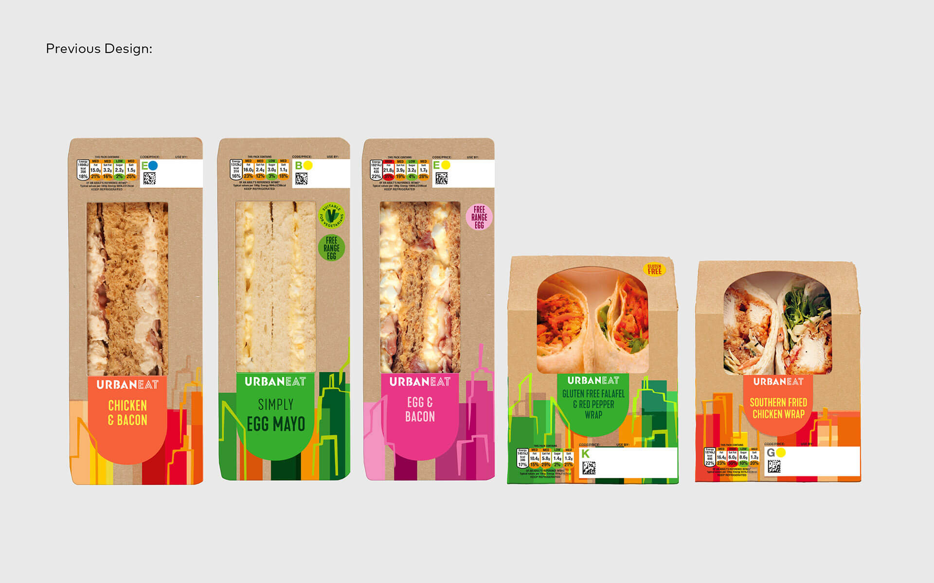
Robot Food Rebrands Urban Eat, Infusing Excitement into Grab and Go
05 October 2021
Leeds
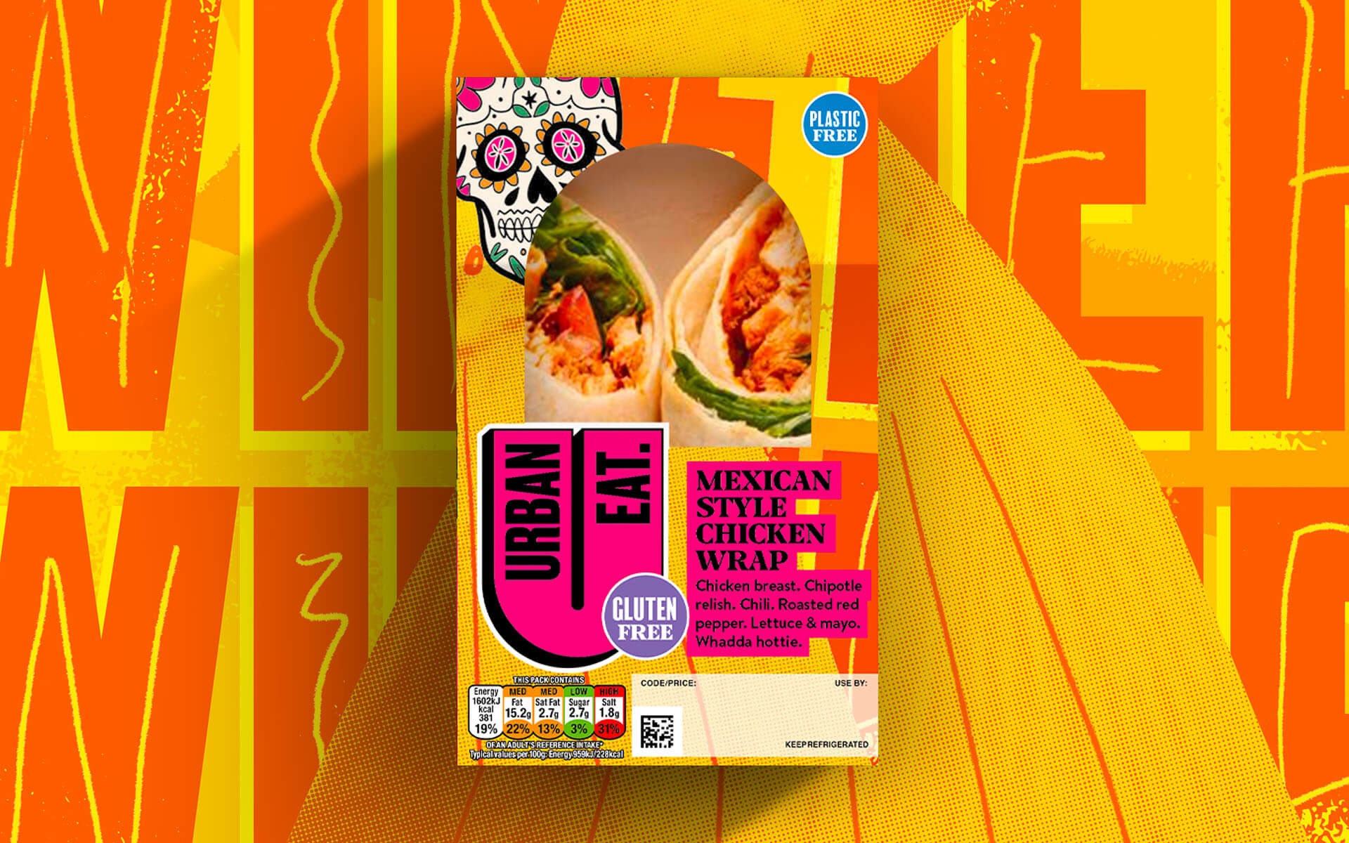
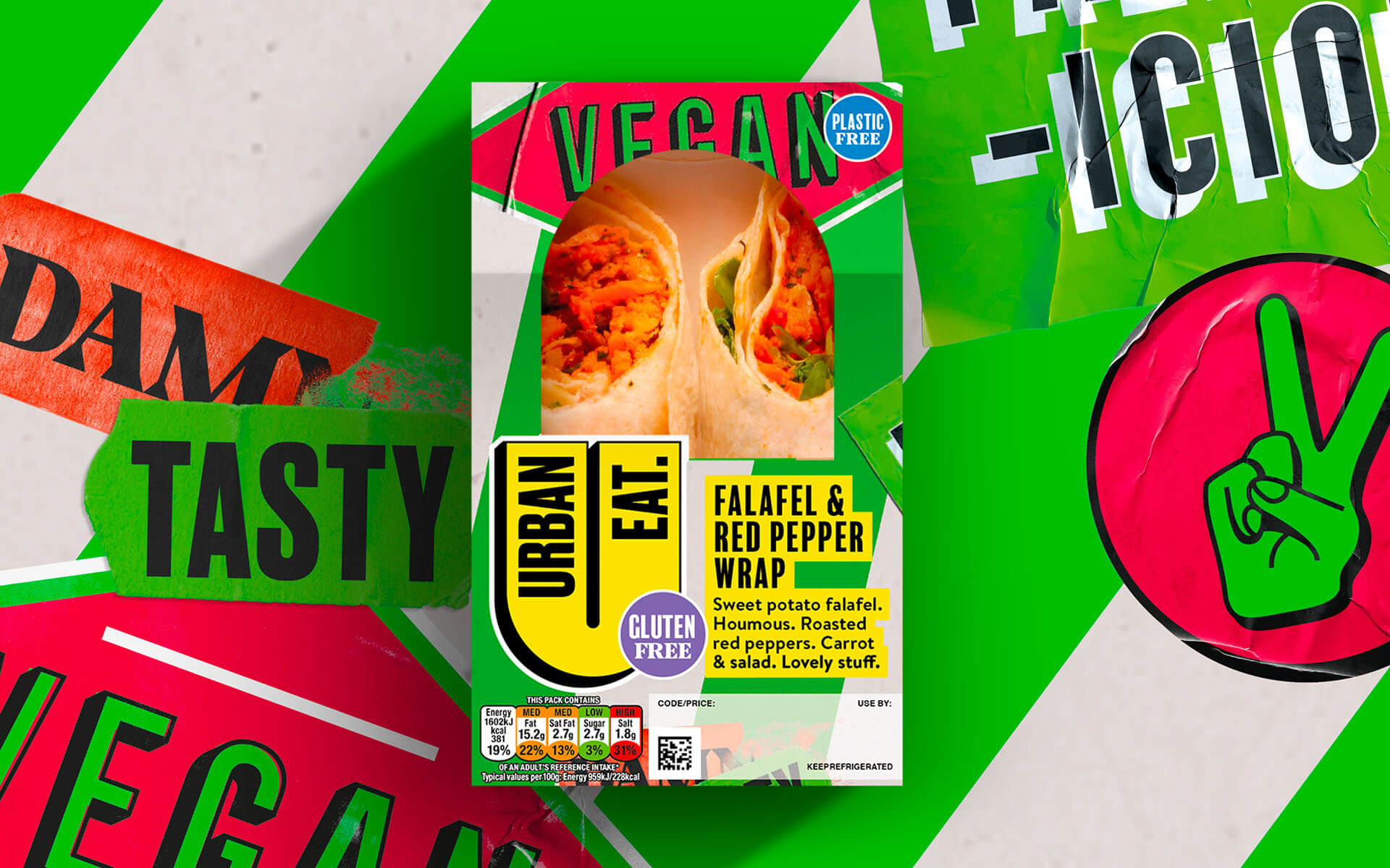
Robot Food has overhauled the branding of food-to-go range Urban Eat, aiming to “implode” the sector with bold new designs that “push the limits and shatter the preconceptions of what ‘grab and go’ can be”.
Simon Forster, founder and ECD, Robot Food says: “The new Urban Eat is all about shaking up your routine while keeping things uncomplicated. It questions the previously unquestioned by providing exciting, always delicious options—whether you’re looking for something familiar or something new.”
Ali Johns, Head of Brand Development at Urban Eat owner Samworth Brothers, says: “This new chapter and identity will allow us to build brand awareness, grow into new listings, and inspire consumers looking for unique and exciting lunchtime offerings. It’s been a pleasure partnering with the Robot Food team and we’re so excited the vibrant new look has hit the shelves.”
Waking-up the ‘lunchtime zombies’
Urban Eat was inspired by the idea of revolutionising the brand to truly shake up the often-drab food to go aisle. Robot Food carried this through in the design. “Everything we did from the visuals and tone of voice is about breaking people out of lunchtime zombie mode and their regular habits,” says Robot Food creative strategist Natalie Redford.
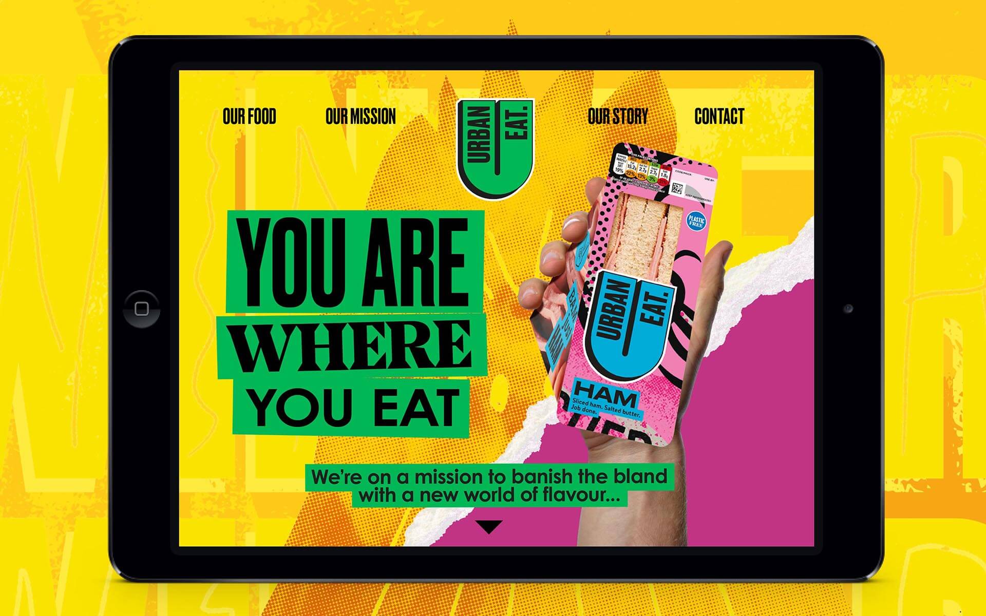
It was crucial to establish a more emotional connection with Urban Eat to bring the rich brand story—articulated by Robot Food as “you are where you eat”—to life.
“The urban environment is about a rich mix of styles and colours, characters and cultures,” says Forster.
“We were visually and verbally trying to translate how eclectic people are in cities and harness that vibrancy to represent everyone who buys Urban Eat.”
Big up the cheese sandwich
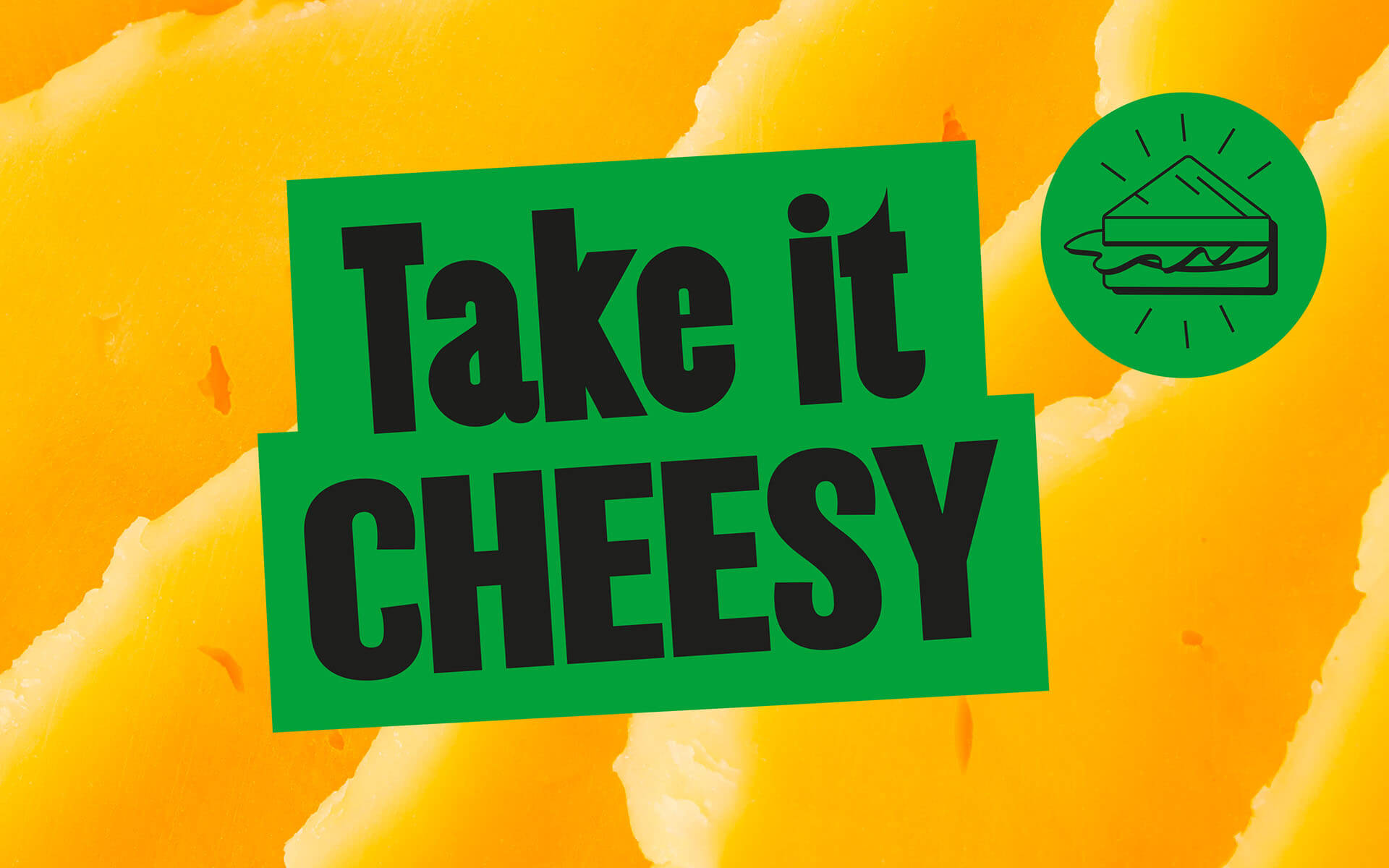
While Robot Food was keen to look at how the brand design could look on new, exciting products coming to the Urban Eat range, it was also vital to amplify the existing, established, familiar flavours. “The ambition was to become this really exciting, innovative brand,” says Redford. “But in the short term, they still have to big up a cheese sandwich—sometimes it’s the only thing that hits the spot.”
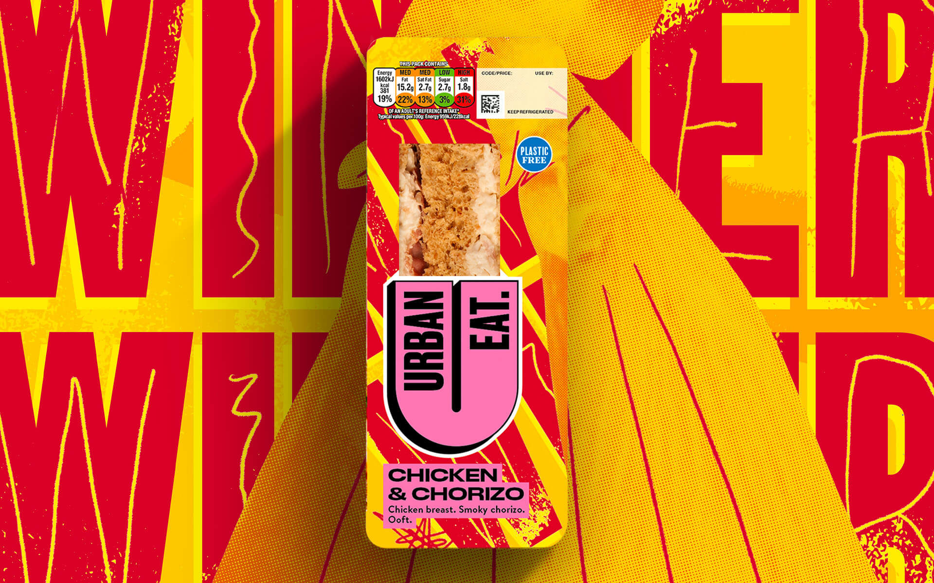
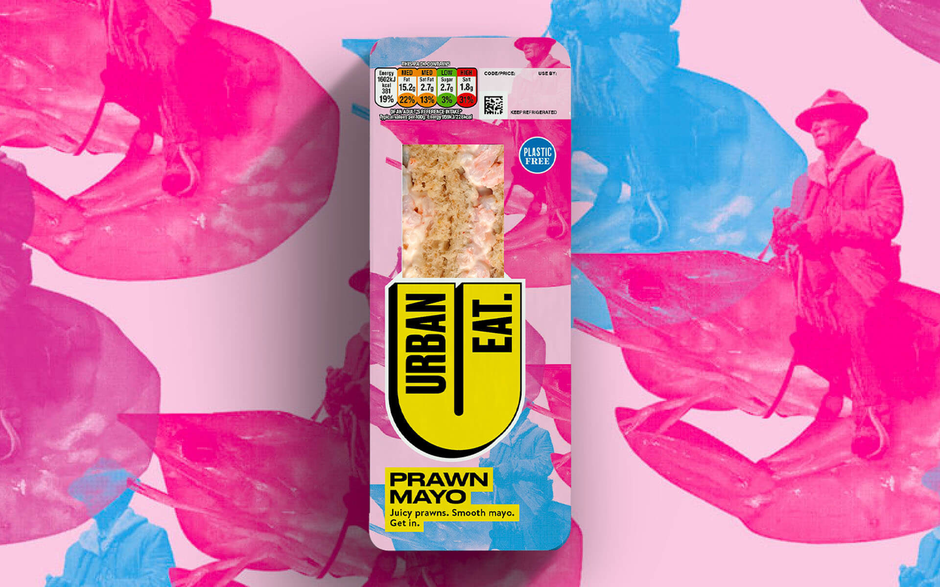
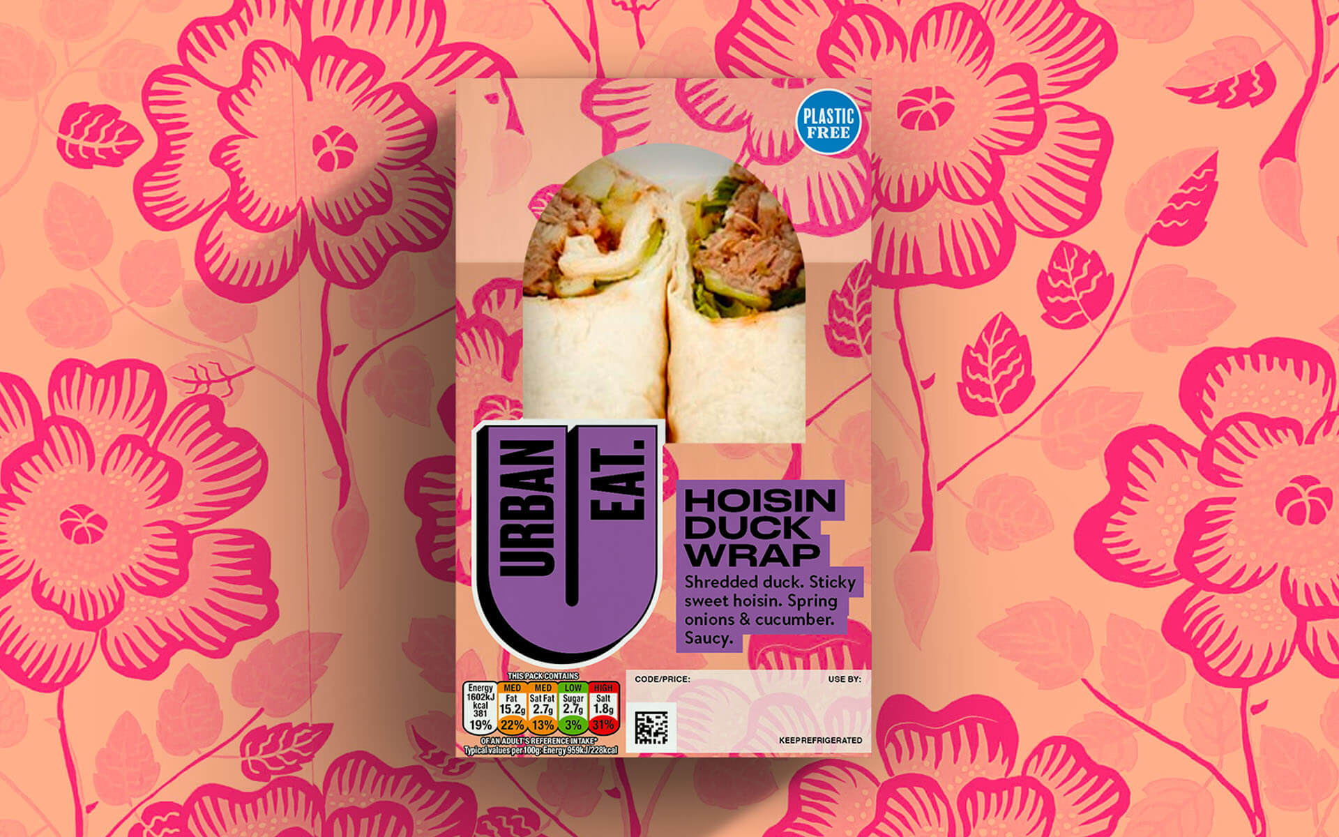
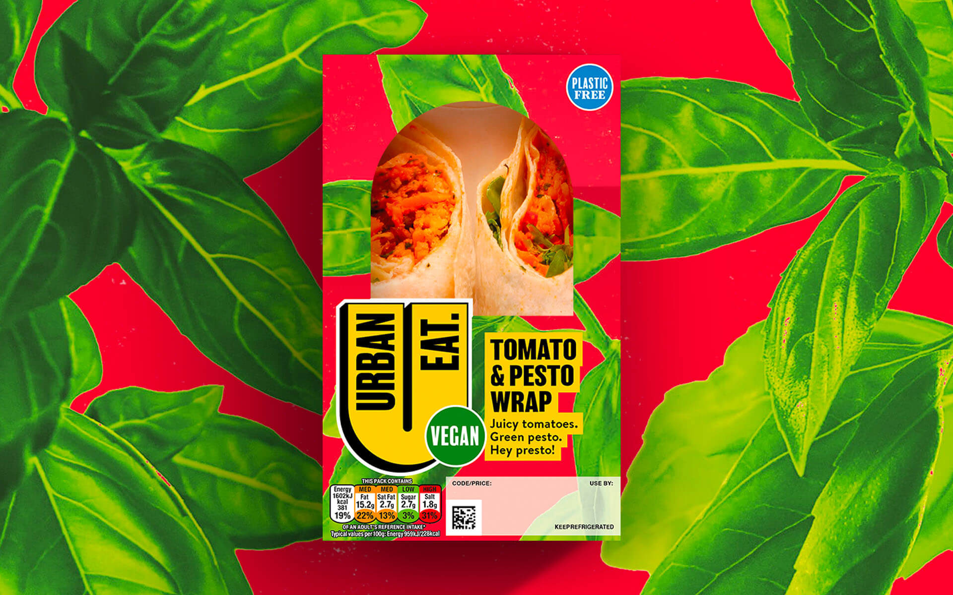
The main design challenge was to harness vibrant colours, intricate pattern designs and illustrative elements but without alienating anyone: “colourful and crazy but tasty and approachable,” as senior designer Chris Shuttleworth, who helmed the creation of all illustrations in-house, puts it.
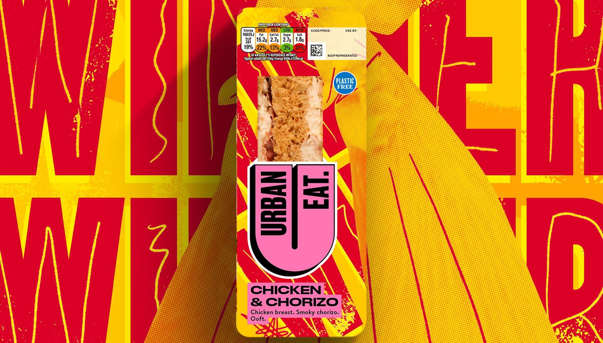
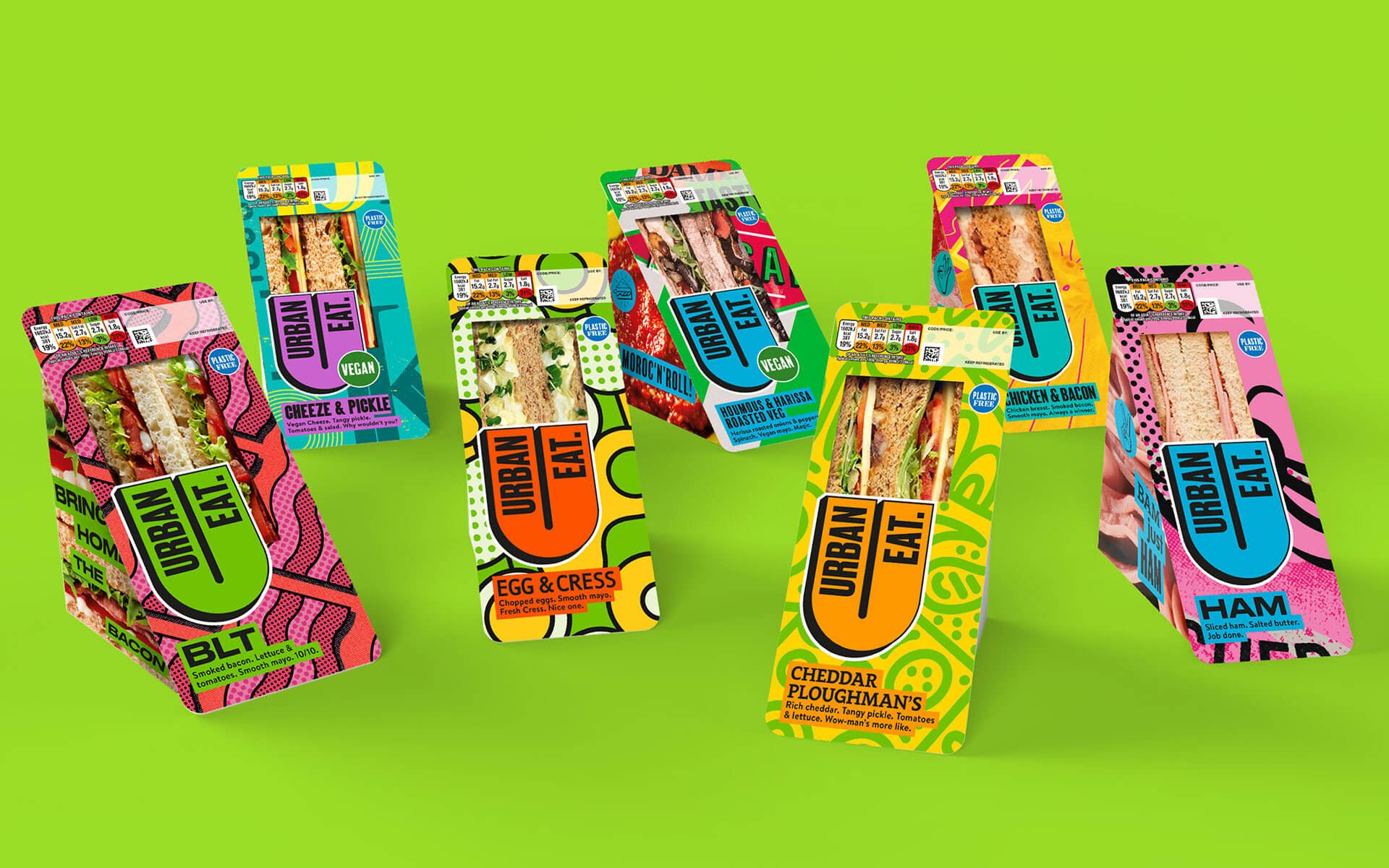
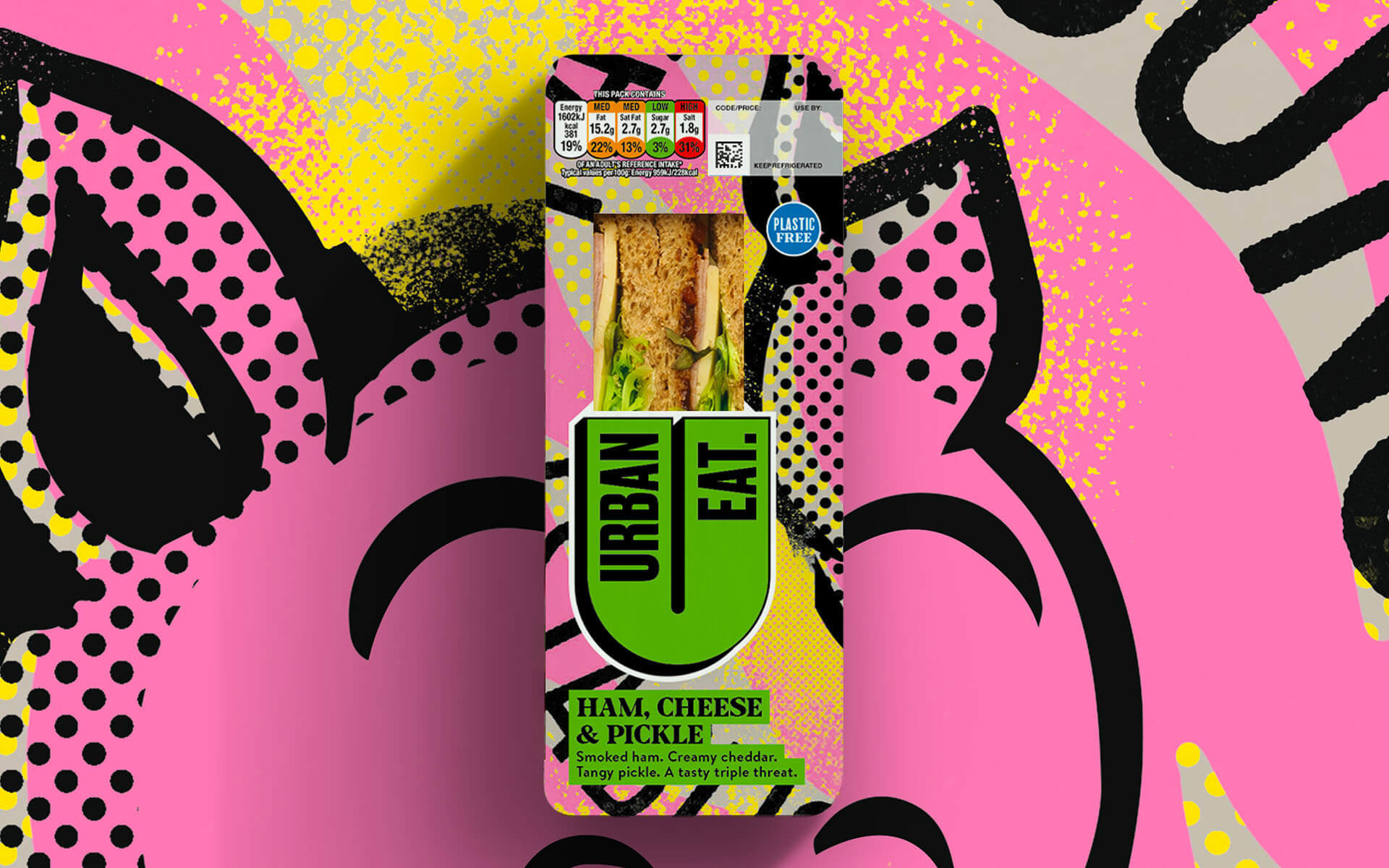
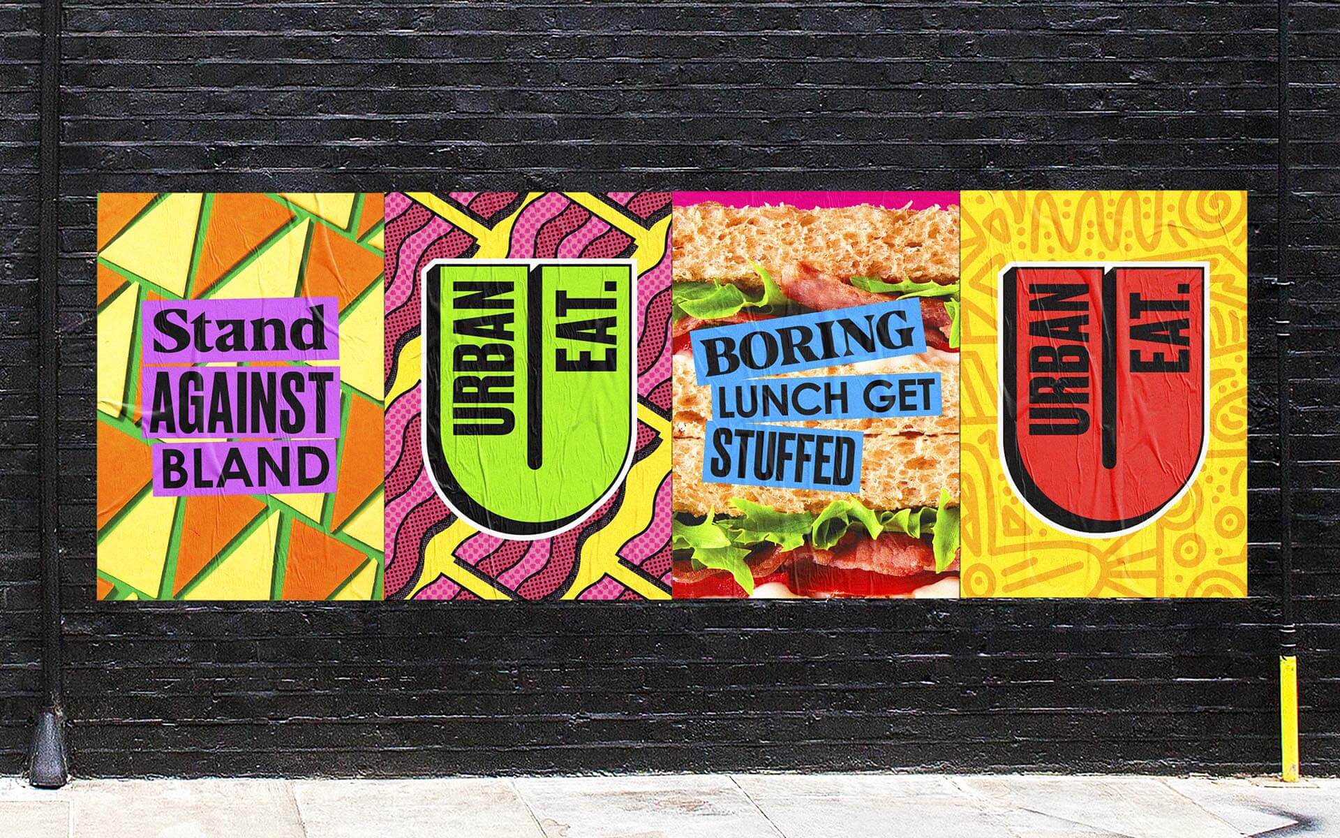
The huge range of illustrative styles are central to the Urban Eat brand, used on-pack to heighten the sense of excitement and dynamism of the range and create a rich brand world.
The high-energy, playful but functional illustrations nod to elements from across art history—as well as the sandwich aisle.
They also help navigation of the range, leaning on traditional conventions such as pink for ham, yellow for chicken with a unique spin to help elevate flavour cues.
Styles range from textured patterns to Memphis-like repeating shapes to Keith Haring-style line drawings, Matisse-esque cutout effects, colour washed photomontage, type-led graphics and more.
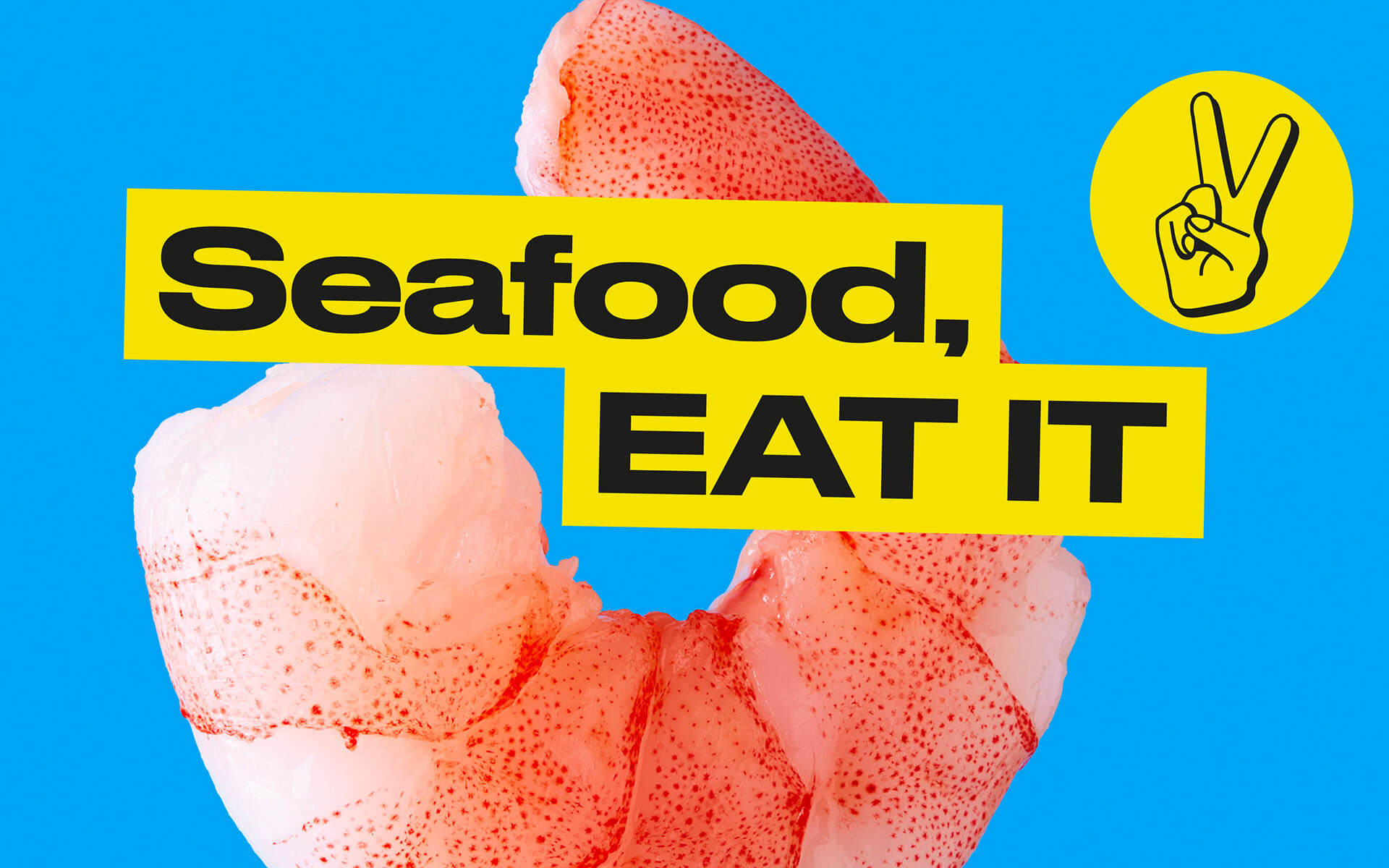
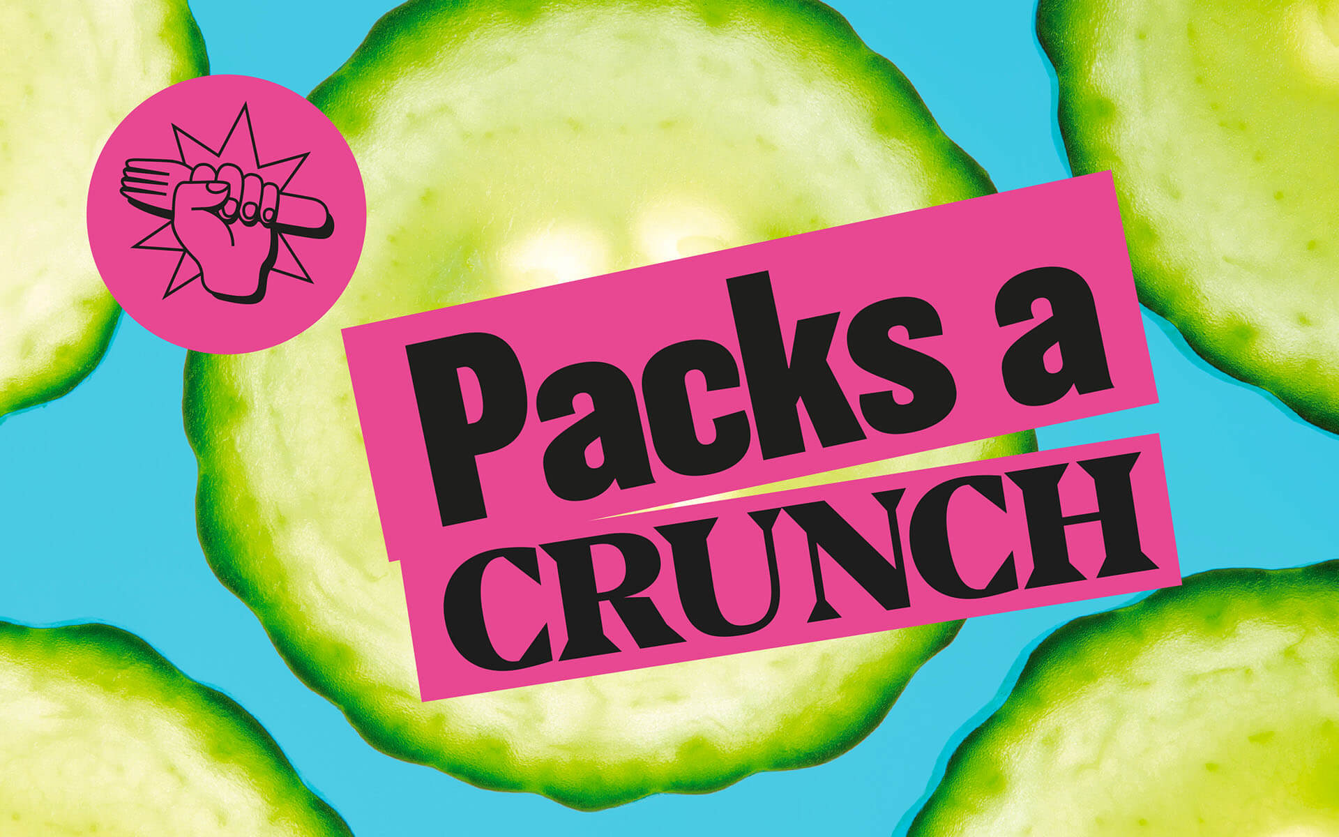
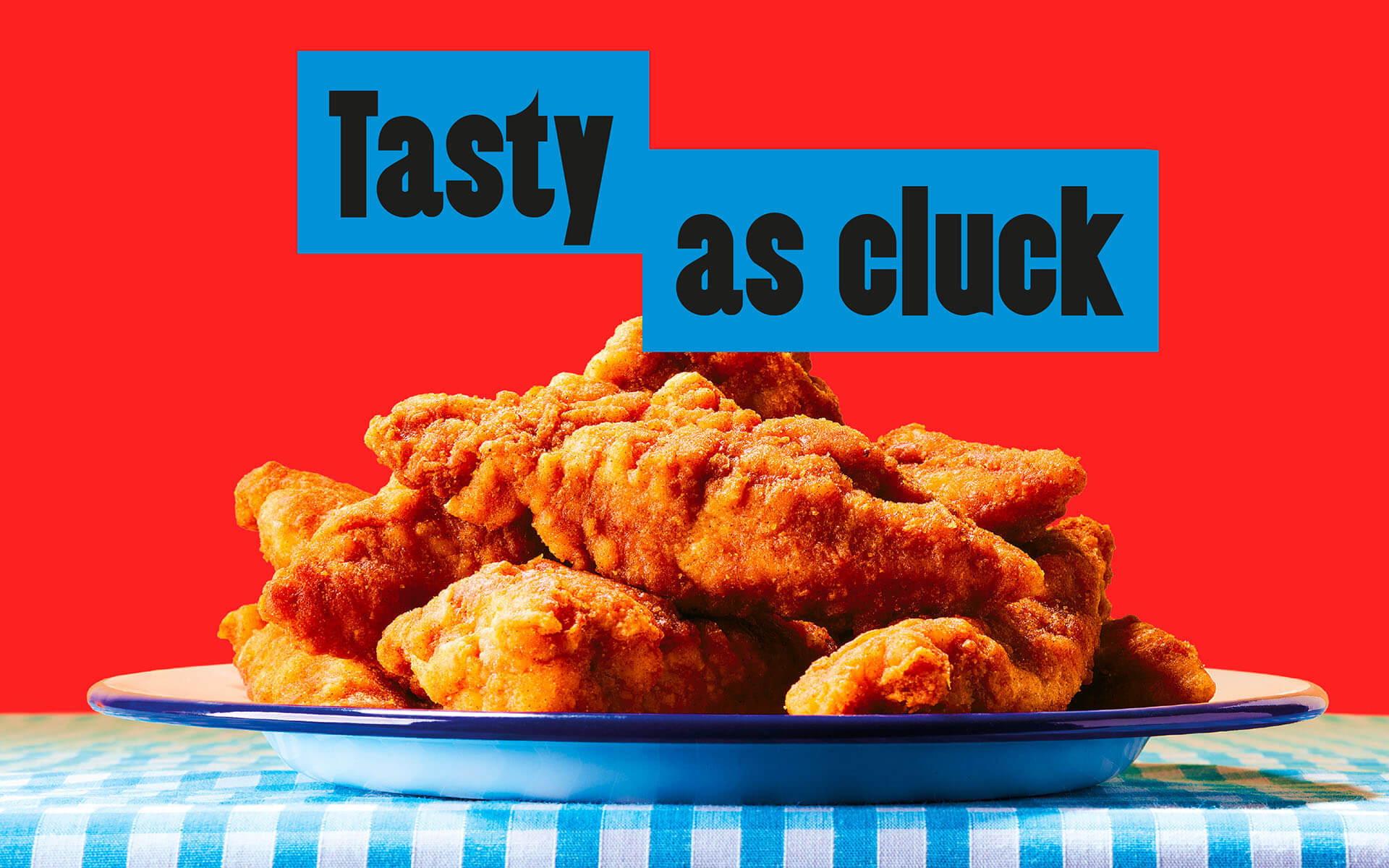
The side of the packs use vibrant pop-art style photography of key ingredients with punchy slogans to “add a touch of the unexpected,” says Forster.
“It’s going into a category with fresh eyes and shaking it up—it’s a dream job. Our design is more akin to a craft beer than a sandwich.”
Playful, expansive typographic language
The new master logo is set in a bright yellow tone with a dramatic drop shadow; while secondary logos can be used in any colourways.
A suite of ten fonts is used to further amplify the sense of eclecticism, including a mix of Druk, Century Gothic and Balboa for title fonts; and Brandon for body copy.
Fonts are used in any combination across packaging and branding applications, prioritising legibility and easy navigation across the range as well as on-shelf standout.
Straight-talking foodies
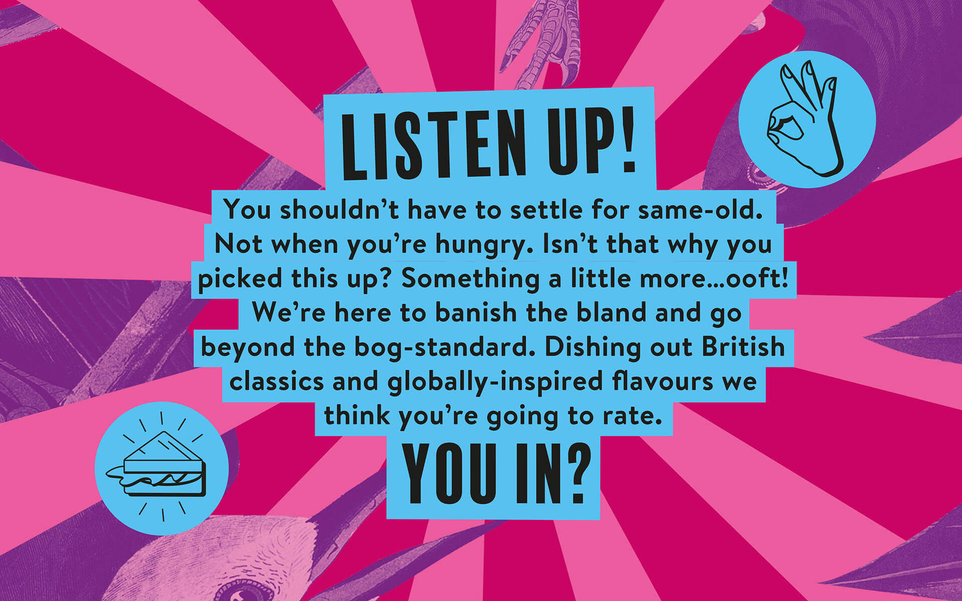
Robot Food created a robust, straightforward tone of voice that both matched and augmented the graphics, resulting in some tongue in cheek phrasing and packed with puns.
“We wanted the copy to be as strong and different and ownable as the design,” says Lizzie De Jong, Robot Food copywriter. “There was nothing that stood out in similar products; the language was either very frilly or very basic.
“The copy needed attitude but without feeling forced or cliched: getting rid of all those empty adjectives that don’t mean anything, being foodie in a way that feels down to earth and real and approachable.
“It was about being celebratory around the food and giving people permission to explore.”
Urban Eat’s new brand by Robot Food is rolling out now and can be found on grab and go shelves at Moto, Welcome Break, Londis and Budgens.
ENDS
Additional information
For more information on Robot Food please contact Red Setter PR:
Miriam Chumbley: miriam.chumbley@redsetteragency.com or Cher Keane: cher.keane@redsetteragency.com
About Robot Food:
Robot Food is an independent branding agency based in Leeds, UK. Since 2009 the team has partnered with global clients of all shapes, sizes and categories to deliver compelling consumer-led brands, grounded in disruptive, strategic thinking. Known for their entrepreneurial attitude and ‘no-fluff’ end-to-end approach, Robot Food specialise in uncovering the commercial opportunity for the brands they work with, including the likes of Carlsberg, Co-op and Vocation Brewery, as well as creating and launching Robot Food’s own brand Stories & Ink. Visit: robot-food.com for more information.
![]()


We are young team which works to inspire packaging designers every day! Our team select the best packaging of today and shares with you.

