
PRELIMINARY:
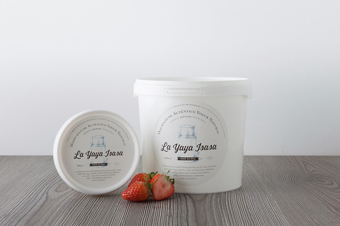
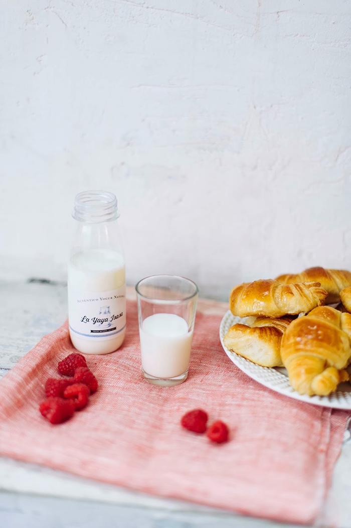
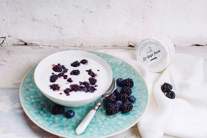
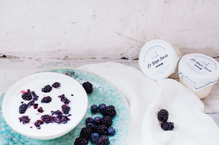
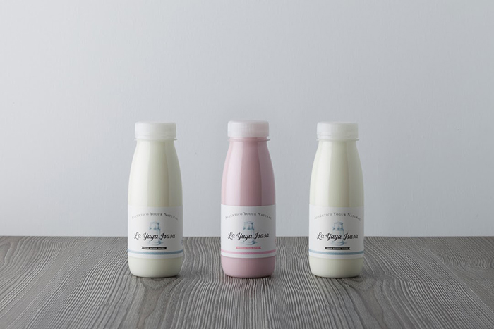
– The client had its own name and packaging design for artisanal yoghurt based it the company name: Dairy Isasa (Lácteos Isasa), the product line included plain yogurt and yogurt smoothie (natural flavors).
– Lacteos Isasa uses only milk and selected lactic yeast to make his yogurt to make a very special lovely and pure yogurt. Even though the brand only started in 2013, it has quickly found a big (and growing) following.
– Strong identification with artisan product and values to the product (region, care, respect for traditions)
THE SOLUTION:
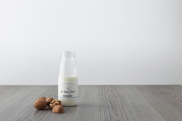
– The solution provided was to build a character: The Yaya Isasa and the people’s need about “things as before ” “the taste of authenticity “.
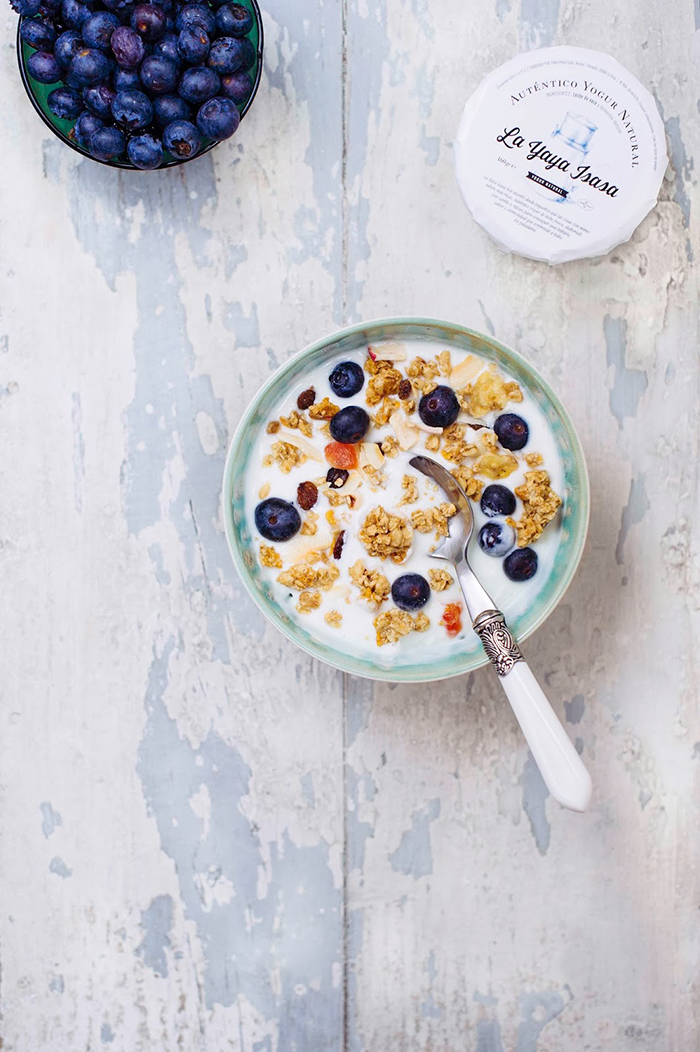
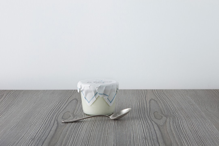
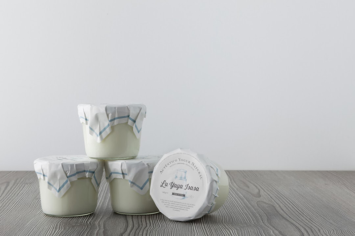
– Graphically we create a visual poem in which all the elements reminds the artisan origin and are clearly identified with brand.
– The carefully crafted design claims its traditional heritage with a modern sensibility that expresses an enlightened awareness of healthy choices.
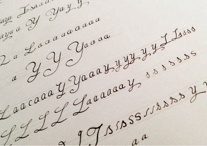
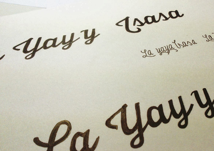
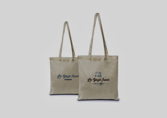
– The use of a own personal calligraphic typeface brings significant value to all the different and conveys a sense of solidity product, care and craftsmanship, this resource simulates the original signature of La Yaya Isasa, reminding notebooks learn to write.
– There are several key elements:
– The name of the brand : The Yaya Isasa.
– Background or texture as a dishcloth
– The claim to accentuate the differential value : GENUINE NATURAL YOGURT.
– The representation of a dairy’s drawn element gives meaning and force to the set and makes it easily recognizable to the target, relating immediately with fresh milk.
– The tone and message of each of the manifestations of the brand : proximity and closeness .
Agency: TSMGO (The Show Must Go On), Spain.
Creative Director : Ricardo Moreno Rodríguez
Designed by: Marta Terrazas Llorente y José Luis Casao
Photography: Lorena Martínez Acha y Carlos Caperos Berdejo


Featured on Package Inspiration