Designed by: BOLD BRANDS
Creative Director & Stragegy: Motiejus Gaigalas
Head of Design & Graphic Design: Vytenis Petrusevičius
Photography: Artiom Ištuganov
These are Casserole style pots well-known for many years. The same type of pots our grandmothers used to prepare various dishes. Grand Feu brand goal is to revive this kind of cooking experience targeting young and modern audience and cooking enthuasiasts.
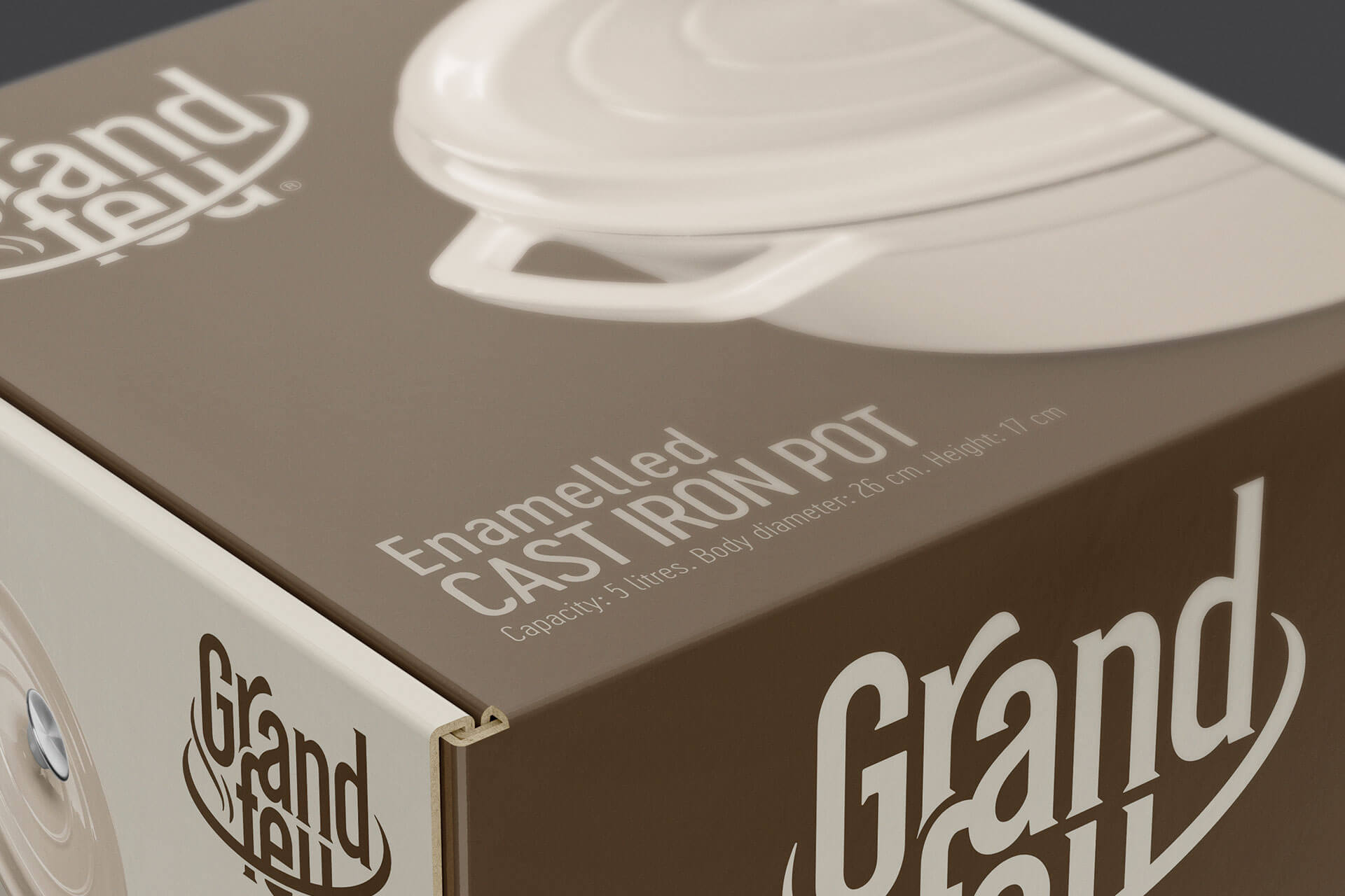
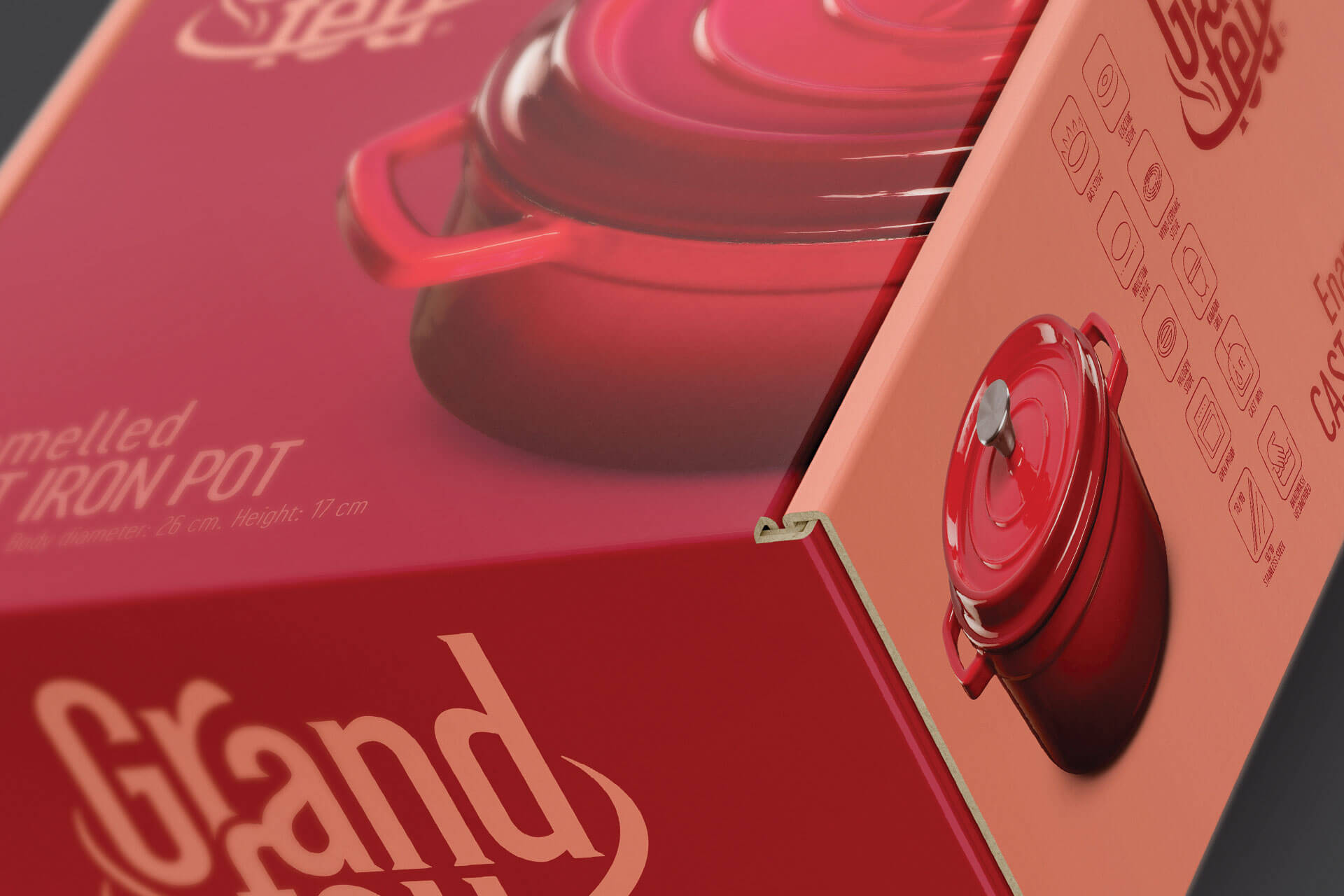
The product itself is well known, therefore not much information about it is required on the packaging. Communication about the finest quality is made through high quality product pictures on package letting the consumer understand what is most important without unpacking it as well as perceive what the outside and inside of the pot looks like. We have refuted the frequent myths about this pot, explained where it can be used or how to maintain it, and infographic icons made it all clear to anyone who speaks any language.
Product has variety of colours, so decision was made that the package itself should convey same emotion as well as being clearly visible and playful. There are quite a few different colour packagings for different colour of product it contains which contributes to better shelf impact.


Featured on Package Inspiration