Challenge. A new packaging design for Coop condoms
A hot issue. As everyone knows, one of the things that drives the word forward, and is also one of the best things there is, can also be a source of trouble. It sounds paradoxical, but it’s true. Even in ancient times it was a hot issue, and it continues to be so also today: if you have sex, there is a risk that you will catch a disease. Our ancestors came up with a solution – the condom, and it’s a solution that still works, even if with a bit more technology.
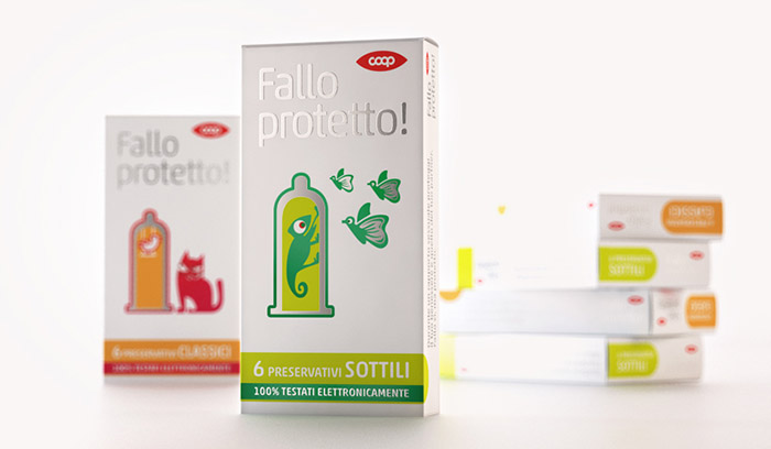
What’s it called? Even before its double meaning*, Fallo protetto! is a plea to use that part of our anatomy that sits on our shoulders, at least just a moment before we use that which is down below. And so Fallo protetto! became the name of a condom that wants to encourage you to do that thing with care, but also with the desire to smile.
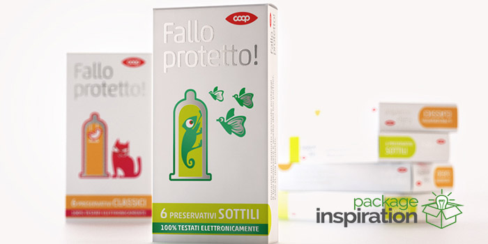
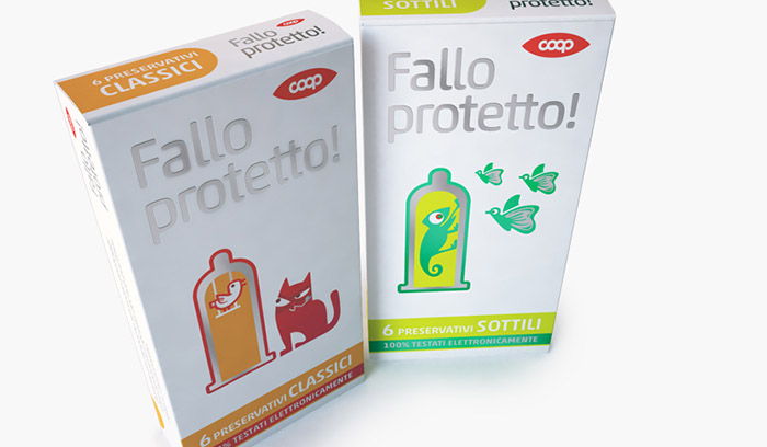
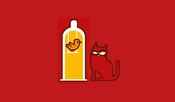
The (big) difference. The packaging design was conceived as being luminous, with a system of essential signs and images that show simple scenes which underline the idea of protection. In one image a hungry cat is eyeing up a bird protected by a cage-condom. In another, an avid chameleon is isolated in a test tube-condom with butterflies flying al around it. The packaging design also recalls authentic ads, and perhaps this is the (big) difference compared with the packaging design competitors. Paolo Rossetti
Illustrations by: Marcella Peluffo
*In Italian the word Fallo is the second-person singular, present tense imperative of the verb fare (to do or to make), but it is also a noun, deriving from the Latin phallus, the erect male organ.
Designed by: Rossetti | Brand Design, Italy.
Featured on Package Inspiration
We are young team which works to inspire packaging designers every day! Our team select the best packaging of today and shares with you.

