
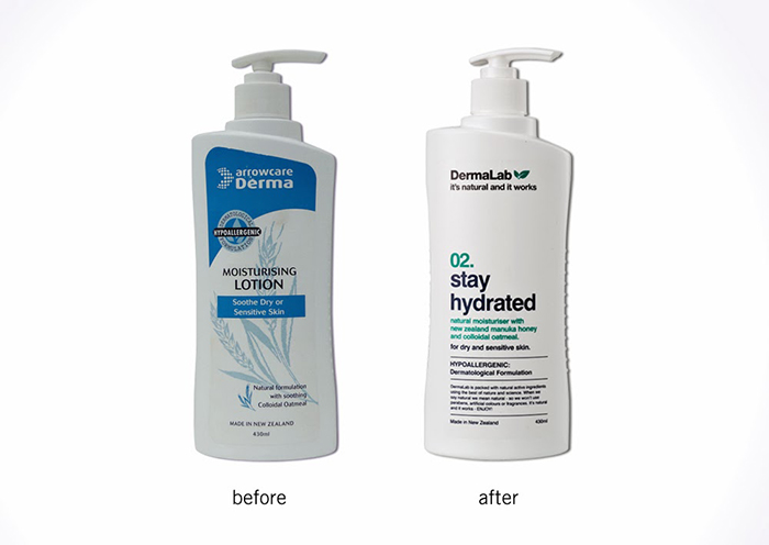
Our client, a large pharmaceutical, launched a ‘me too’ product in the sensitive skin care category, taking on brands like Cetaphil. Cetaphil has extensive distribution and strong brand awareness, but it’s full of nasties – what they call science – to be effective. Our challenge was to take a purely natural product that had proven results and to convince consumers that natural actually worked. So, after 12 months in the market, we were commissioned to undertake this packaging revitalization.
The end result – a massive growth in sales, increased distribution and happy clients.
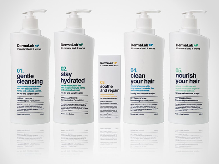
What we found was that we needed more than a packaging refresh, we needed a brand overhaul to lay foundations of what the product could actually do. We renamed the product DermaLab to give it a scientific feel and personality and our communications hierarchy on pack was very clinical but accompanied with a friendly tonality. We developed a numbered system to make it unique and easily identifiable on shelf, and a clean, non-traditional look which reinforces the proposition that it actually works.
Agency: Redfire, New Zealand.
Designer: Creative Director: Colin Downing, Designer: Reuben Alderson
Client: Arrow Pharmaceuticals

Featured on Package Inspiration
We are young team which works to inspire packaging designers every day! Our team select the best packaging of today and shares with you.


&p[summary]=Our client, a large pharmaceutical, launched a 'me too' product in the sensitive skin care category, taking on brands like Cetaphil. Cetaphil has extensive distribution and strong brand awareness, but&p[url]=https://packageinspiration.com/dermalab-packaging-redesigned/&p[images[0]=https://packageinspiration.com/wp-content/uploads/2014/02/DermaLabMAIN.jpg)