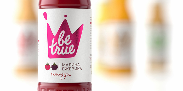
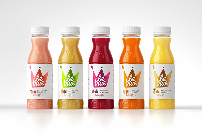
STUDIOIN rebranded smoothie “Be true”.
Smoothie still remains strange product for Russian customers.
“Be true” did not have its own look before and borrowed it from European prototypes.
Due to that before STUDIOIN was set a task to leave previous design which was copycatted straight from world`s brand and create a new original design for the product.
The target audience of smoothie is wealthy and active young woman. We encourage her ambitions and rush to have the best and healthiest food. And that is exactly what” Be true” offers to her: the feeling of being princess who gets the most delicious things whenever she wants.
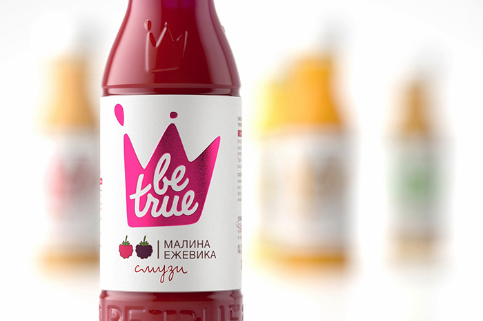
This message embodies a new symbol of brand – the crown, which is performed in a shape of splashes.
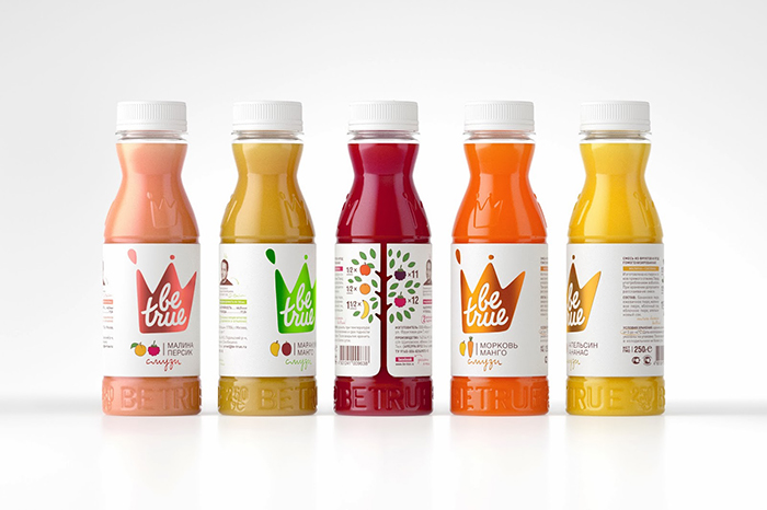
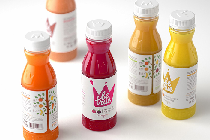
This corporative sign is made on textured paper using foil stamp method and accentuates privileges of the brand. Two corners of the label meeting together and form a fruit tree which completes the design with important infographics.
Not cheap but very tasty and healthy product grew up and became more ambitious. There is nothing left from replicating of world`s analogues. The new bottle has got an ergonomic shape and it makes the product more individual.
The product is expecting on the shelves in 2014.
Designed by STUDIOIN, Russia.
Team: Pavla Chuykina, Katya Teterkina, Kseniya Sazikova, Nastya Yudina, Arthur Schreiber, Roman Inkeles, Galima Ahmetzyanova.

Featured on Package Inspiration