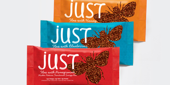
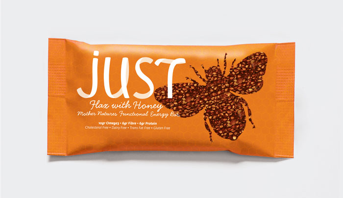
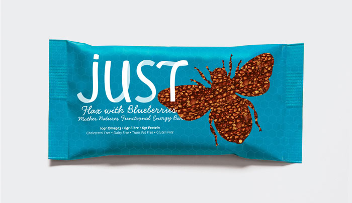
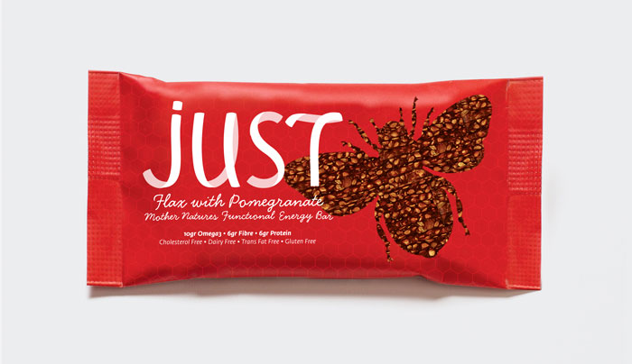
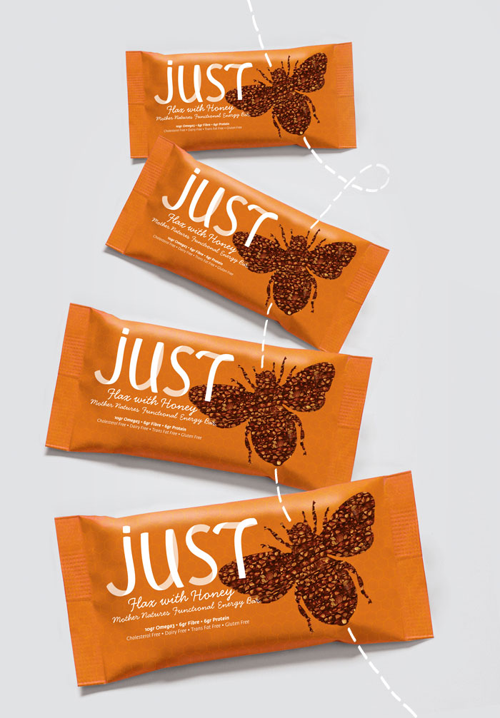
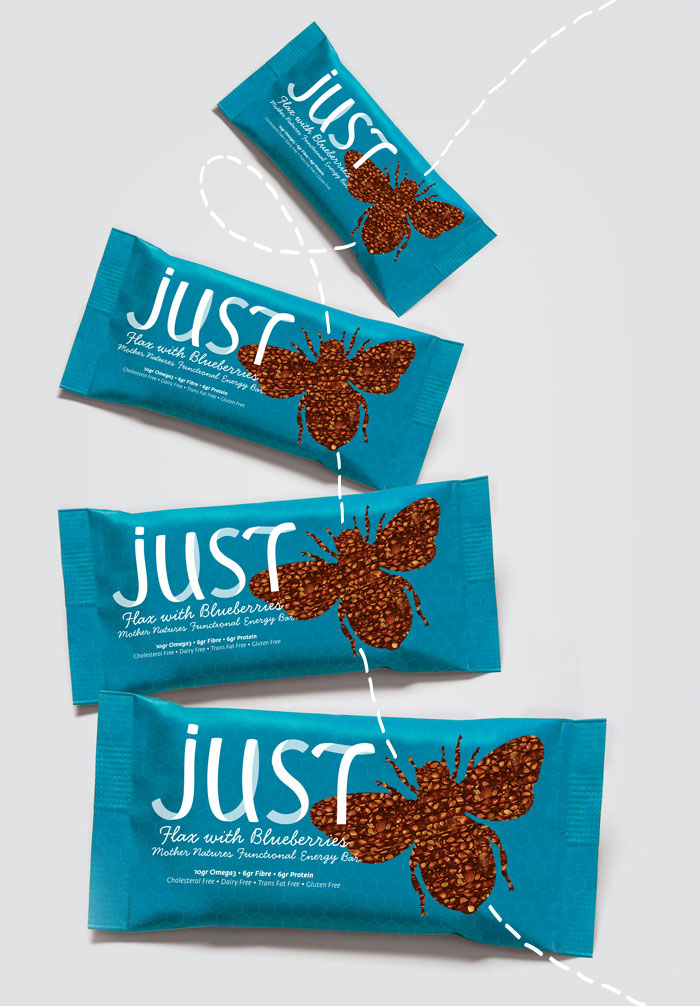
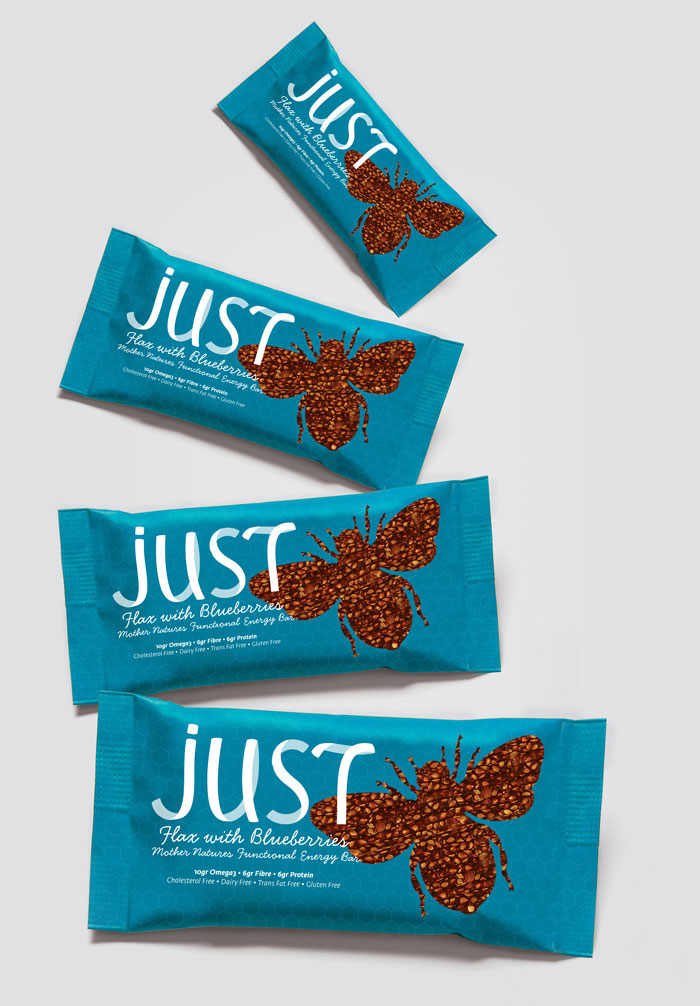
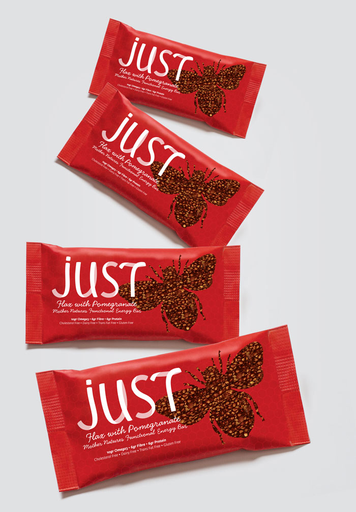
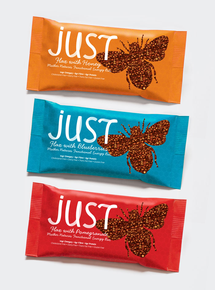
Jelena Grahovac created a concept project for North American local product called Just. “It is energy bar made of limited ingredients flax and honey (that’s why it’s called Just), and it comes in 3 different flavors. So I make it simple, by keeping it clean. Since bar is made from bee’s product, I found that important, and made bee-shaped transparent window to bar, because color of the bar is dark and it looks very nice with a lots of happening, lots of nice detail on it, and made good contrast with packaging color and its simplicity, and also product looks very nice and appetizing. Font that I used is Leo Koppelkamm’s Blu, because it is very clean, simple and elegant, and somehow, to me, it looks like a bee’s flight track, like it is made from observing how bees fly. ”
Designed By: Jelena Grahovac, Serbia.



Featured on Package Inspiration