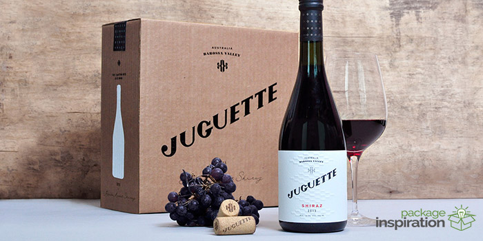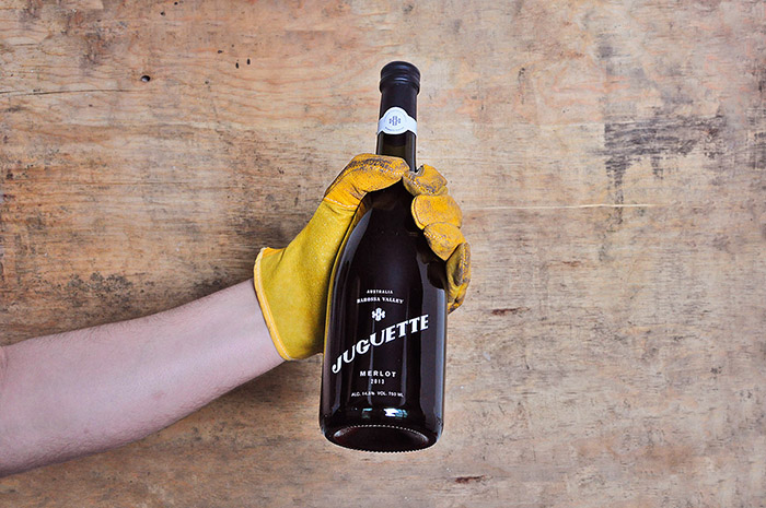
Juguette is a manufacturer of high-end wines of Mexican and Australian origin. It was co-founded by two very passionate wine connoisseurs. They have the philosophy of developing handcrafted wine, with extreme attention to detail. The wine is created in Australia, in small batches, for the wine lovers around the world. Both co-founders would like the wine tasters to have a journey with Juguette, traverse the world, taste a place, and experience a different culture through their wine.
The brand’s essence conveys a sense of playful luxury. Since the wine is an experimental product, the naming takes from a play on the word toy, or juguete, in Spanish, and the word coquette. The co-founders play with ingredients like grapes, soil, and key characteristics of the procedure, to reach the optimal wine tasting experience. The concept behind the brand is based in toys, both intellectual and playful. The Shiraz bottle has a chessboard inspired pattern, depicting cleverness. The rosé wine is more joyful, with brighter colors and a pattern that takes on the classic pinwheel toy.
The logotype was created as a custom typography from scratch, capturing the brand’s essence and a balance between elegant and playful. This fun and very lively typeface, combined with a very clean aesthetic, resulted in an authentic brand that really pushed the boundaries within the standards of the wine industry. We chose a pure and clean color palette, in combination with red, a brilliant color. This creates a perfect balance of white space and color, which injects life and elegance to the finished product.
Editorial photography by Dan Brind.
Designed by: Firmalt, Mexico.


Featured on Package Inspiration