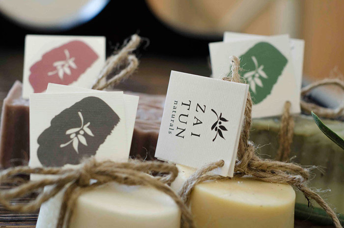
Zaitun Naturals is an organic skincare brand that prides itself of its high quality, natural, handmade soaps. The company needed a new brand identity that reflects its passion for simplicity with luxury, while enabling the beauty of the products’ natural textures to be highlighted. No two bars of soap are the same shape and size, so a flexible packaging system was designed to bring consistency with each unique product.
Zaitun is the Arabic word for ‘olives’. All soap products by Zaitun Naturals have a gentle olive oil base and stamped on every product is its logo – the olive branch of peace. To highlight the natural textures of the products, all packaging designs have been printed on thick, textured white paper.
All photographic imagery displayed here was also produced by myself for promotional material, including the upcoming website, to enhance the gentle atmosphere that encompasses Zaitun Naturals.
Designed by: Rachel Farag, Australia.

Featured on Package Inspiration