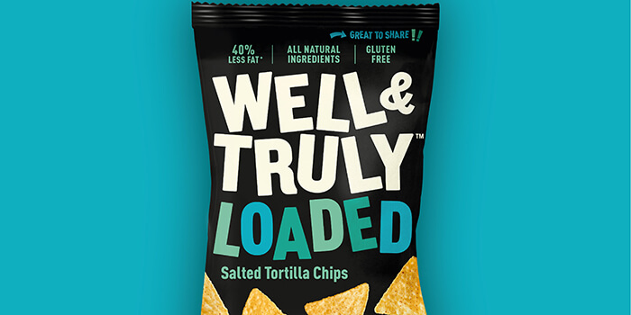
Designed by: B&B studio, UK.
Baked corn snacks brand Well&Truly has unveiled a new identity, with design by B&B studio. In a deliberate move away from the brand’s original health-focused positioning, the new look celebrates taste and satisfaction, returning to the fundamentals of what it means to be a snack.
As the mainstream and healthy snack sectors begin to converge, B&B was keen to help Well&Truly take advantage of the opportunity to be the better-for-you option within mainstream snacking. The new branding reflects that repositioning by expressing the powerful flavours and textures found in every mouthful.
Pleasure doesn’t have to equal guilt
With its existing packaging playing to the design codes of ‘lighter’ options, Well&Truly was struggling to step outside its healthy niche. Having identified the opportunity to challenge both the healthy snacking and mainstream snacking categories, B&B introduced a cheerful, upbeat tone of voice and increased energy across the brand.
Positivity not prohibition
To achieve maximum shelf standout, B&B turned up the volume on Well&Truly’s visual identity, focusing on the high quality of ingredients and intensity of flavour. A black background on pack – rare within both healthy and mainstream snacking – is brought to life with sans serif type in bright hues and a positive language that focuses on enjoyment.
This bold new personality is uncontained, pushing the physical limits of pack dimensions and rolling out across all touchpoints and social media platforms. Celebrating the joy of food and movement, B&B studio has introduced visuals of real people and uplifting behavior for an engaging and relevant identity.
Forefront of the #cleaneating backlash
Shaun Bowen, Creative Partner at B&B studio, says: “Well&Truly is a rare brand that sits at the intersection of two highly-competitive and slowly-converging categories, delivering a tasty snack to the mainstream with properties that also appeal to consumers seeking a healthy alternative.
“With a new energy to its social media outreach, Well&Truly now sits at the forefront of the #cleaneating backlash, showing that choosing the healthy option no longer needs to be about deprivation or sad snacks. An underpinning ethos of ‘Positivity not Prohibition’ shines through in the rebrand with a generous, spontaneous spirit that celebrates depth of taste and flavour – not just lower fat content.”
Sara Trechman, Co-founder, Well&Truly, says: “Our snacks are bursting with flavour and natural ingredients but by restricting ourselves to the healthy snacking sector, we were missing out on reaching a much wider pool of consumers who weren’t necessarily seeking a health-conscious option.
“B&B studio understood the potential of Well&Truly from day one and injected a new energy into the brand, giving us a voice in the ongoing conversation about what healthy really looks like. For us, it’s about not compromising on flavour and delivering a delicious, nutritious option that tastes just as good as the mainstream alternative. Snacks shouldn’t be ‘less’ just because they’re healthier!”
Well&Truly crunchy sticks are currently available in three flavours – Really Cheesy, Sour Cream & Onion, and Spicy Paprika – with tortilla chips available in Lightly Salted.

Featured on Package Inspiration