Verolive | Rebranding
Verolive is a Cretan family-run business creating handmade natural cosmetics and soaps with extra virgin olive oil. Given that the company is moving to the next generation and gradually growing, we were asked to work on their rebrand and packaging redesign.
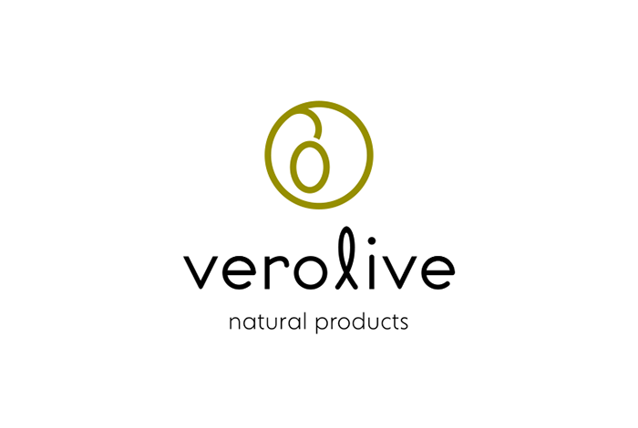
The company used to have a very busy logo and packaging design confusing customers with too much copy and information. So the new logo kept the olive symbol of the original logo as a reference to the company’s tradition, yet the olive fruit is minimally designed, not including too many elements, to underline the concept of cleanliness. We chose an in between modern and old style typeface, because after all Verolive has been in business for many years already.
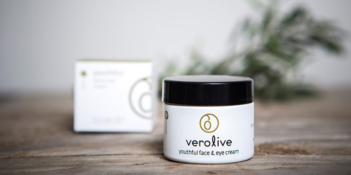
The packaging design had to be consistent with the minimal logo design, so the logo and all information were set against a white “clean” background. Our aim was to organize the flow and pace of the package text and imagery as opposed to previous packaging. Therefore, now Verolive’s logo and packaging design is representative of the products’ quality creating a consumer experience at the shelves of spas and organic shops in Greece and abroad.
Designed by: S & Team, Greece.

Featured on Package Inspiration