
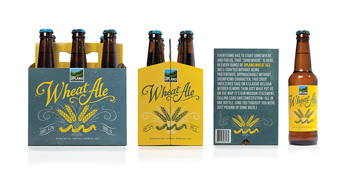
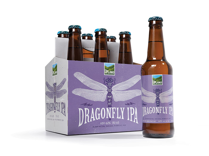
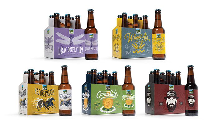
Since their inception, Upland Brewing Company has won countless fan across the Midwest with a collection of traditional, well-crafted beers such as Upland Wheat Ale and Dragonfly IPA. Just as important for the company, it’s embodied the progressive spirit of Bloomington, the college town it calls home. Living sustainably, supporting local musicians and artist, locally sourcing ingredients—all of these are vital parts of Upland DNA.
Recently though, it became increasingly clear that Upland’s packaging and identity needed to evolve…
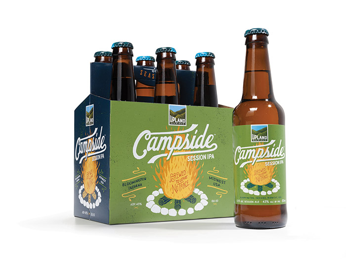
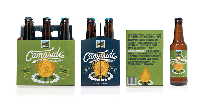
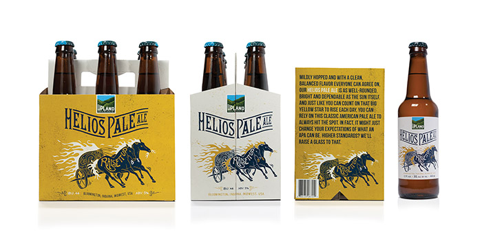
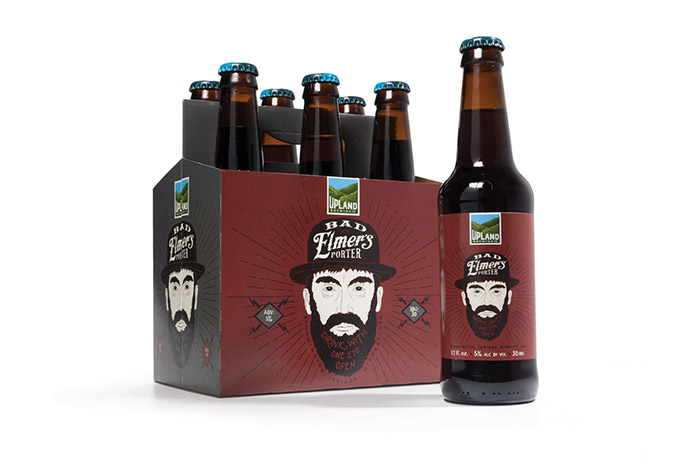
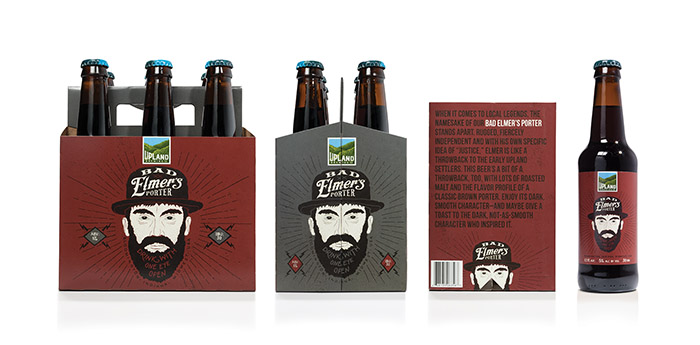
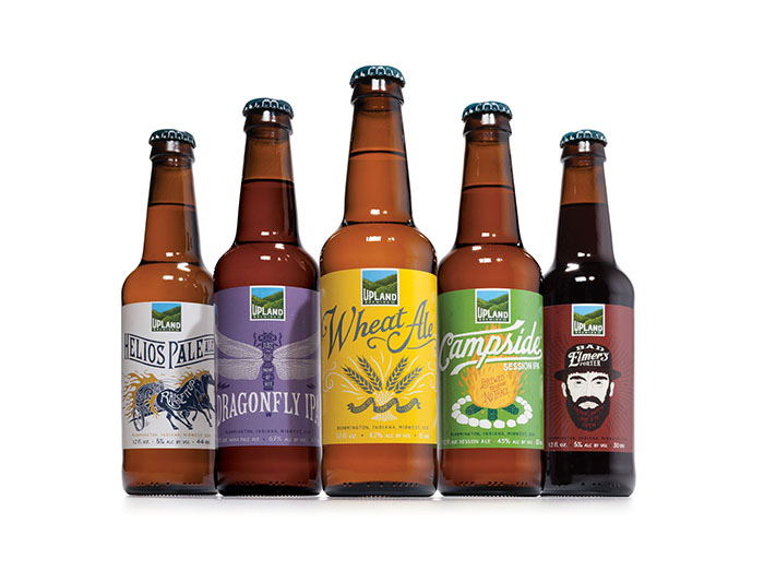
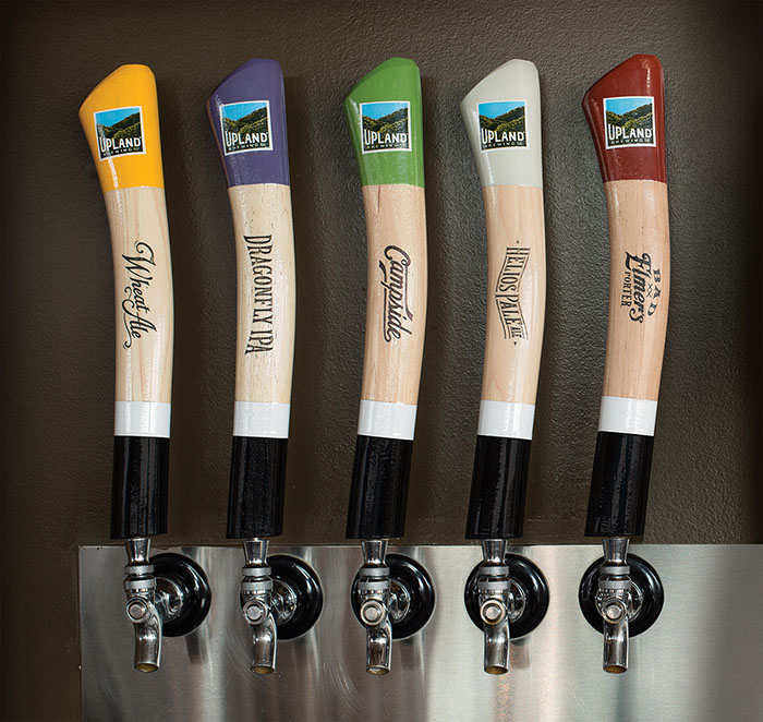
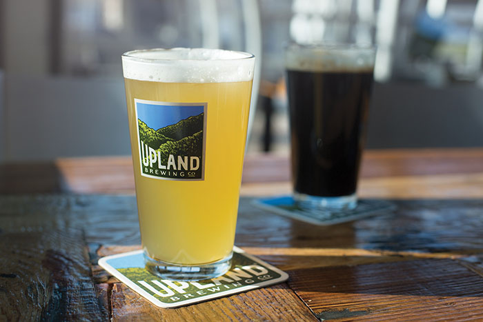
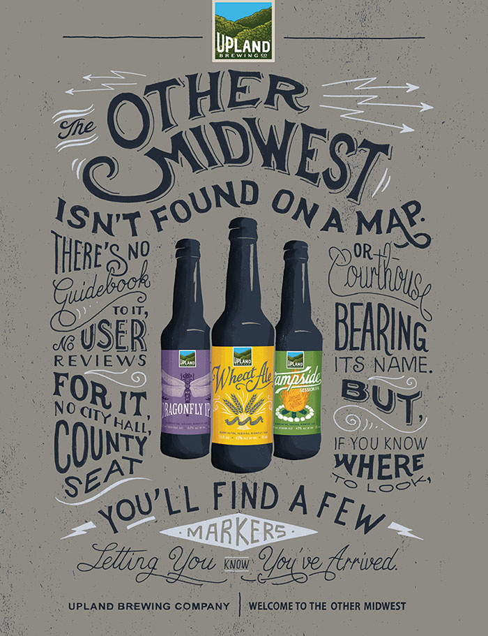
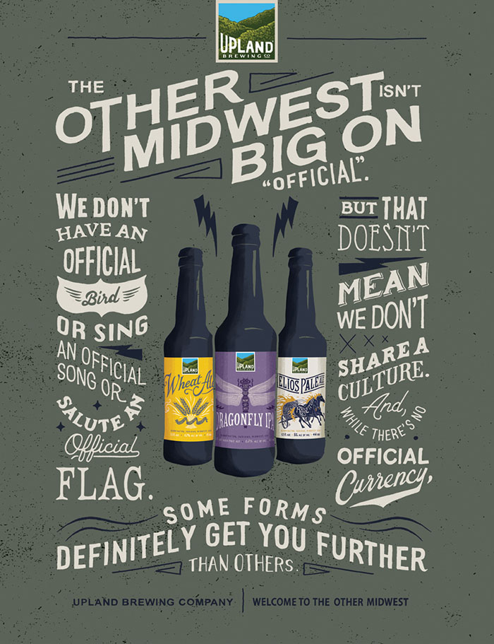
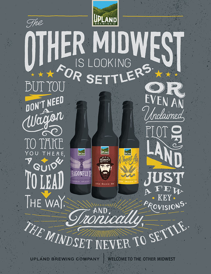
So what did that evolution look like? New packaging and a new identity for a venerable Indiana craft beer—an exhaustive rebranding, beginning with a new logo and branching out to include new packaging for eight of Upland’s most popular beers (with more likely to follow), as well as new signage, marketing materials, collateral and even tap handles.
The goal of the new look was simple: to capture the quality, culture and spirit that make us—and our community—unique. The hand-crafted nature of the beer is reflected in the extensive use of hand-lettered type and illustrations, whether in the distinctive hills logo (illustrated by Colorado artist The Bungaloo), or in the packaging and related materials (done by France’s BMD Design).
Designed by: Young & Laramore, USA.
Executive Creative Director: Carolyn Hadlock
Creative Directors: Bryan Judkins / Trevor Williams
Art Director: Zac Neulieb
Senior Writer: Scott King
Illustrator: BMD
Design Illustrator: The Bungaloo!
Photographer: Gary Sparks







Featured on Package Inspiration