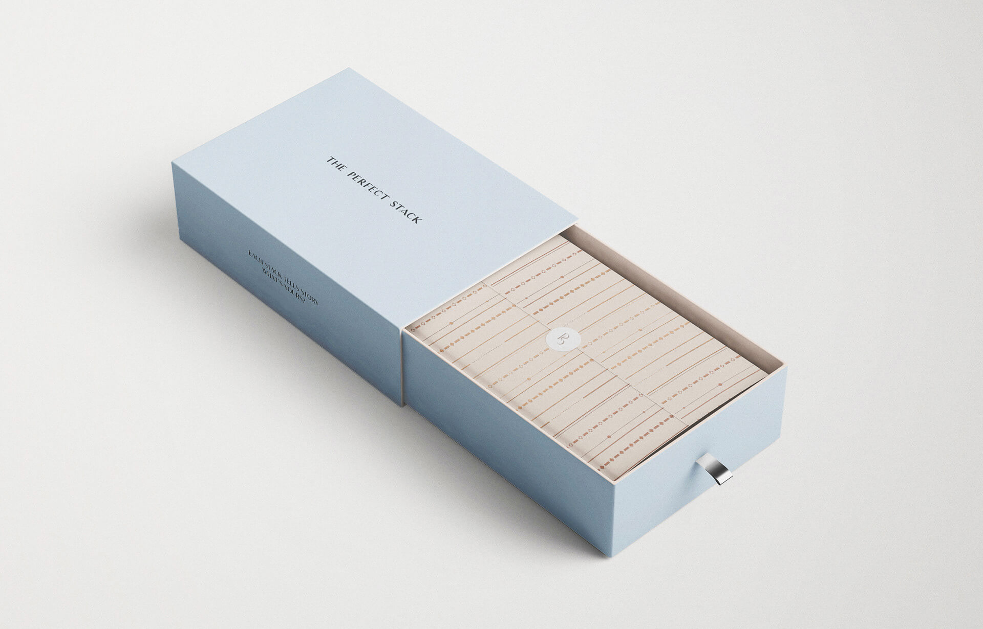
The Challenge:
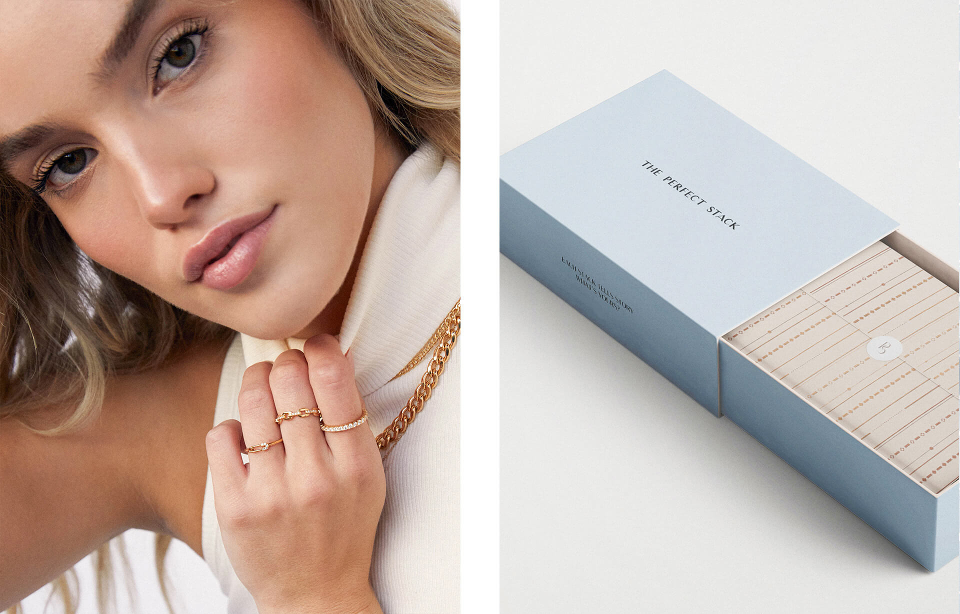
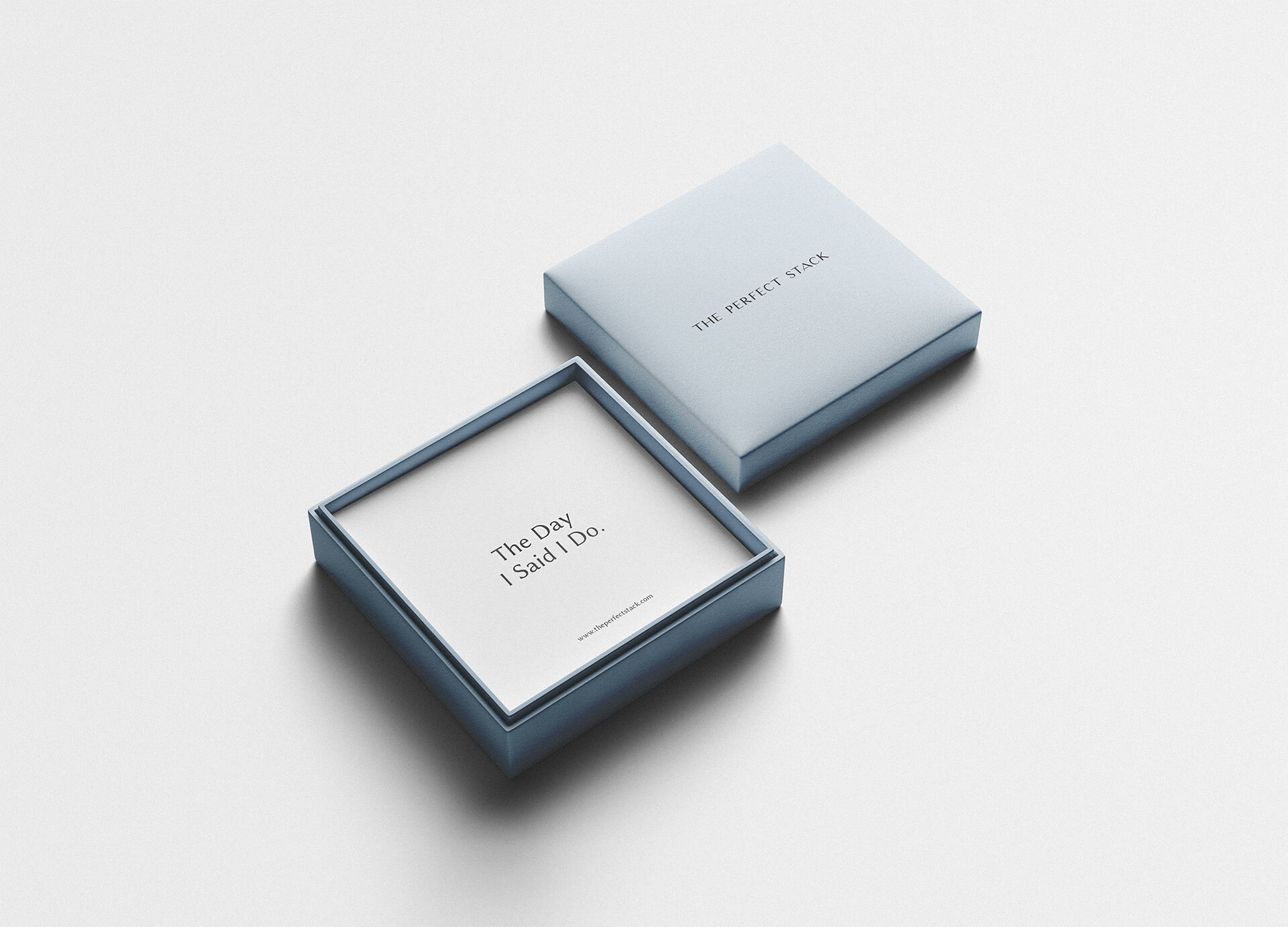
The Perfect Stack wanted to put the accent on a variety of rings and bracelets combinations you can create in their store. Each product has its own story: one ring is for “The Day I Said Yes”, another one is for “The Day I Said I Do”, or “Christmas Gift For Myself”. Each product can say different things and always will be a special one for every person. It keeps warm memories, it makes you stronger, it is your stack. Your Perfect Stack.
The Solution:
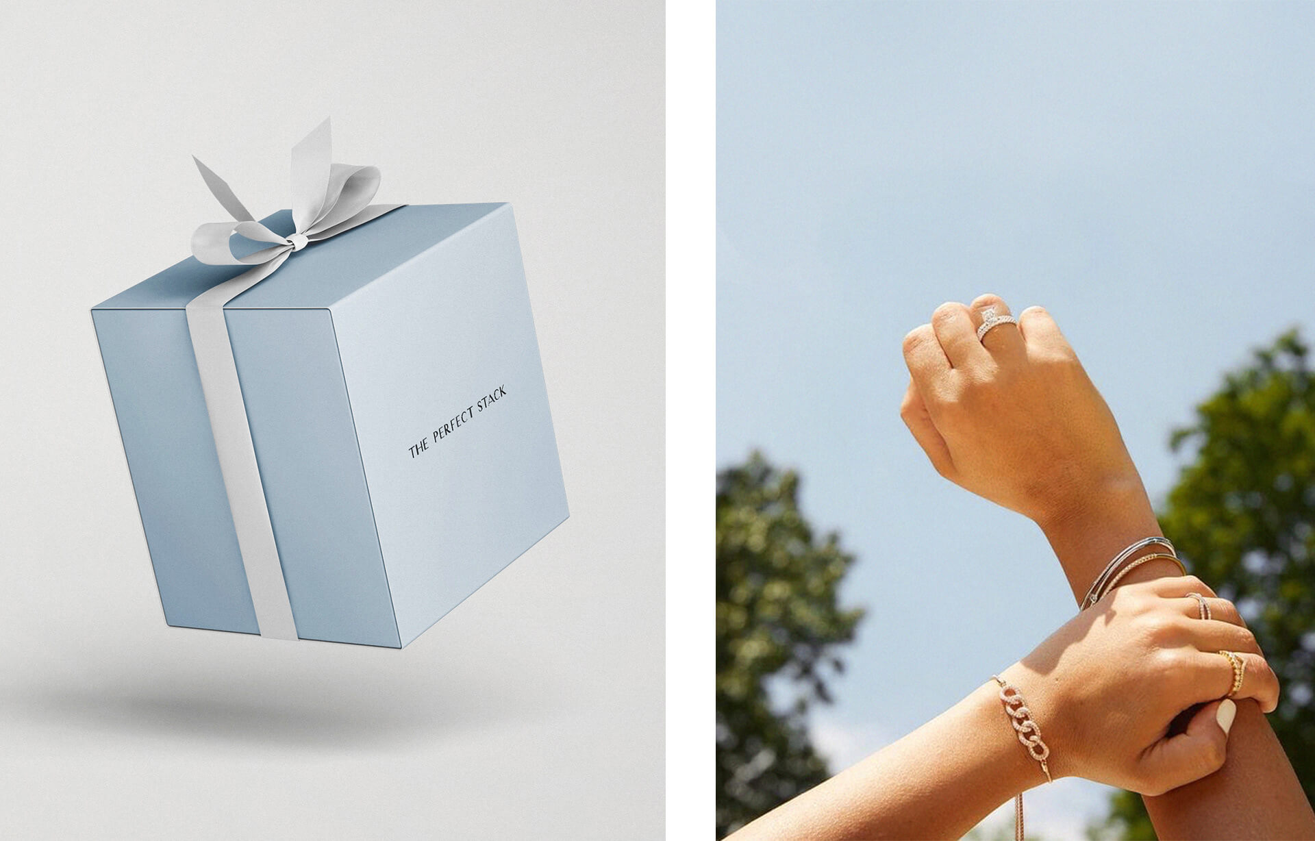
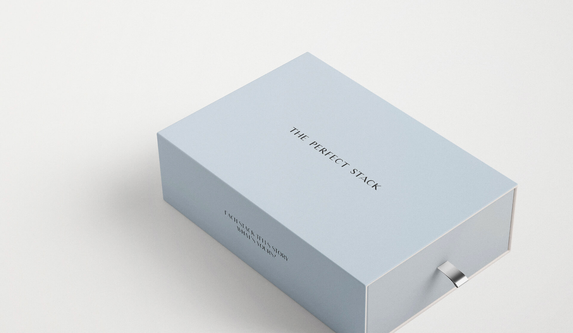
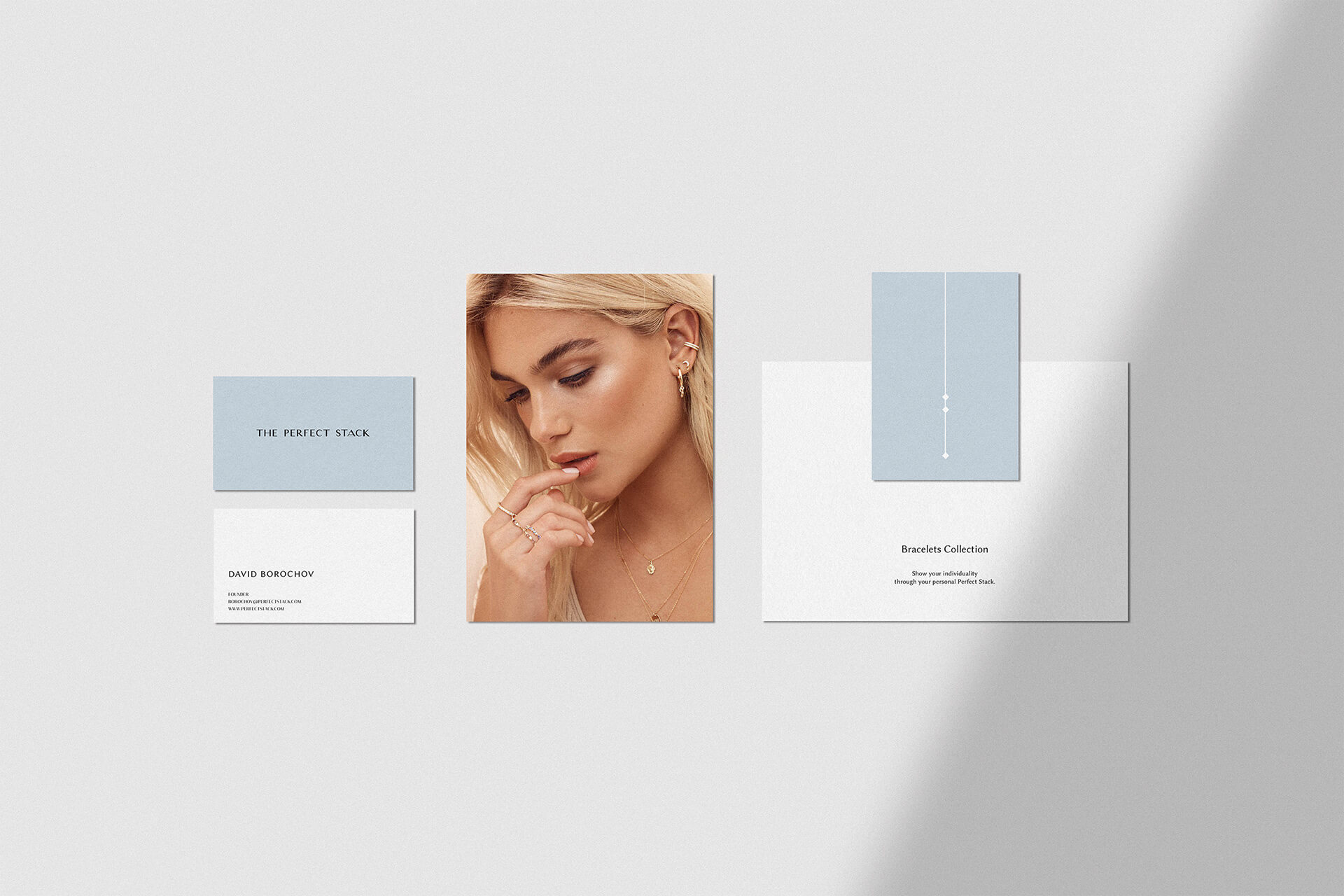
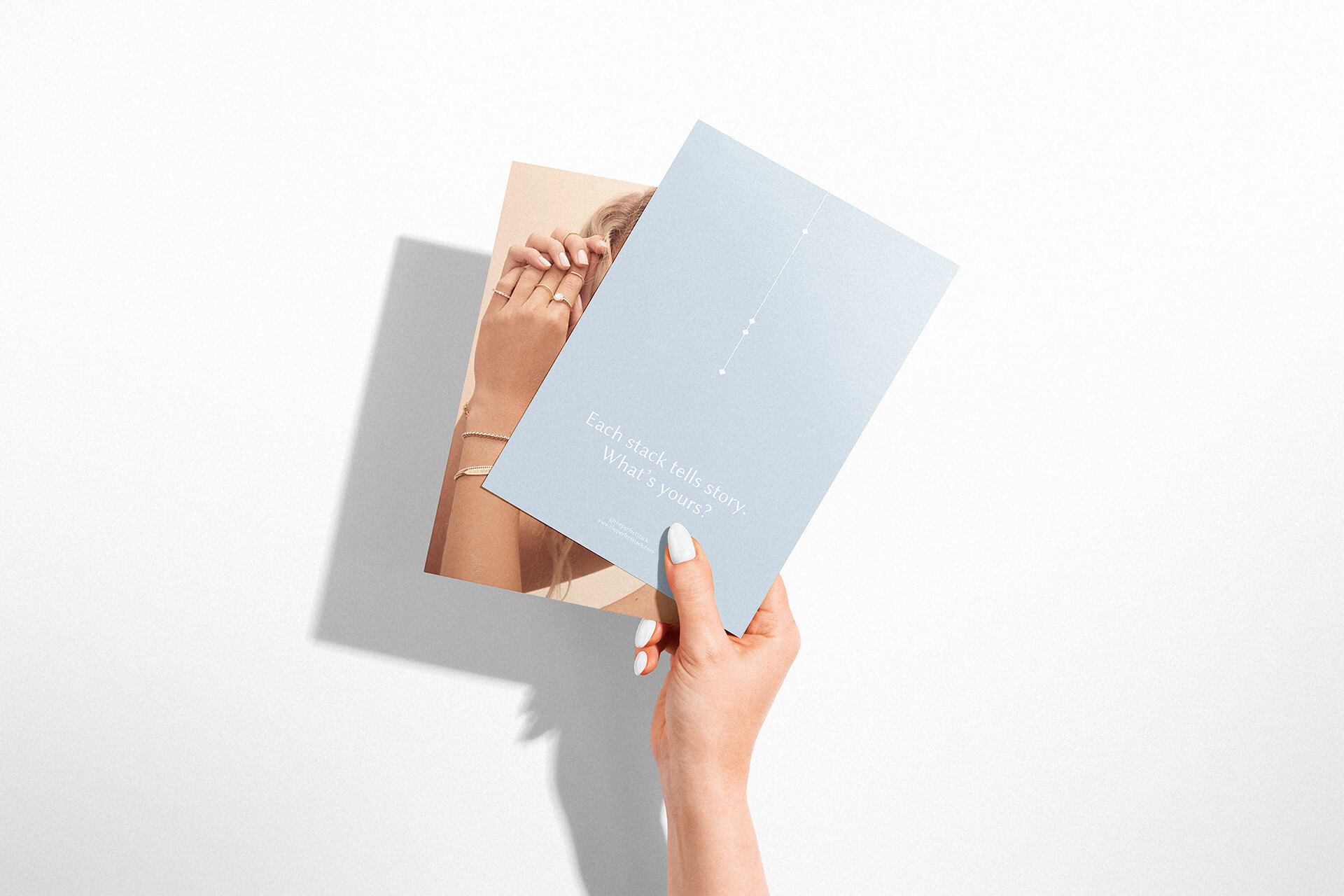
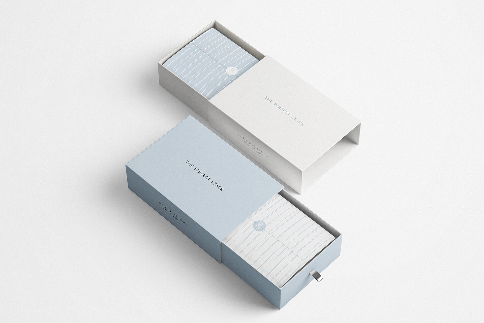
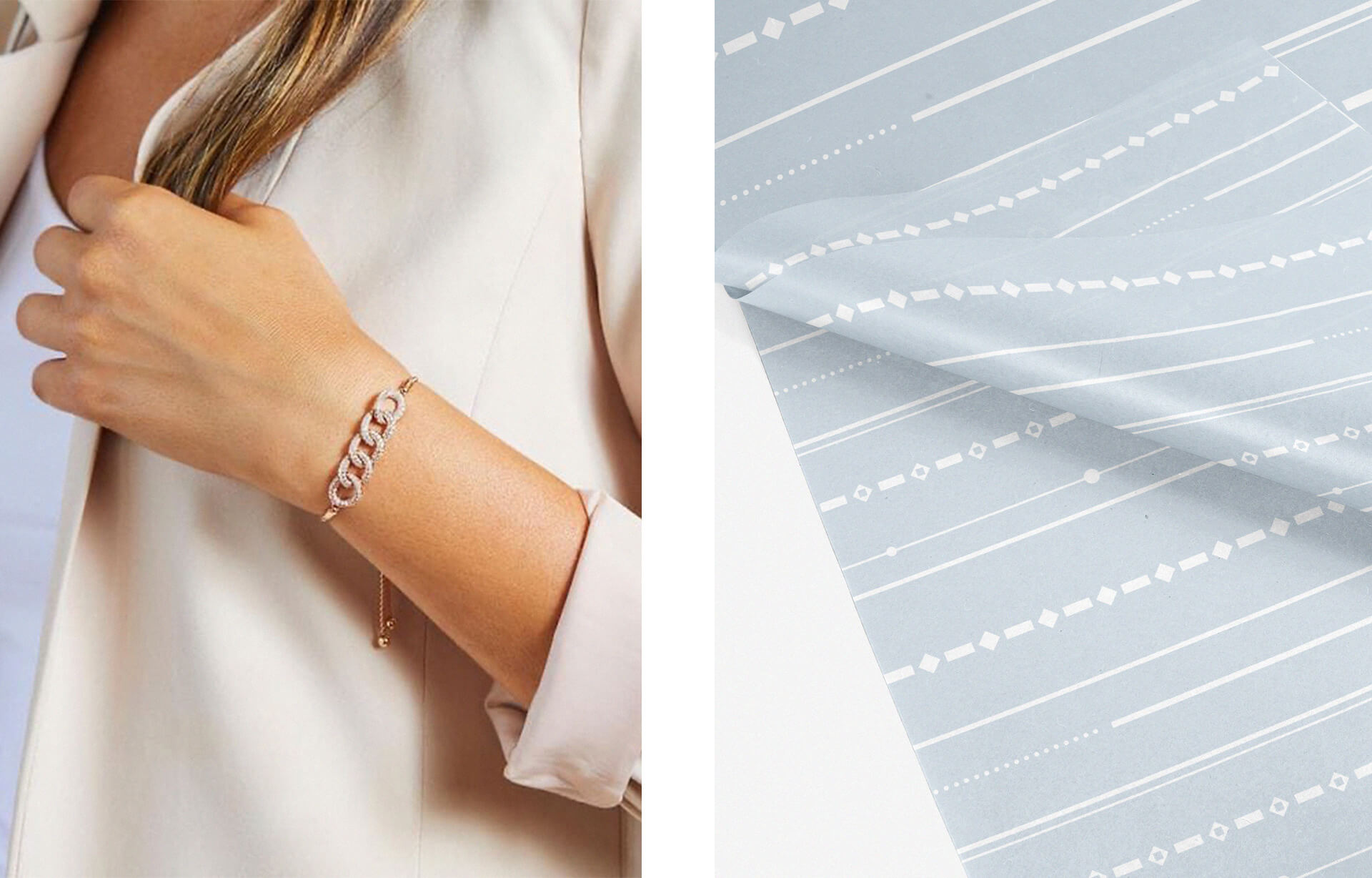
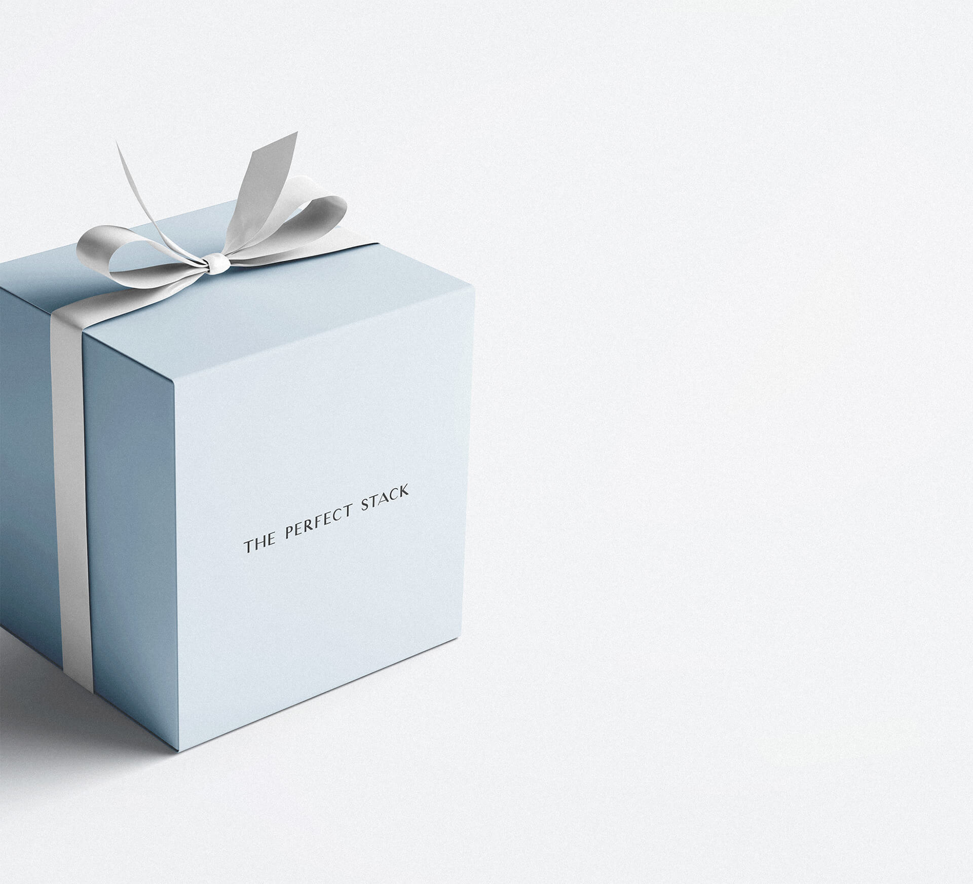
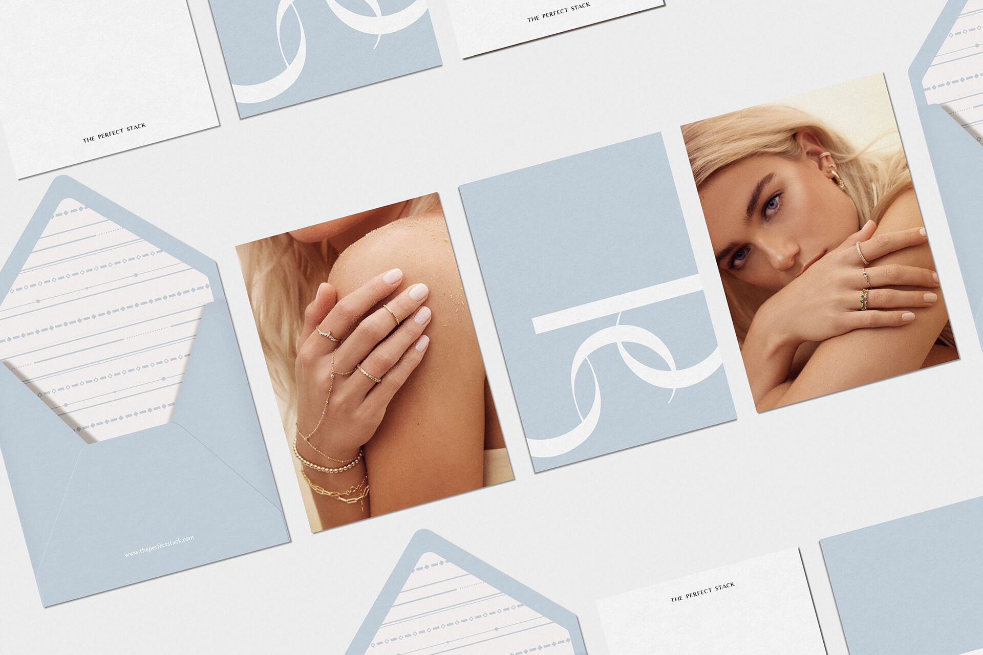
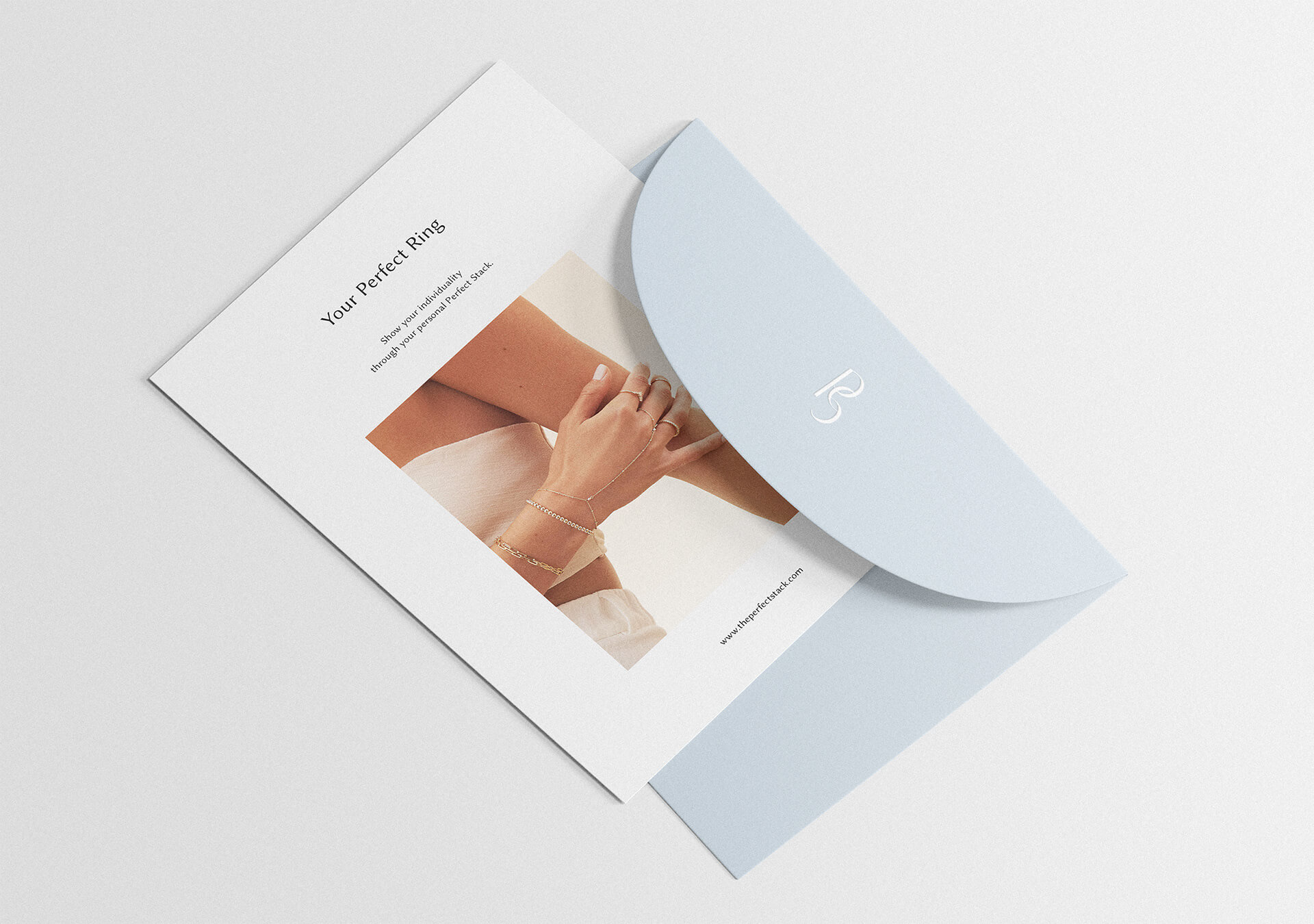
Creative direction focused on infinite combinations you can create with a big variety of Perfect Stack’s products. It ended up in a minimalistic, jewelry-oriented geometrical brand pattern, strong sans serif logo with elegant touch on it & main pale blue brand color. Each piece together creates a sophisticated feeling of the brand and translates a variety of perfect collections you may own.
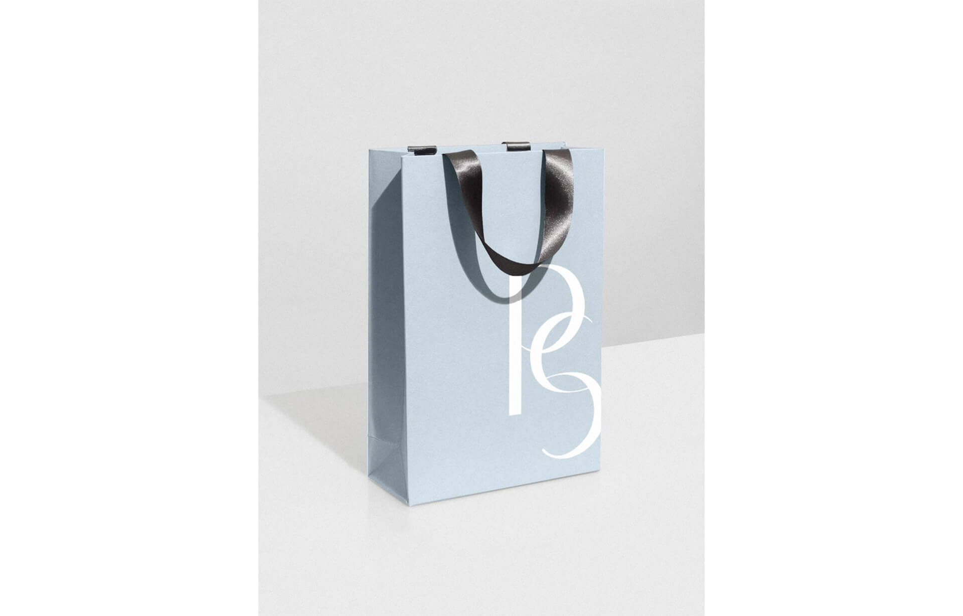
Logo system consists of primary logotype and submark. Submark translates the associations of products that the brand sells. Letter “C” from the main logotype represents ring, earing, and bracelets and create a chain of jewelry. Brand submark works as an additional graphic element and can be used on a variety of products. Brand color palette translates gentle elegance through heaven-inspired blue hue.


 accessories


