Designed by: Double D Creative / Lilly Parr (Graphic Designer) & Tom Dent (Art Direction), UK.
Title: The King’s Deli – Packaging Project
Sub Heading: Crisps fit for a King!
The Brief
Create an original brand of crisps with a distinctly British feel to appeal to the export market.
The Client
Smylies is a family run business who specialise in the consolidation and export of British food and drink. This idea was born following requests from their clients for a superior, quality tasting crisp with a long enough shelf life for the export market due to long-distance shipping.
—–
Name Generation
The first part of the project was name-generation for the brand. With an initial brief of ‘Quintessentially British’ we had an excellent starting point which threw up plenty of ideas. After consolidating our initial thoughts, we focused on three primary themes: An old market, farmhouse or country style kitchen theme e.g. ‘The Market Kitchen Crisp Co’; A traditional British sounding name as a face for the brand e.g. ‘Tommy George’s Crisp Co’; or something regal, royal and classy e.g. ‘The King’s Crisps Co’.
—–
The Brand Name
After much consideration Smylies decided to go down the ‘Regal and Royal’ route and following further development and discussions there was a unanimous decision – ‘The King’s Deli’. The target export markets would find the name easy to pronounce, it had a distinct ‘Britishness’ to it and was also futureproofed in the eventuality Smylies wanted to expand the range.
—–
Pack Concepts & Development
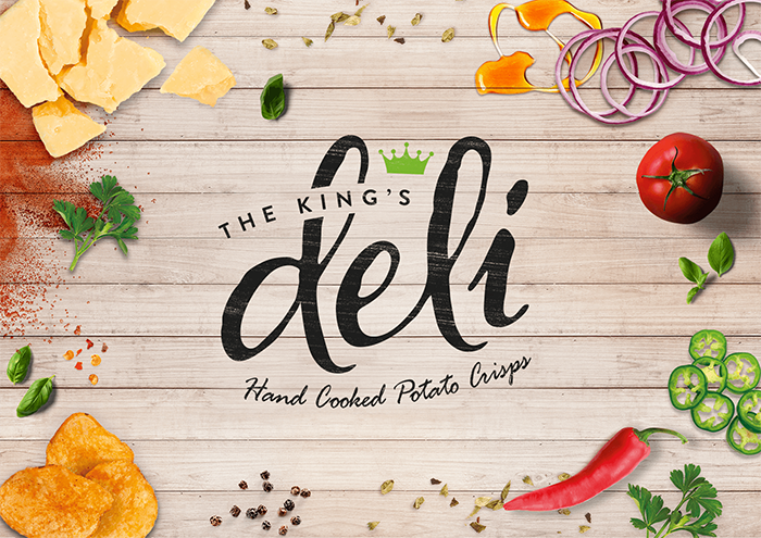
We explored various designs and layouts for the pack design. One of Smylies’ main wishes was to include bold and easily recognisable images of the ingredients on the pack. This served the dual-purpose of making the flavour of crisps obvious to a customer who can’t read English (essential in the export market) and being visually striking on-shelf.
—–
The Final Packaging
A simple white background featuring top down images contrasting with vibrant, flavour-specific colours was agreed upon for the final packaging. We also took the time to photograph each flavour of crisp to give the customer an accurate depiction on the pack. What you see is what you get.
—–
Website & Promo
As well as the initial branding and packaging we have since worked on various promotional materials including brochures, trade stands, pullups and social media graphics, further expanding ‘The King’s Deli’ brand. Most recently we finished designing and building The King’s Deli website – thekingsdeli.com

Featured on Package Inspiration