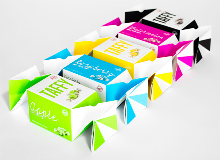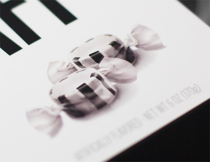
Seven years after I helped design the first Taffy Twist box for Sweet’s Candy Company they came back for a refresh—or more like a complete overhaul. The ask was to update the Twist line to have a more contemporary look where color would play a much larger role. Sweet’s wanted something that would not only demand attention on retail shelves, but also work well with the gift basket industry, which often times compiles products based on packaging and color. With such a unique dieline, we decided to let the facets of the box play a large part in defining the colored panels. With three primary display panels, retailers can stack the boxes to create a striking presentation. Props to the client. How cool is it when a candy maker asks you to develop packaging around color to which they will match the product?
Designed by: Peder Singleton, Salt Lake City, UT, USA.


Featured on Package Inspiration