
Supersense
See, hear, taste, smell, feel – Supersense stays true to its name. In mid-2014 Florian Kaps opened a concept store in central Vienna, appealing to all five senses and moving skillfully between analog and digital.
For Supersense we developed a corporate design principle, packaging, manual and a microsite.
Corporate Design
Concept, Corporate Design, Type Design
The Supersense logo is a certificate as well as a sign of quality. To emphasize the haptic experience in its written and visual identity the logo is applied by hand, stamped, punched, riveted, embossed, glued, branded or sprayed.
Product Packaging
Packaging Design
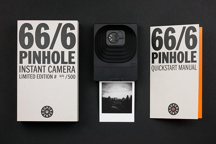
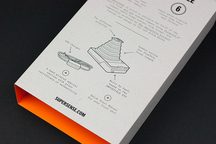
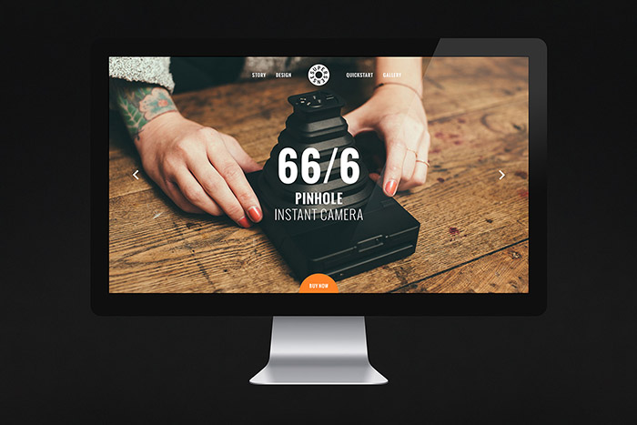
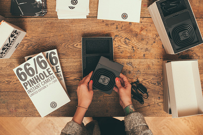
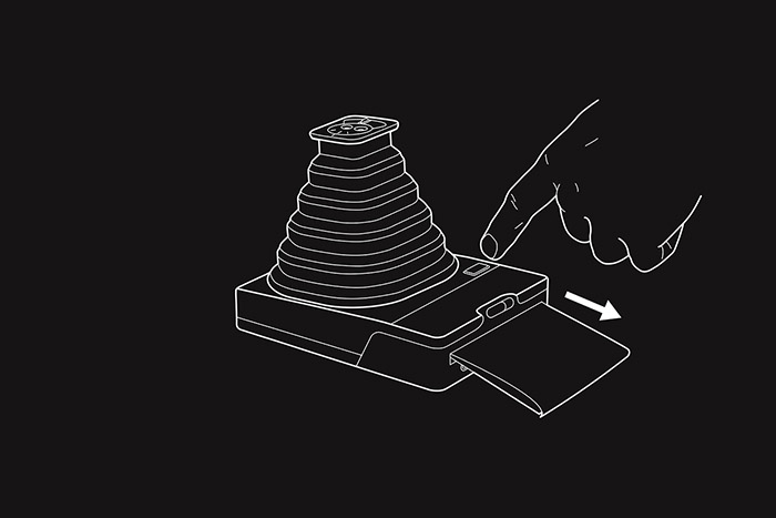
The first instant pinhole camera, designed by our founder Achim Heine, was produced in a limited edition of 500. We designed packaging, manual and a microsite.
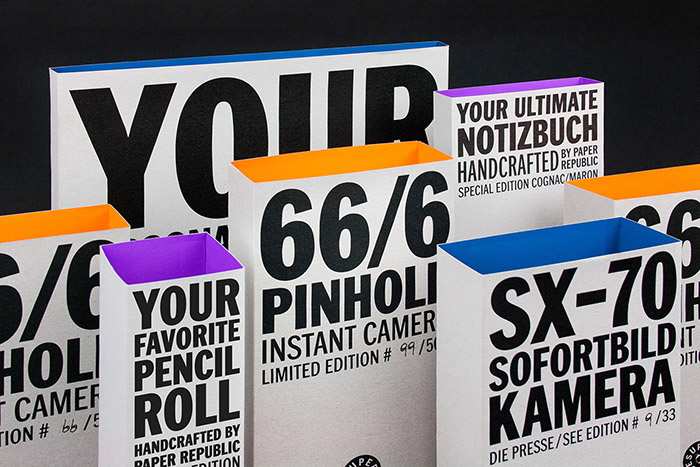
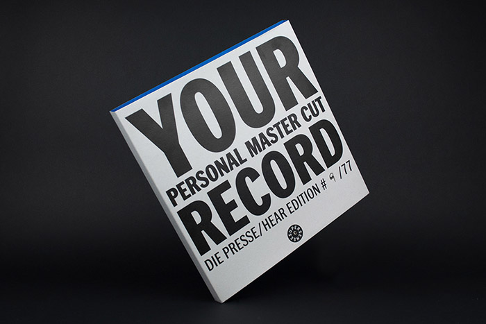
Supersense products are packaged in handmade boxes of solid cardboard, the Supersense logo is equipped with a rivet. The typography on the sleeves cites analog, manually set, typographic letterpress posters.
Microsite
Web Design
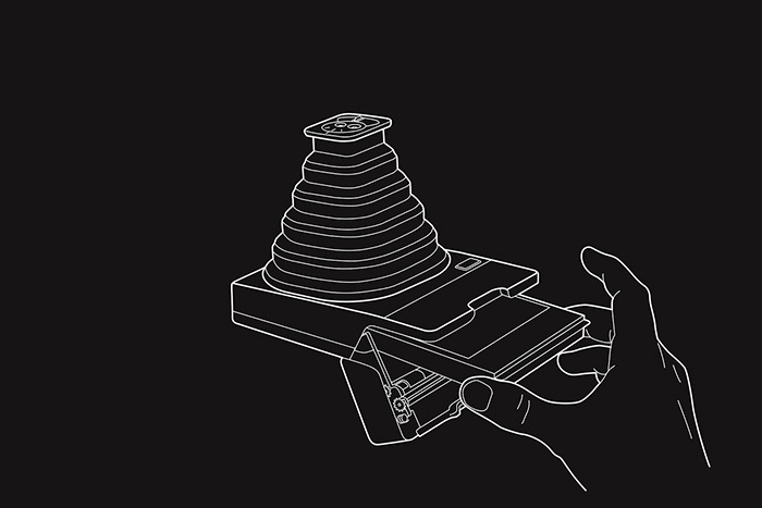
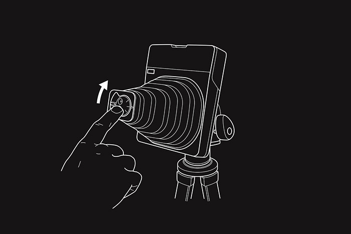
In addition to the packaging for the pinhole Instant Camera, we developed a microsite that does not only build up interest for the camera, but also illustrates how it works and provides support with the first photos.
Designed by: Heine/Lenz/Zizka, Germany.









Featured on Package Inspiration