Designed by: CRITICAL Design Agency, Lithuania.
Limited edition label design for Stumbras Vodka
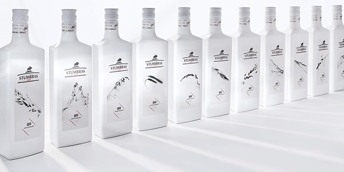
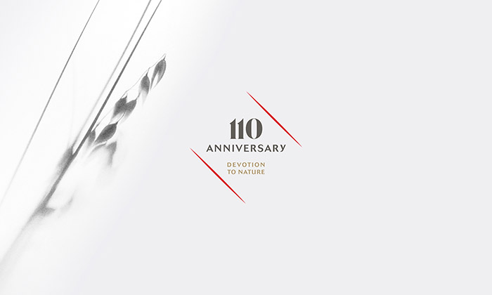
110 years – 110 unique distinctive labels.
The most important aspect of „Stumbras vodka“ label design is interconnection with the nature and the foster of traditions and mastership.
To consolidate this each bottle design has been carefully crafted with fragmented imprints of light herbal arrangements. A special photography technique captures the play of light and shadows within the compositions creating a sun-bleached effect. Delicate details are turned into red and gold foil to reveal itself in the monochrome label.
Custom made white gloss sleeve represents the purity and the soft taste of „Stumbras Vodka“. The dominance of white colour in the packaging has a symbolic meaning and marks significant occasions and celebrations of a year. As a result – white bottle has greater shelf impact without being provocative.


Featured on Package Inspiration