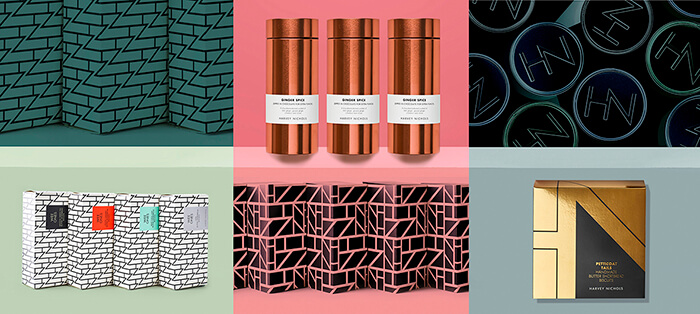
The new own-label look brings the zeitgeist of fashion back to food, with a collection that captures the stylish, irreverent and unique Britishness of luxury department store Harvey Nichols.
Using the language of fashion
Harvey Nichols’ own-label food packaging, famous for its iconic black and white photography, launched in 1994 and has stood untouched until now.
Smith&+Village reassessed the desires of the store’s uber-stylish consumers and delivered a collection as inspired and led by fashion as the London store itself, reinventing the food offering by putting the language of fashion at the heart of this daring rebrand.
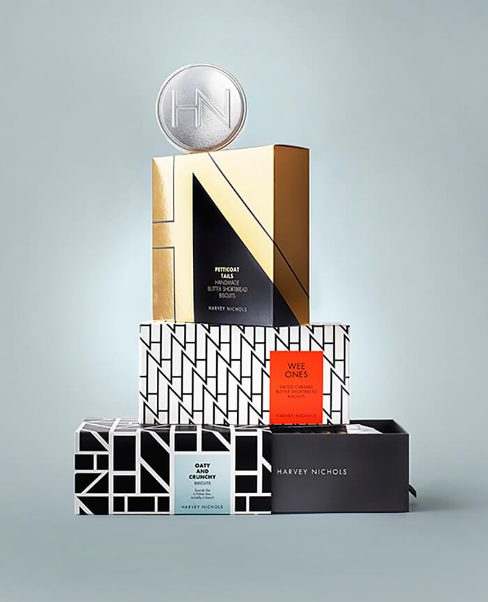
Each individual range, from tea to biscuits, is given its own identity, but like a fashion collection, it is built up with lots of different elements, so that everything works together but does not look the same. The collection is unified by a strong tone of voice, luxury materials and a collection of newly crafted graphic patterns incorporating the Harvey Nichols ‘HN’ monogram. The success of the first range is evident with the patterns already appearing as touchpoints in other parts of the store.
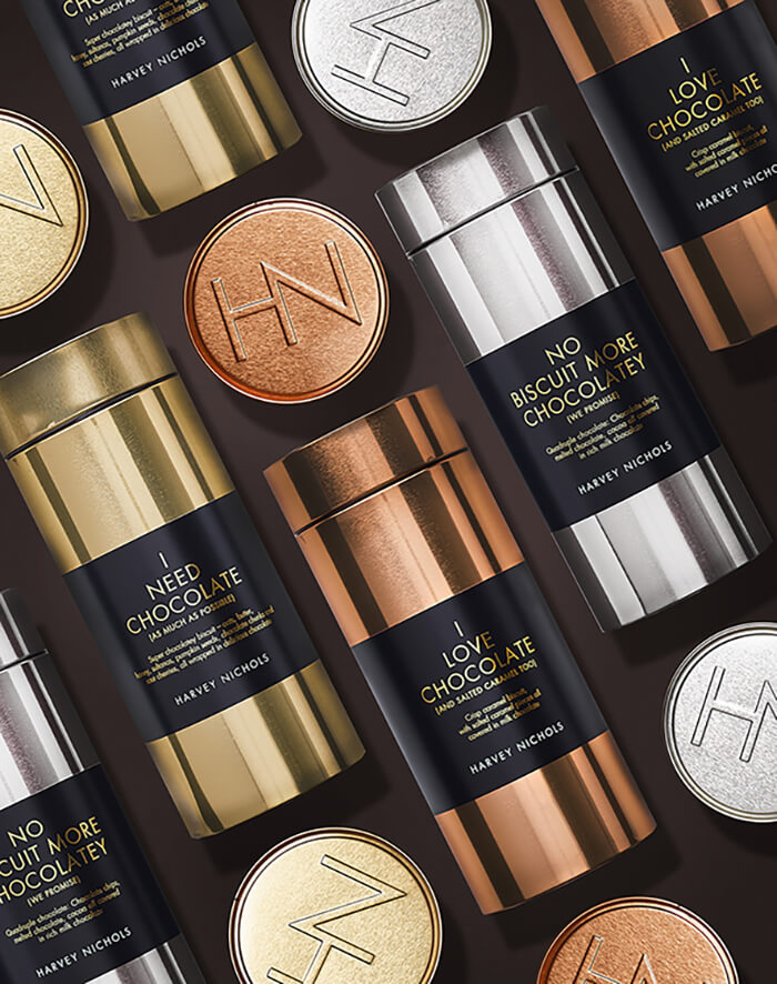
The fearless attitude and razor sharp wit of Harvey Nichols is communicated in a tongue-in-cheek naming strategy for the food products, incorporating playful and mischievous one-liners such as ‘Short and Ginger (But I Still Love You)’ for ginger shortbread and ‘Must-have Bags’ for teabags.
Capture the zeitgeist; break the mould
Richard Village, Director, Smith&+Village, says: “The original identity for the Harvey Nichols food collection captured the Ab Fab glamour of the 1990s. The new high-fashion identity is absolutely right for today’s super-stylish, highly visual, fashion-forward foodie consumer who wants to have fun when shopping the collection.”
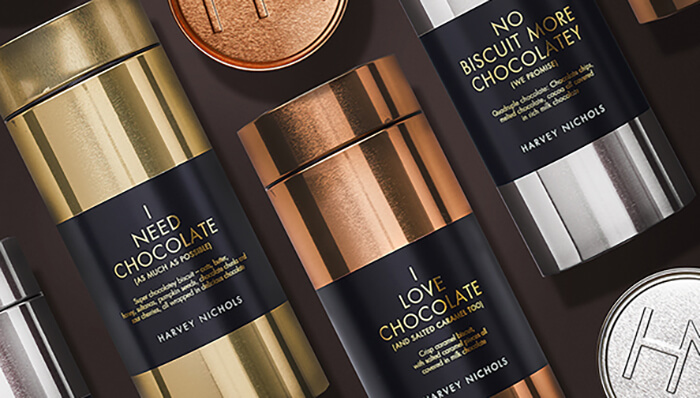
Debrah Smith, Creative Director, Smith&+Villages adds: “The design of the physical packaging has been extremely important in this project. For a start, none of it is throw-away, so the Harvey Nics brand lives on in people’s kitchens long after the product is finished. Secondly, it is led and inspired by fashion to delight the target audience – pull-out biscuit packaging that is closer to a sunglasses case than a pack of biscuits; airtight tins to keep biscuits fresh for longer with colours inspired by lipstick shades and shiny, elegant refillable tea tins.”
Shirley Aubrey, Food Development Manager, Harvey Nichols, says: “In reimagining our much-loved food collection, Smith&+Village has delivered an inspirational concept that connects with our consumers on many levels. It’s inspirational, agile and outstandingly relevant, with a finish that encourages the consumer – or gift recipient – to keep each piece of packaging and reuse and rediscover it time and time again.”
Smith&+Village will be bringing the new look to seasonal variations across the fashion year, with the launch of a Christmas range shortly. The new strategy ensures that the food collection stays relevant, stylish and desirable.

