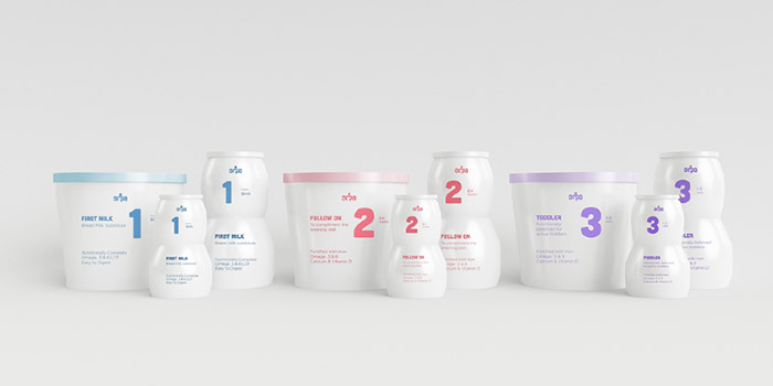
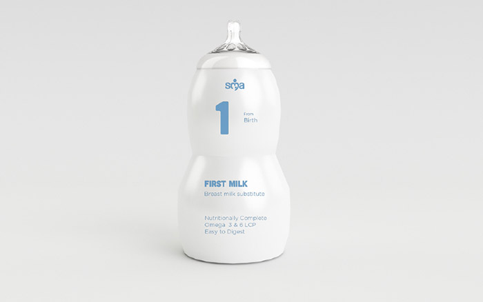
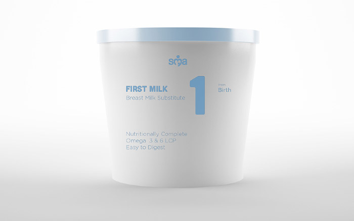
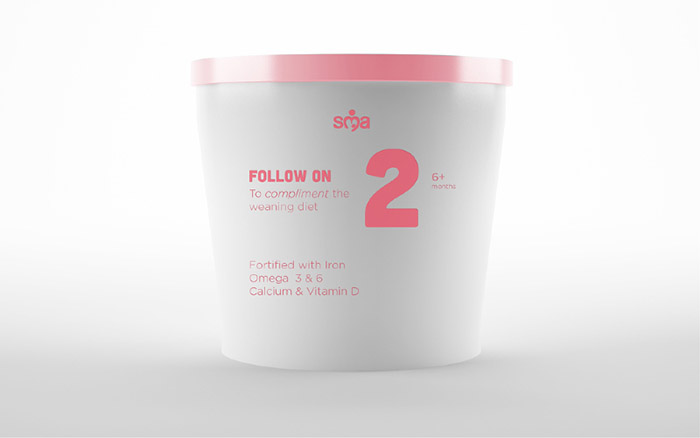
Recreating a design with structure, hiarchy, and overall a better informational system, Michael James Phillips designed SMA Infant Nutrition with a strong strategy to create a package that was simplified, and more appropriate for the market.
“The SMA infant nutrition brand had become very confused and overcomplicated. SMA was previously the market leader but lost out to the superior voice of their competitors. The category language is also questionable, which I saw as an opportunity to redefine.
My strategy is to reposition the SMA brand in order to create a lasting brand image of focused and sincere information (in accordance with current and proposed regulations). I aimed to reinterpret the category language and create packaging and aesthetic that I believe is more appropriate to the market.
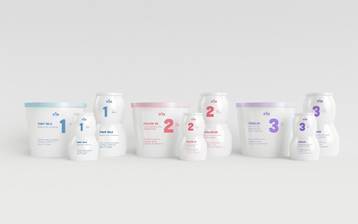
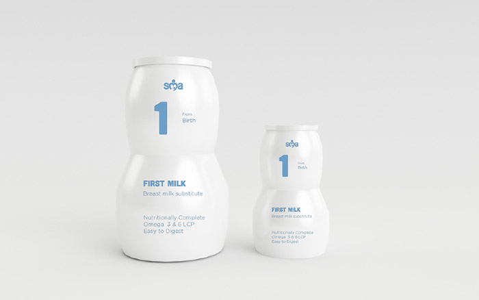
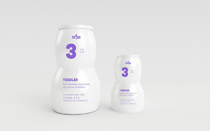
I have used the ‘123’ system to differentiate between the different age appropriate formulas, this was previously only applied to the ‘first milk’, ‘follow on’ and ‘toddler’.
The hierarchy on the packaging has been adjusted to move focus from the logo to the product information. This more discreet use of the logo would also be carried through to the corporate identity for use by SMA representatives talking to midwives: which is an important point of contact.”
Designed by: Michael James Phillips, Netherlands, Amsterdam.



Featured on Package Inspiration