Background:
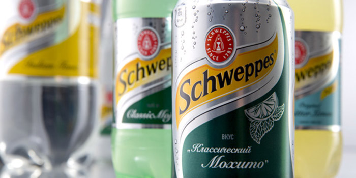
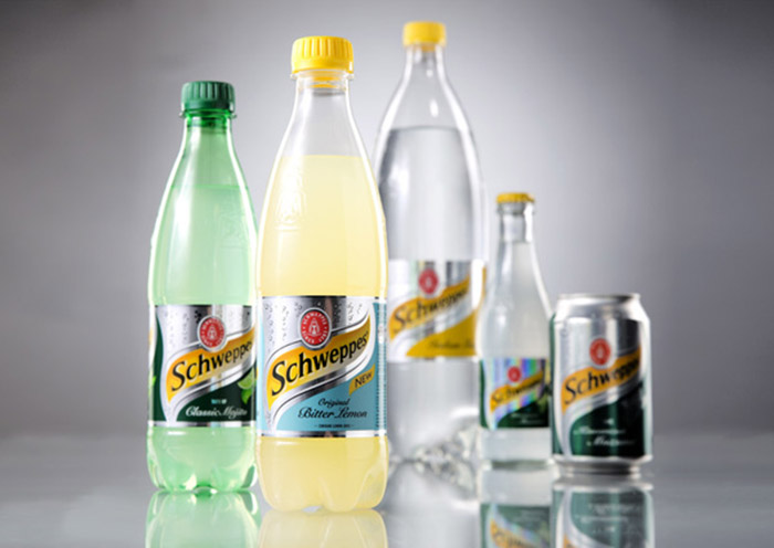
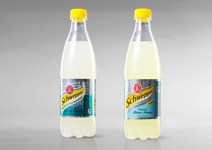
Packaging redesign connected with brand re-launch, which aims to increase knowledge and consumption of Schweppes by adults. In Russia Schweppes is popular and chosen for its unique complex flavor with a touch of bitternes, that meet the requirements of the demanding adult consumers – Bitter Lemon, Indian Tonic, Classic Mojito. New Schweppes design should retain the authenticity of the brand and remain recognizable and emphasize the premium and exquisite image. At the same time, the new design should attract the customer’s attention to the updated Schweppes (improved Bitter Lemon and the new taste of Classic Mojito) and demonstrate a variety of flavors on the shelf.
Challenge:
To update the label, to emphasize the premiumness of elegant brand image, to distinguish it on the shelf, to differentiate tastes.
Solution:
DDVB experts modified the label and cleaned it of small details , focused on refreshing , adding bubbles in packaging design, modernized packaging by means of print – effects (matte, spot varnishing ), developed the principle of tastes differentiation.
Designed by: DDVB, Russia.


Featured on Package Inspiration