Designed by: Brandon
Leading British food manufacturer Samworth Brothers is launching a ground-breaking range of ready meals to appeal to everyday athletes, with brand identity and packaging by design consultancy Brandon.
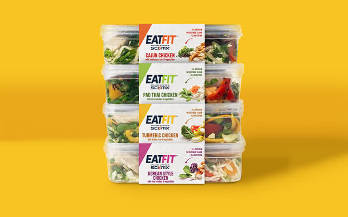
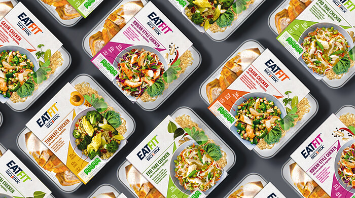
Responding to an increasing consumer demand for healthier convenience options, the meals, which come in three variants – Cajun Chicken, Turmeric Chicken and Pad Thai Chicken – are high in protein, with clean ingredients and green traffic lights indicating low fat, sugar and salt.
Samworth Brothers, which makes chilled foods for supermarkets including Tesco and owns sports-supplement company SCI-MX, asked Brandon to design a brand and communications strategy that would unite the culinary and fitness sectors.
Fusing two worlds
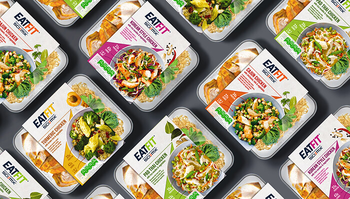
Brandon responded by creating a whole new design language that fuses appetising ready-meal branding with the informative sports-nutrition language that you find on supplement bars and drinks.
The name EatFit was chosen at it’s easy to understand in those crucial decision-making seconds at shelf or while scrolling online. And in a nod to accepted cues from the sports sector, the logomark appears in capitalised ‘go-faster’ italics, with ‘Intelligent nutrition by SCI-MX’ underneath to highlight that the products are being delivered in collaboration with a trusted sports-nutrition brand.
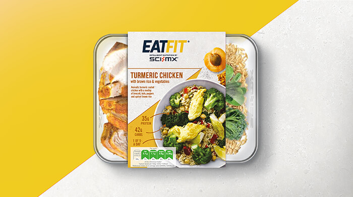
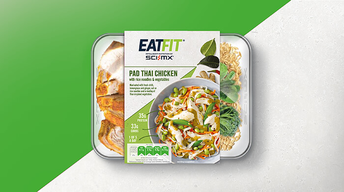
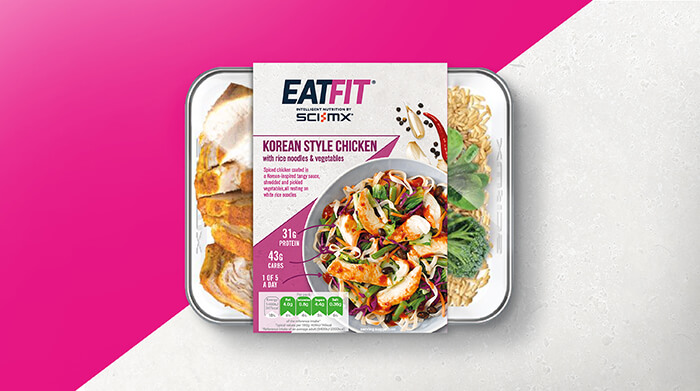
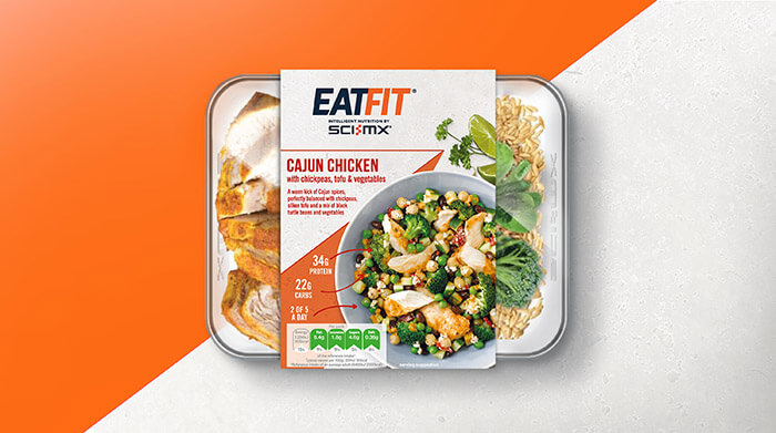
It was important to celebrate the products’ culinary appeal, too, so stand-out colourways representing key ingredients have been highlighted on pack as ‘arrowheads’, which also provide backdrops to the main images and reinforce the healthy, sporty messaging. Appetite appeal was further enhanced with beautiful overhead shots of plated meals, tapping into established cues from the ready-meal sector.
Decoding for consumers
One of Brandon’s key tasks was to simplify the complex messaging so that it could be decoded quickly by consumers. The design team devised a clear visual hierarchy that sets out the culinary and scientific messaging succinctly.
To that end, product names have been kept simple and familiar. Nutritional claims have been limited to three in number – high in protein, clean ingredients, all green traffic lights – and are clearly displayed alongside the appealing imagery. Information about specific ingredients is visually linked to the photography with arrows, pointing to the fact that the products are healthy, hearty and delicious.
The perfect combination
Simon Ellis, Client Services Director at Brandon says: “Our challenge was to make the very different design cues and sector-specific language work together in a way that’s credible and appealing. The brand had to stand out in its own right, with SCI-MX® promoting the fact that it’s a serious brand with weighty nutritional claims, not a faddish challenger.
“We’ve created a new sports nutrition ready meals design language. But we also had to ensure that the scientific information on pack was easy to absorb at speed. It’s an entirely new proposition, and our work will support SCI-MX at it expands the range.”
Steve Rich, Commercial & Marketing Director at SCI-MX Nutrition® says: “Brandon has successfully found a way to combine the visual language of fresh ready meals and sports nutrition, creating an appealing and exciting new brand that fulfils a need for health-conscious, time-poor consumers.”
The range will be available exclusively in Tesco stores nationwide from mid-November, retailing at £4.49 for a single serving.
About Brandon
Brandon is a brand design consultancy that helps established iconic FMCG brands navigate today’s world. Brandon develops brand strategy, innovates and creates design that works to drive growth, making sure brands make a difference in people’s lives and stay relevant.
Follow Brandon at its website, on Instagram, Twitter and LinkedIn

Featured on Package Inspiration