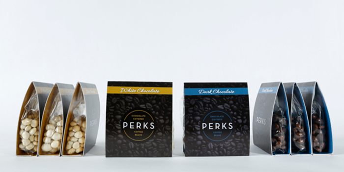
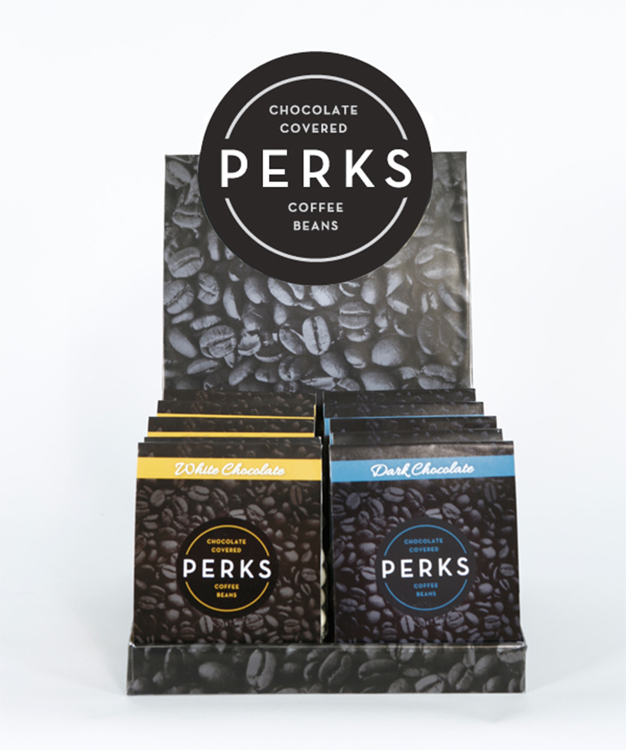
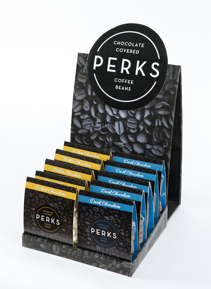
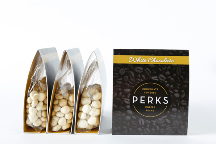
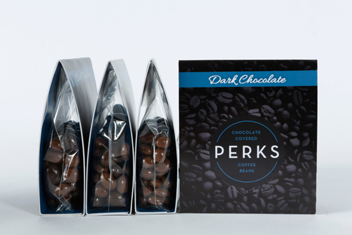
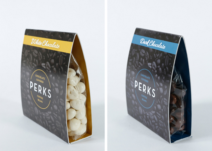
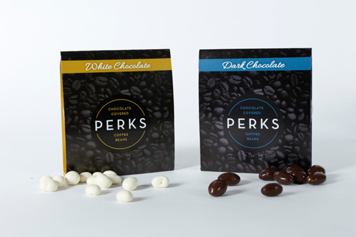
With this project, I wanted to design the packaging for a candy that would appeal to the busy, working professional. I chose to design the package in black and white to give it that sophisticated feel while using an accent of either blue or yellow to differentiate the two flavors that the candy comes in. I also wanted the consumer to be able to see the coffee beans, which is why I constructed a package with open sides. This allowed for the texture of the candy to become a part of the design as well.
Designed by: Taylor Wichrowski, USA.

Featured on Package Inspiration