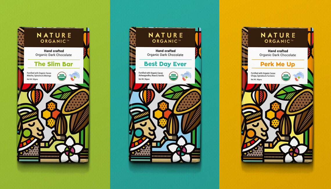
Design by: Mike Karolos
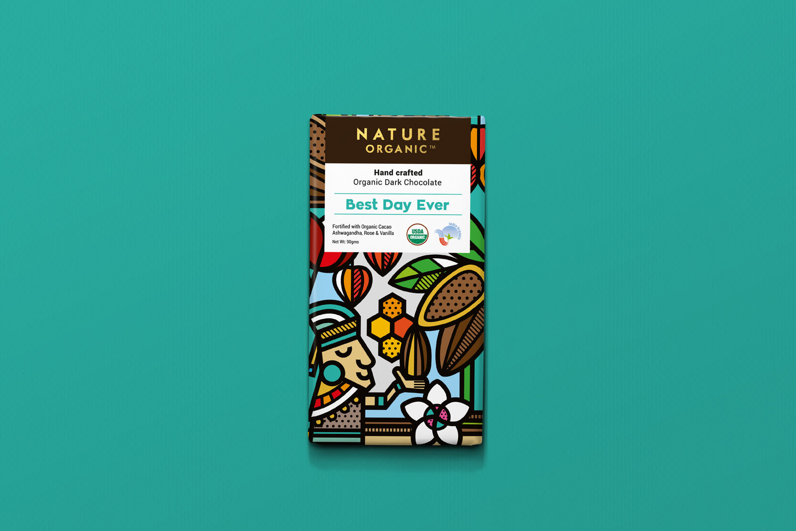
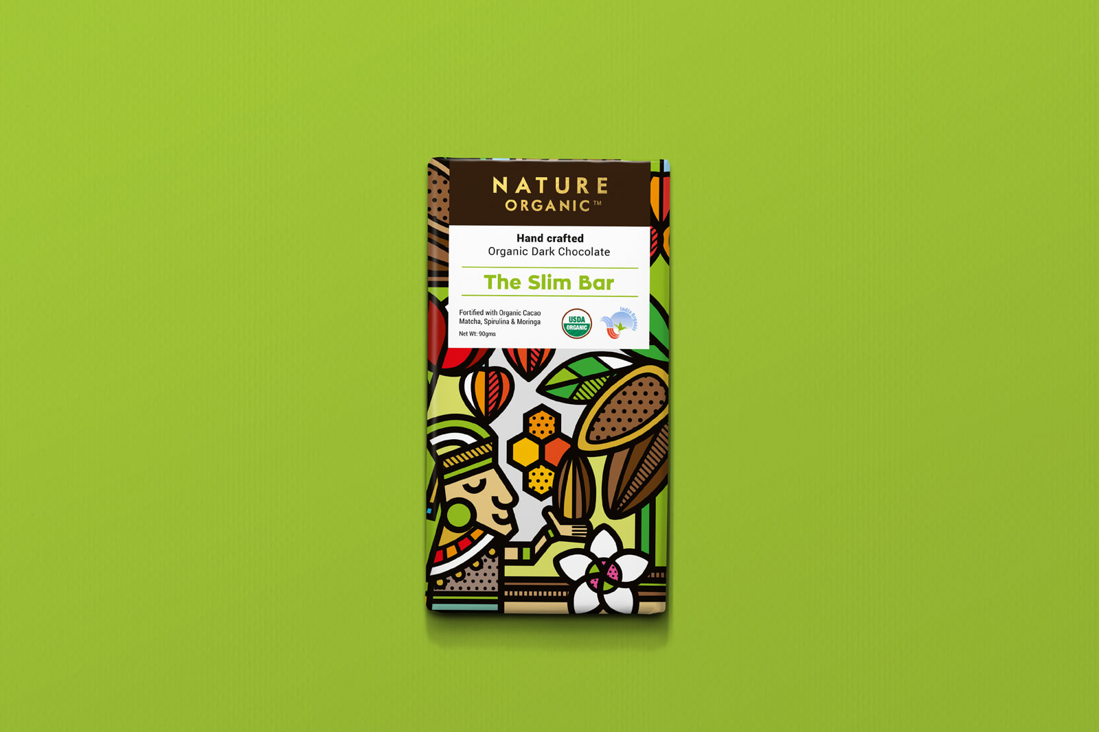
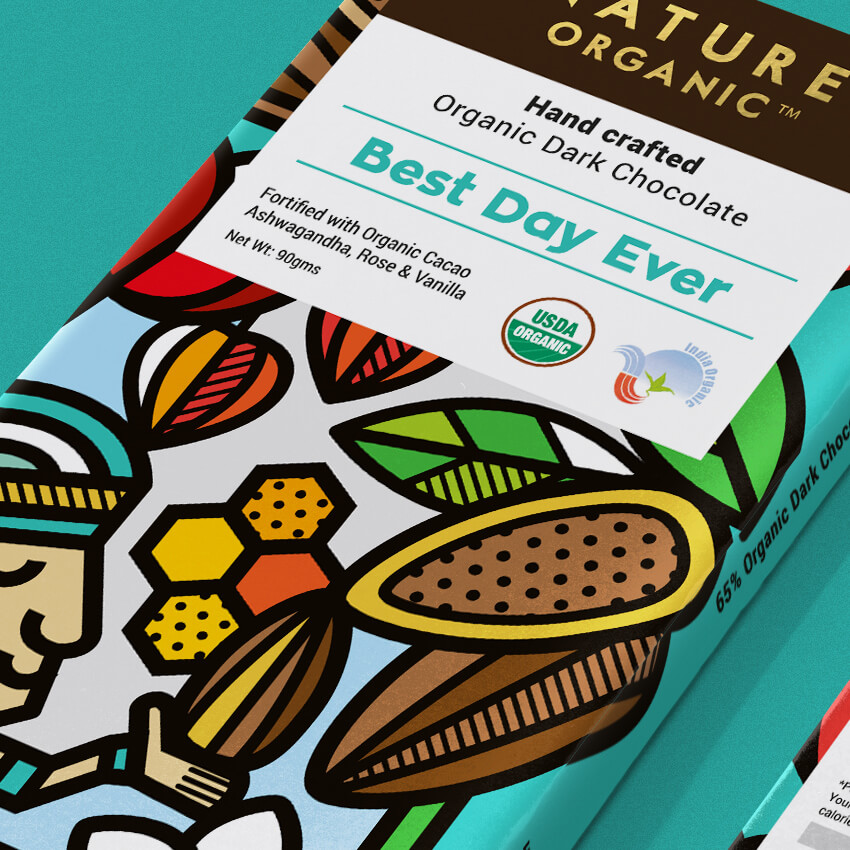
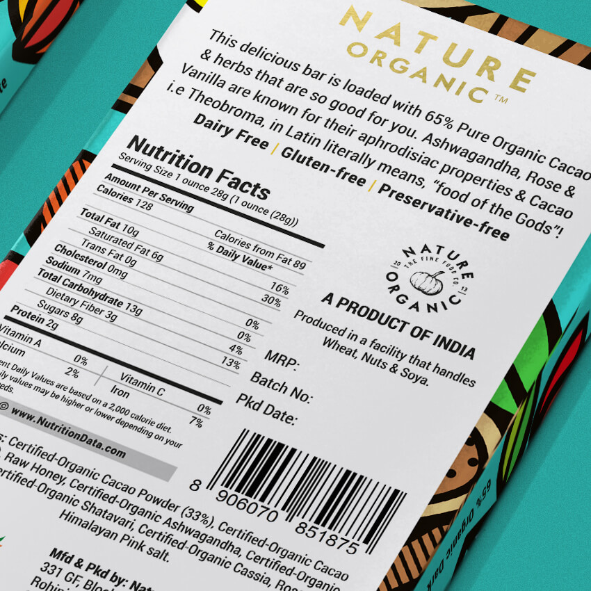
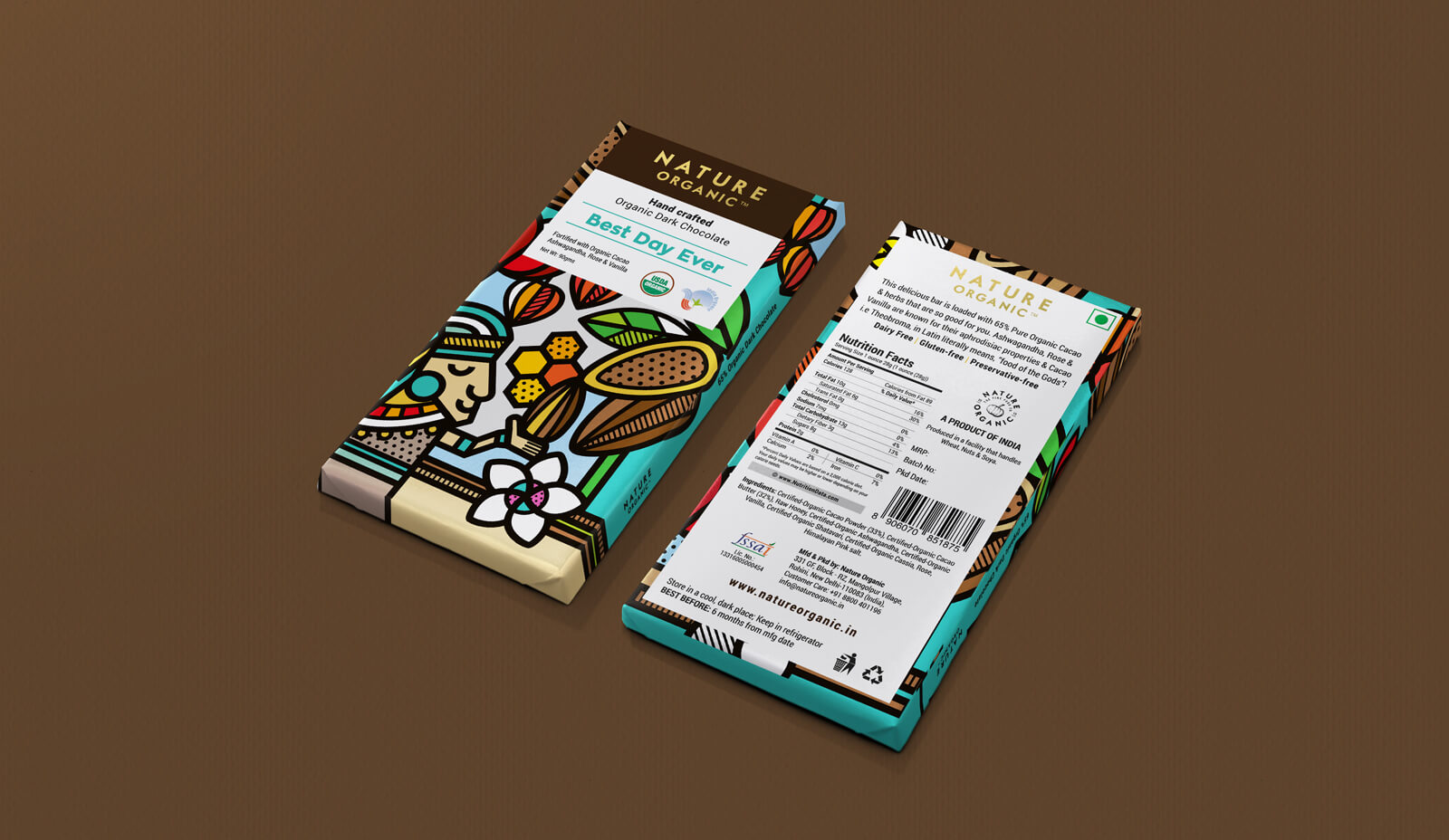
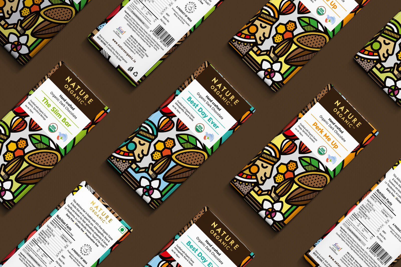
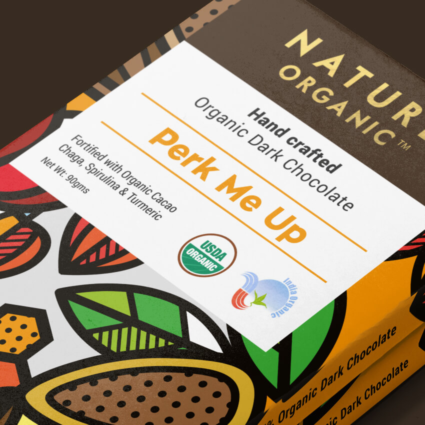
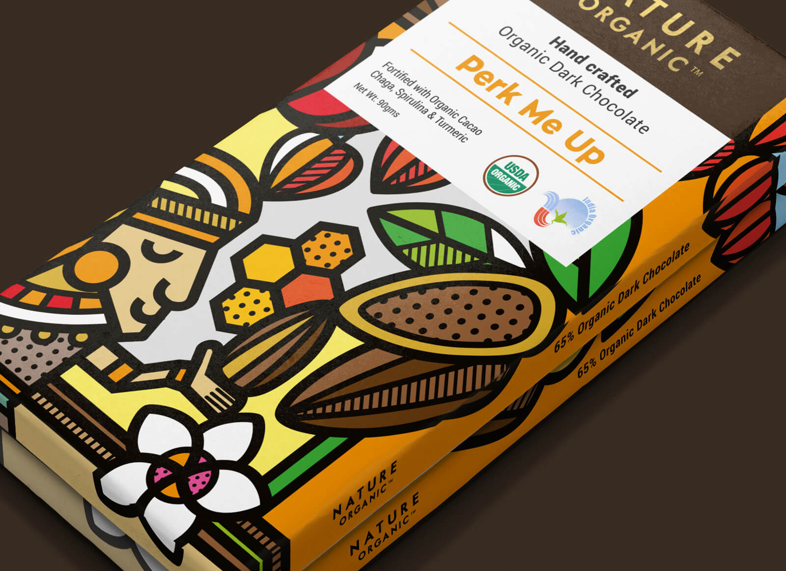
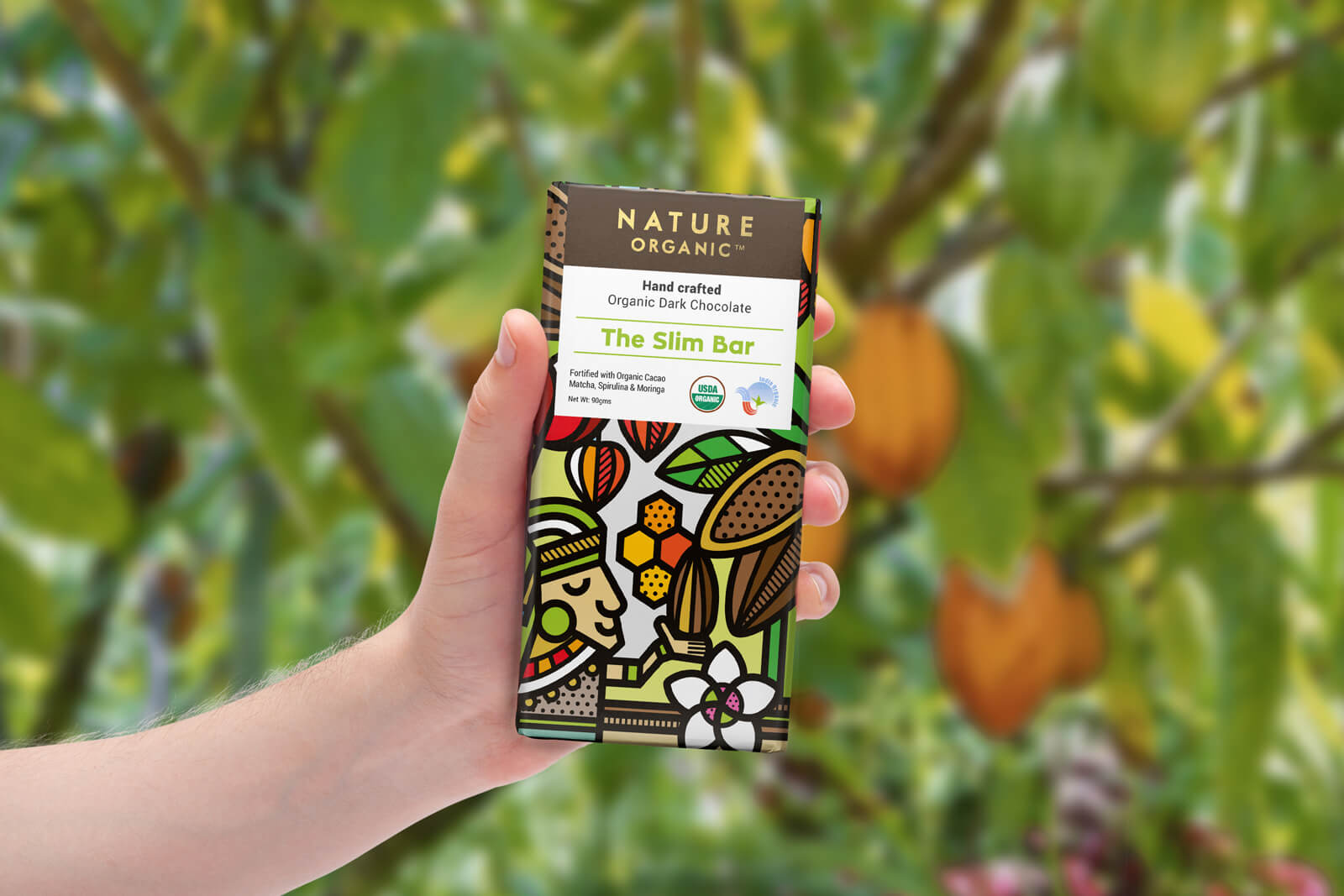
Earlier this year I was commissioned by the food brand Nature Organic to redesign their handcrafted organic chocolates. The first part of the brief was to bring color to the packaging. Their previous packaging was mostly in black & white and that was proven to be a problem in India’s market, as people there want colors. India after all is known to love colors. At the same time a little luxury feeling was also something that had to be considered, but created a little conflict, as usually luxury and colorful don’t really go together. So what we did, was just give a touch of gold foil on the logo on a dark brown background and the rest of the text in a clean white area. The illustration as usual is in my own style, bold, colorful, with a few patterns and with not too much detail, creating a fun, vibrant, fresh and maybe a little classy, chocolate packaging. The elements used in the illustration scene are from the main ingredients of the chocolates. Such as rose, vanilla, honey, ashwagandha and of course cacao beans and trees. Last but not least I was also asked to illustrate a character that worshiped the cocoa beans inspired by the ancient Aztecs and Mayans, that where the first in recorded history to use cocoa beans for chocolate. Once we finalized the main packaging we made another two chocolates where each has it’s own colors and name. Hope you enjoy the project.




Featured on Package Inspiration