Agency: Tanya Dunaeva
Tutor: Leonid Slavin
–
Description:
The dairy market occupies more than a fifth of the structure of food products and is the largest market among packaged products. Accordingly, the competition of products is very high. In order to stand out on the dairy shelf, increase sales, expand the geography of representation and distribution channels, the brand must be different and attract attention at first glance. More often, agricultural motifs are depicted on kefir packaging, such as fields with fresh grass or grazing cows on a white or light background. Therefore, when starting to design the packaging of kefir of the MUGO trademark, it was decided to do something completely different, not typical of mass products in the category.
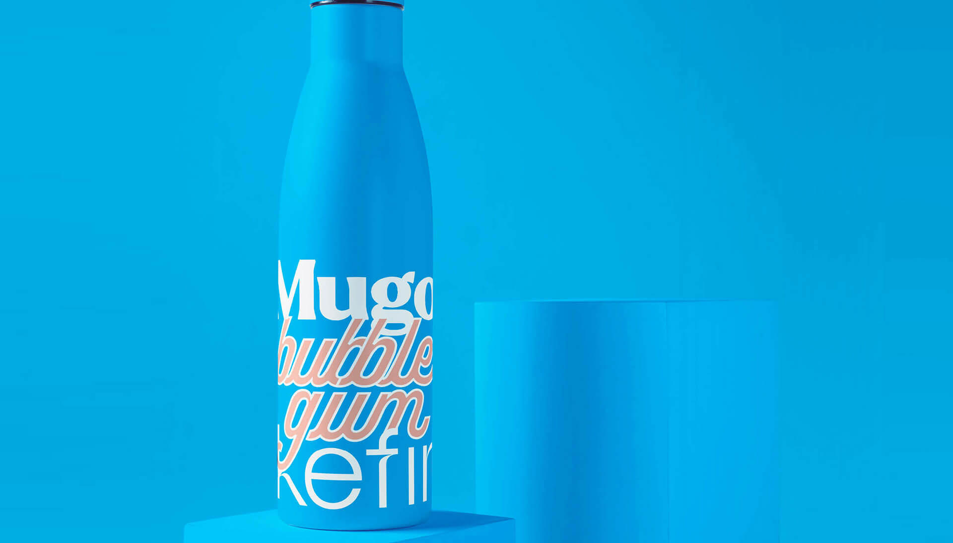
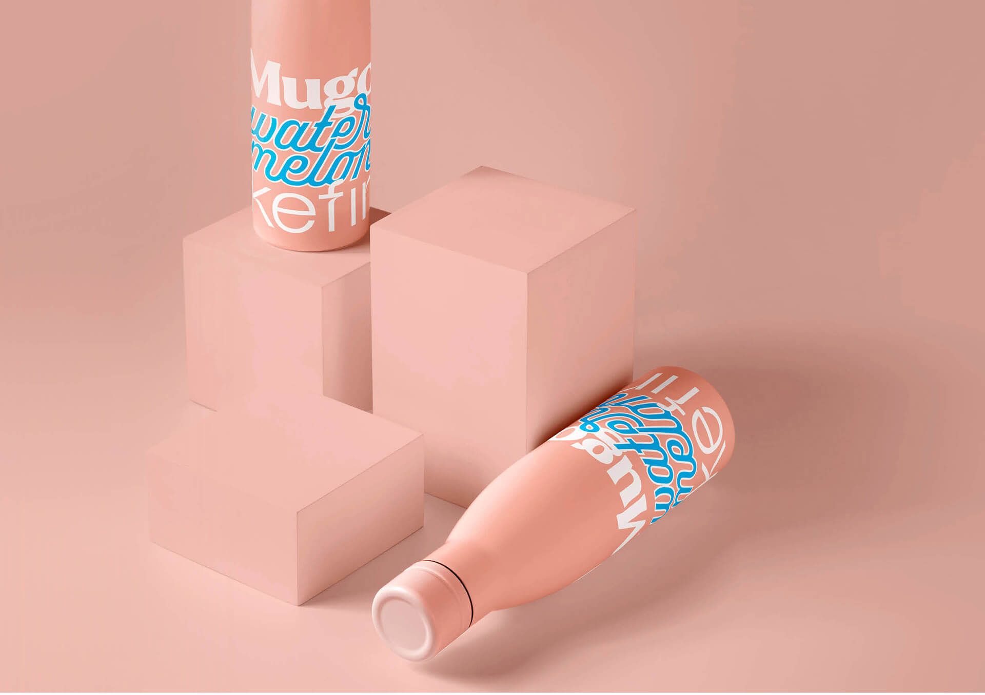
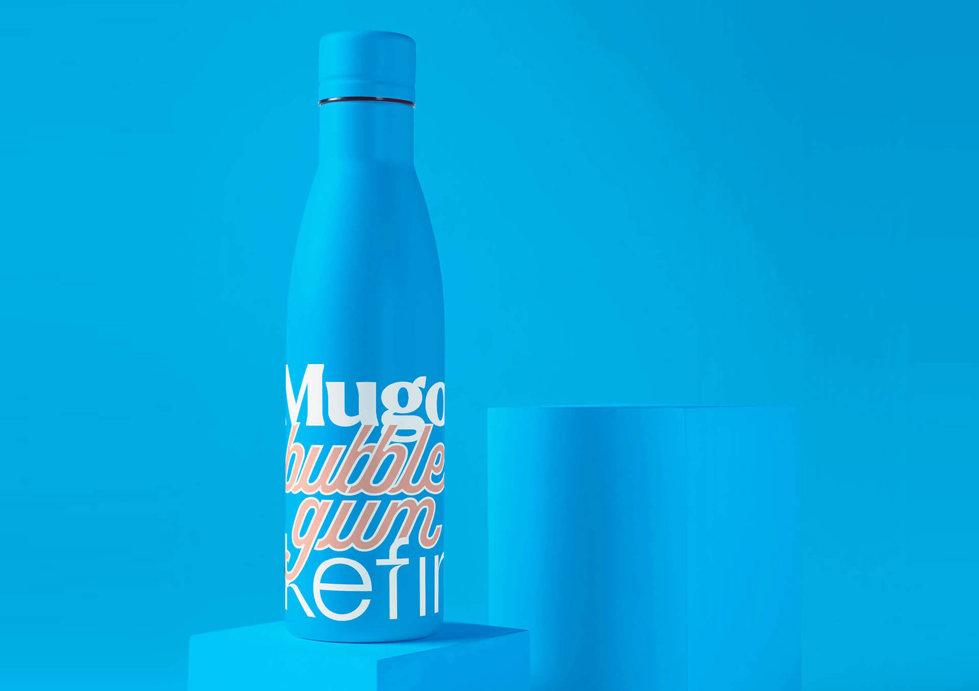
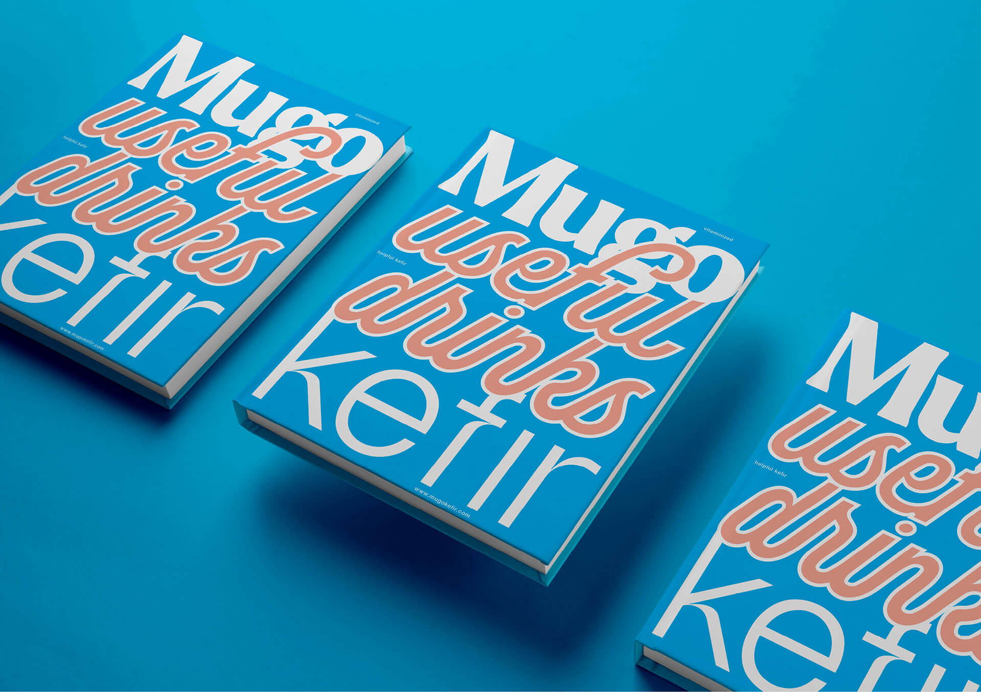
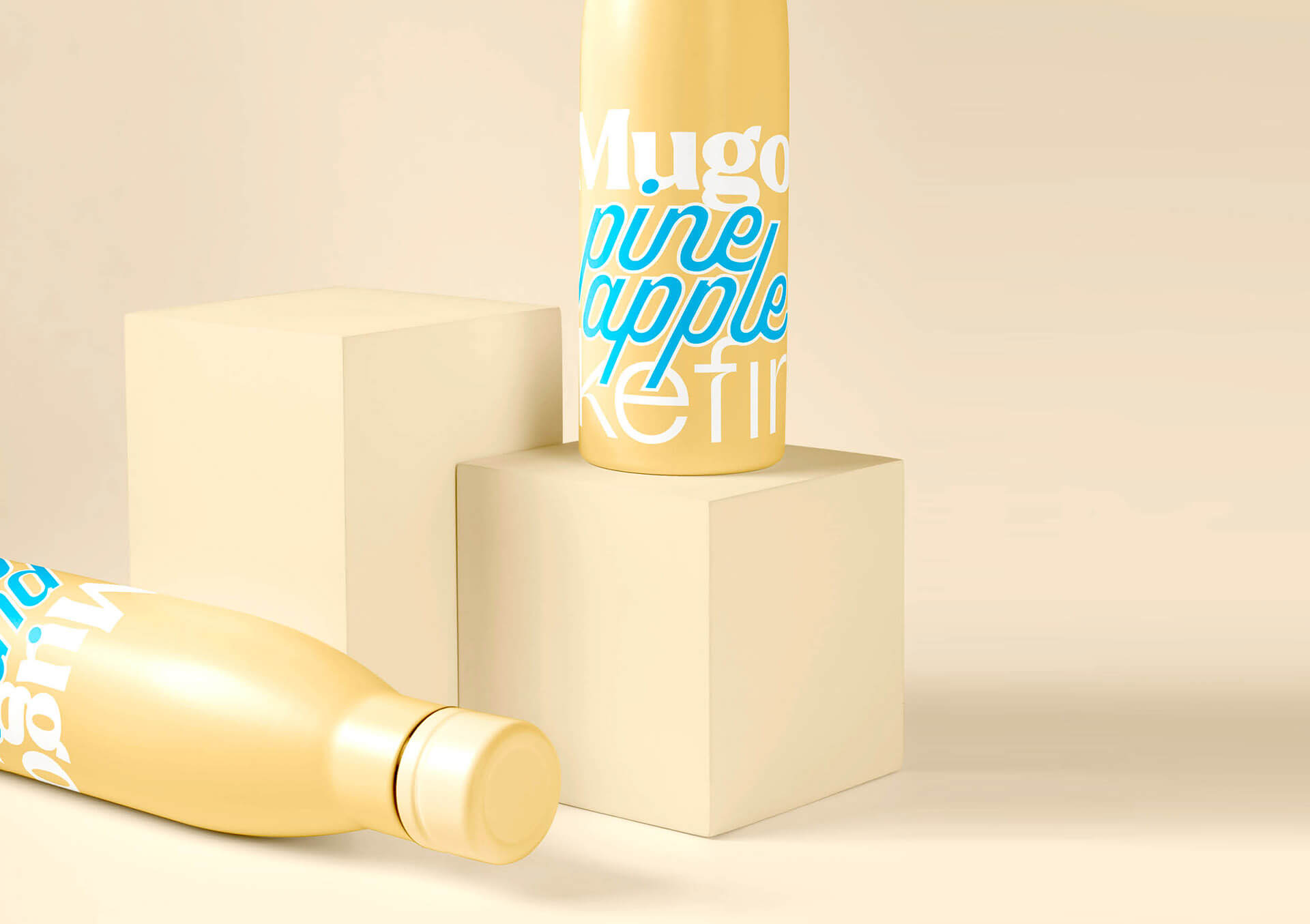
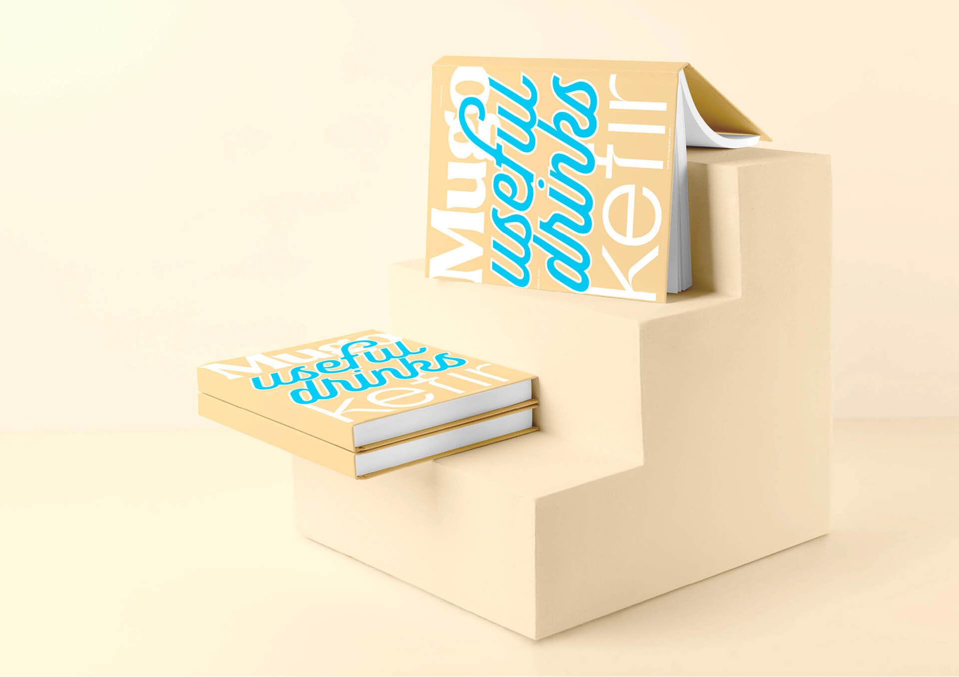
Retro-style font design, bright local colors with a minimum amount of white color create an unusual original aesthetic. Among the “scattering of berries and milk splashes”, contrasting shapes and large precise words distinguish the product on the shelf much more effectively. Moreover, when they turn to consumers – real aesthetes and convey the main value of the manufacturer – the production of only natural products without any impurities and additives.
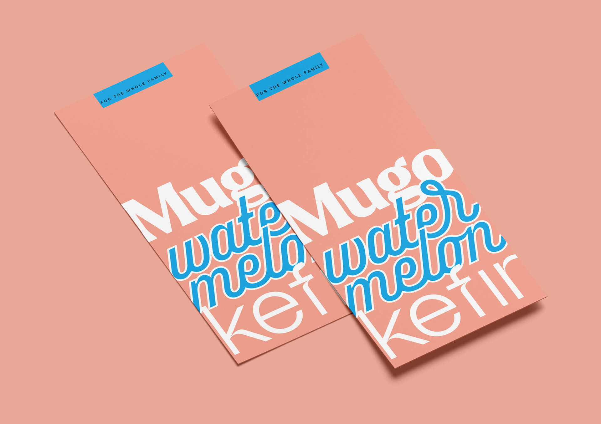
The local color of the bottle is responsible for the taste identification, so there is no need for an illustration of the fruit, which makes it possible to make the design more concise and clean. Despite the fact that the whole concept is built on typography and simple forms, the design system turns out to be very flexible. In support of the new packaging, advertising materials, printing products were developed, as well as the created design allows the brand to look holistically in the digital space.
Special thanks should be delivered to Russian Higher School of Economics (HSE Art and Design School) and personally to Packaging tutor Evgeny Razumov & to Leonid Slavin, head of Art direction MA Program.
Featured on Package Inspiration