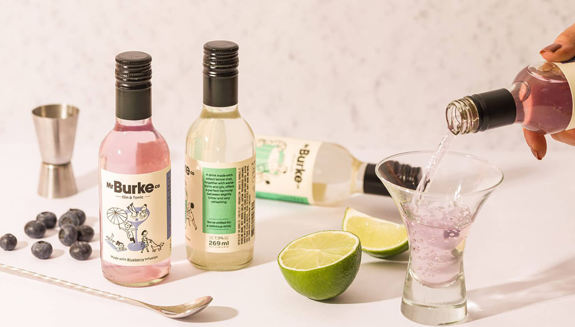
Agency: PSNDesign
–
Description:
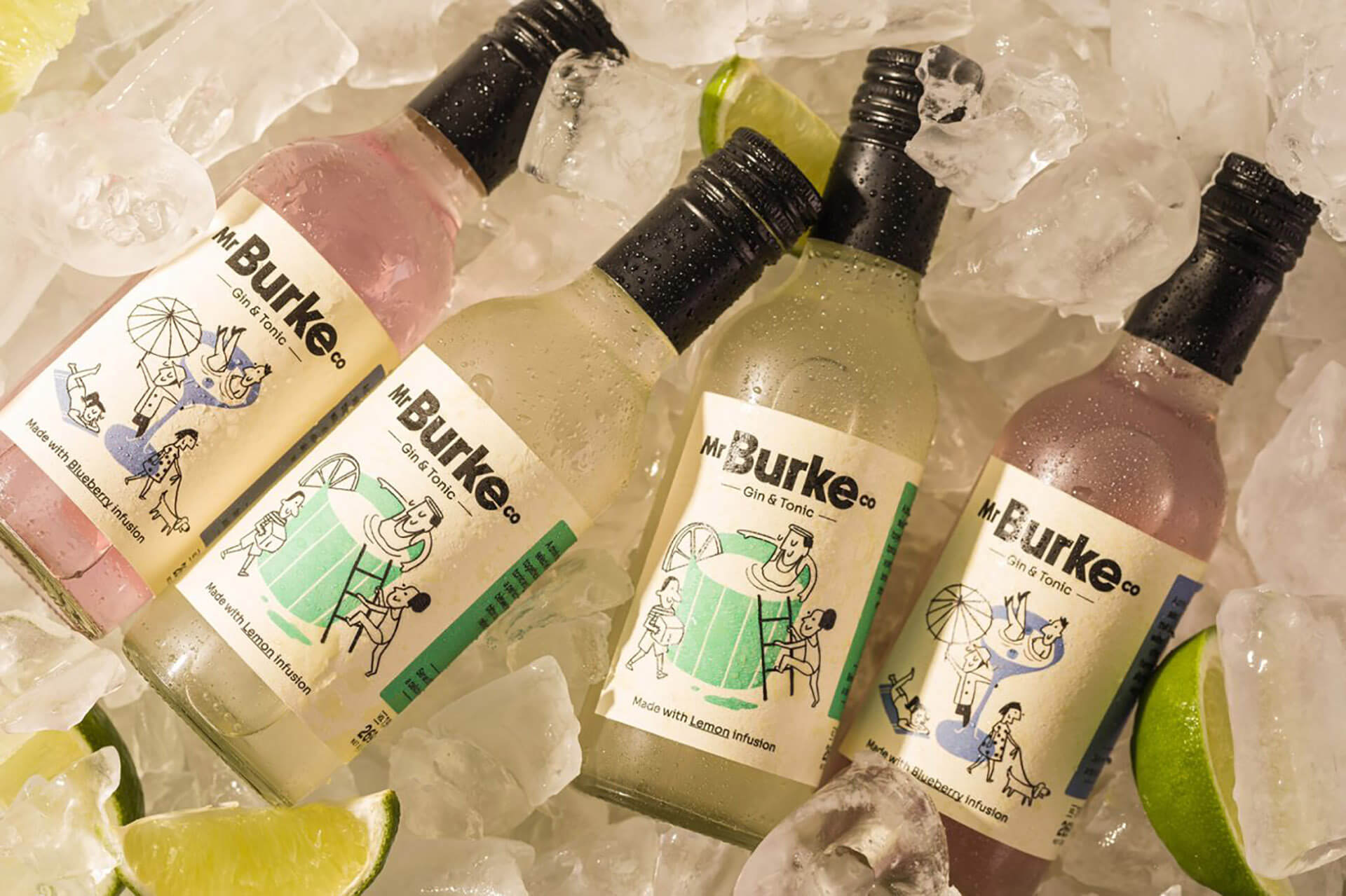
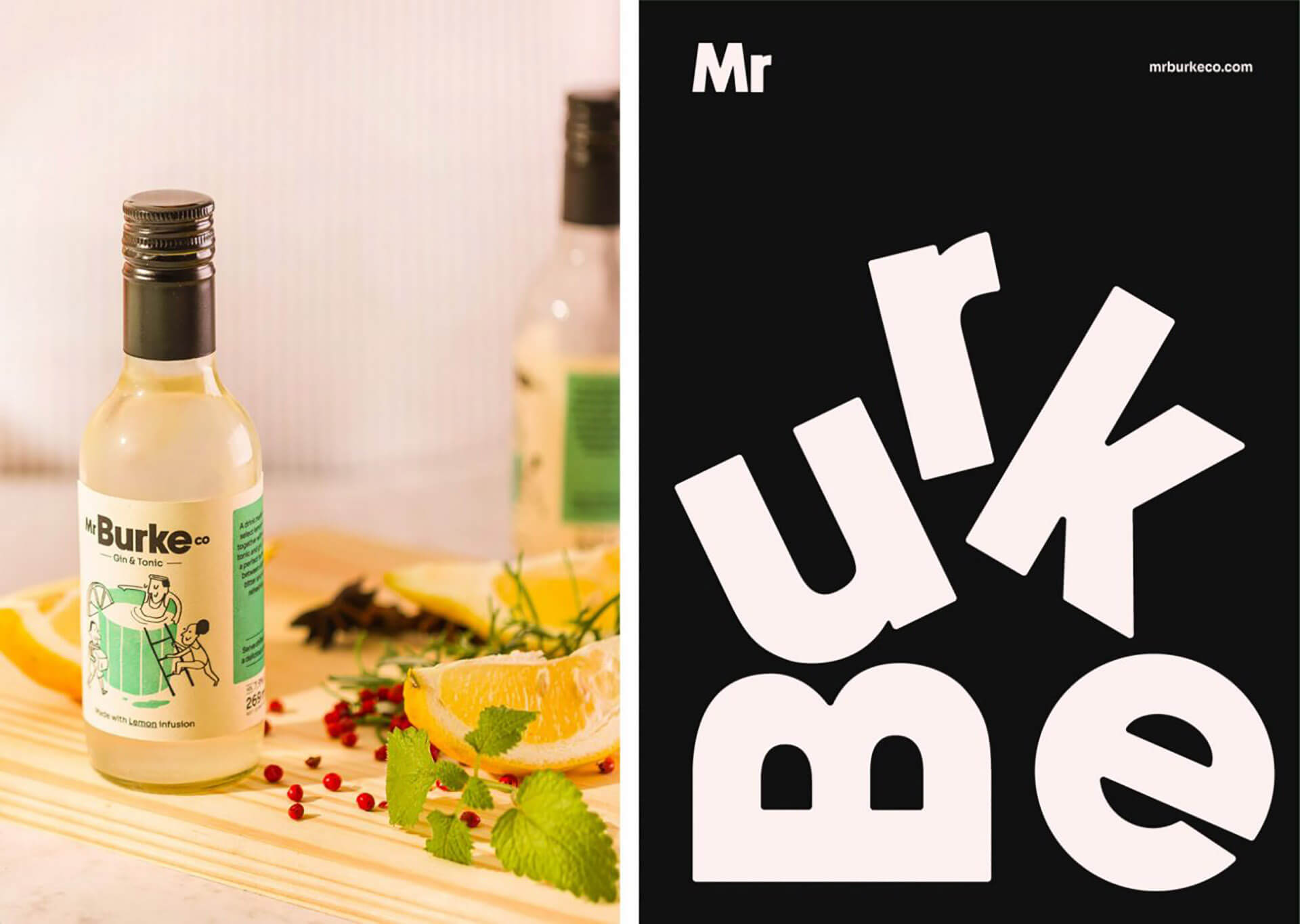
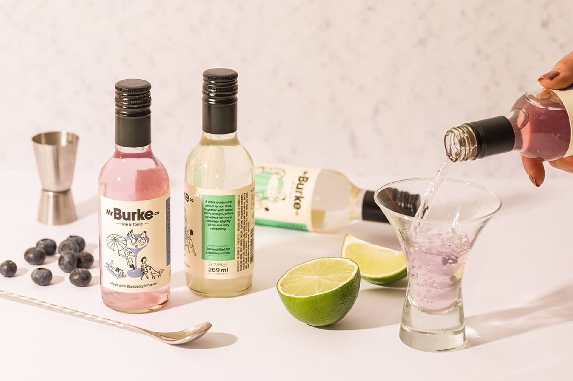
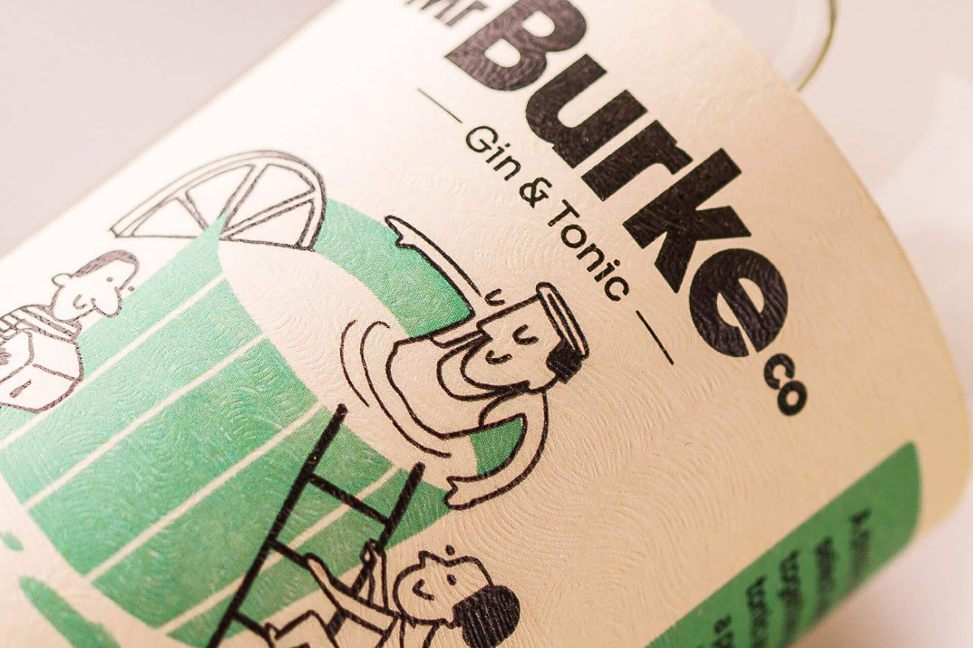
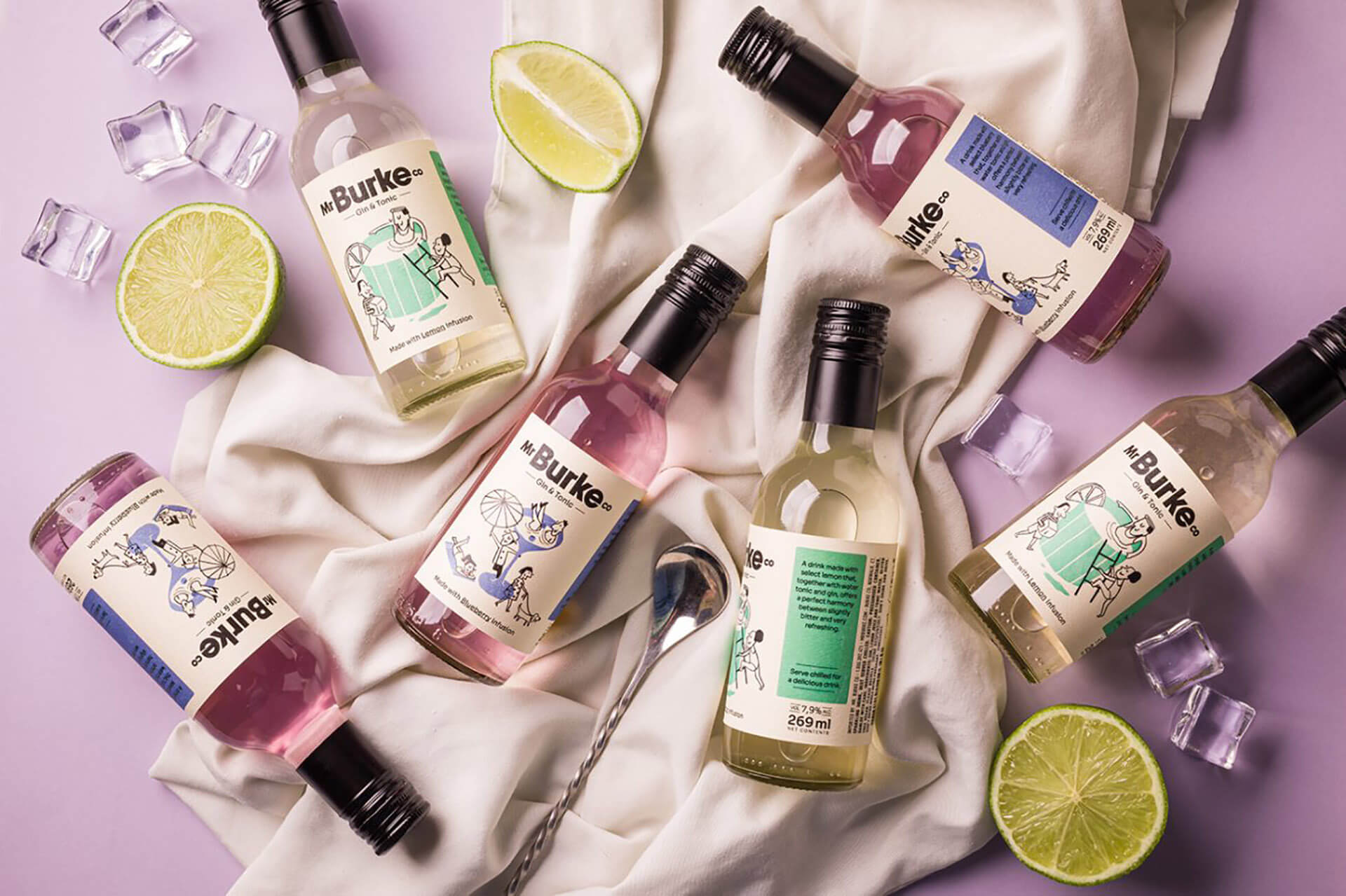
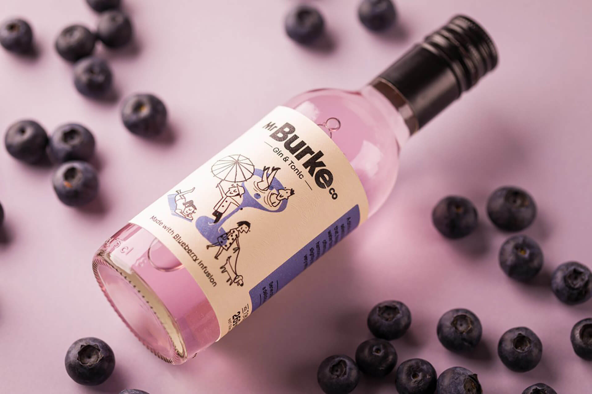
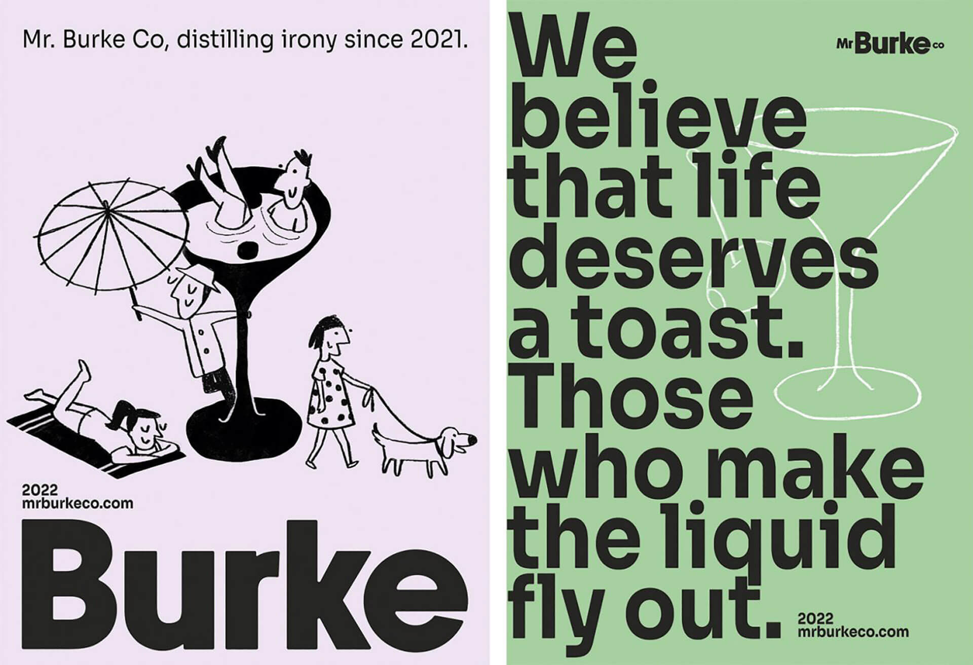
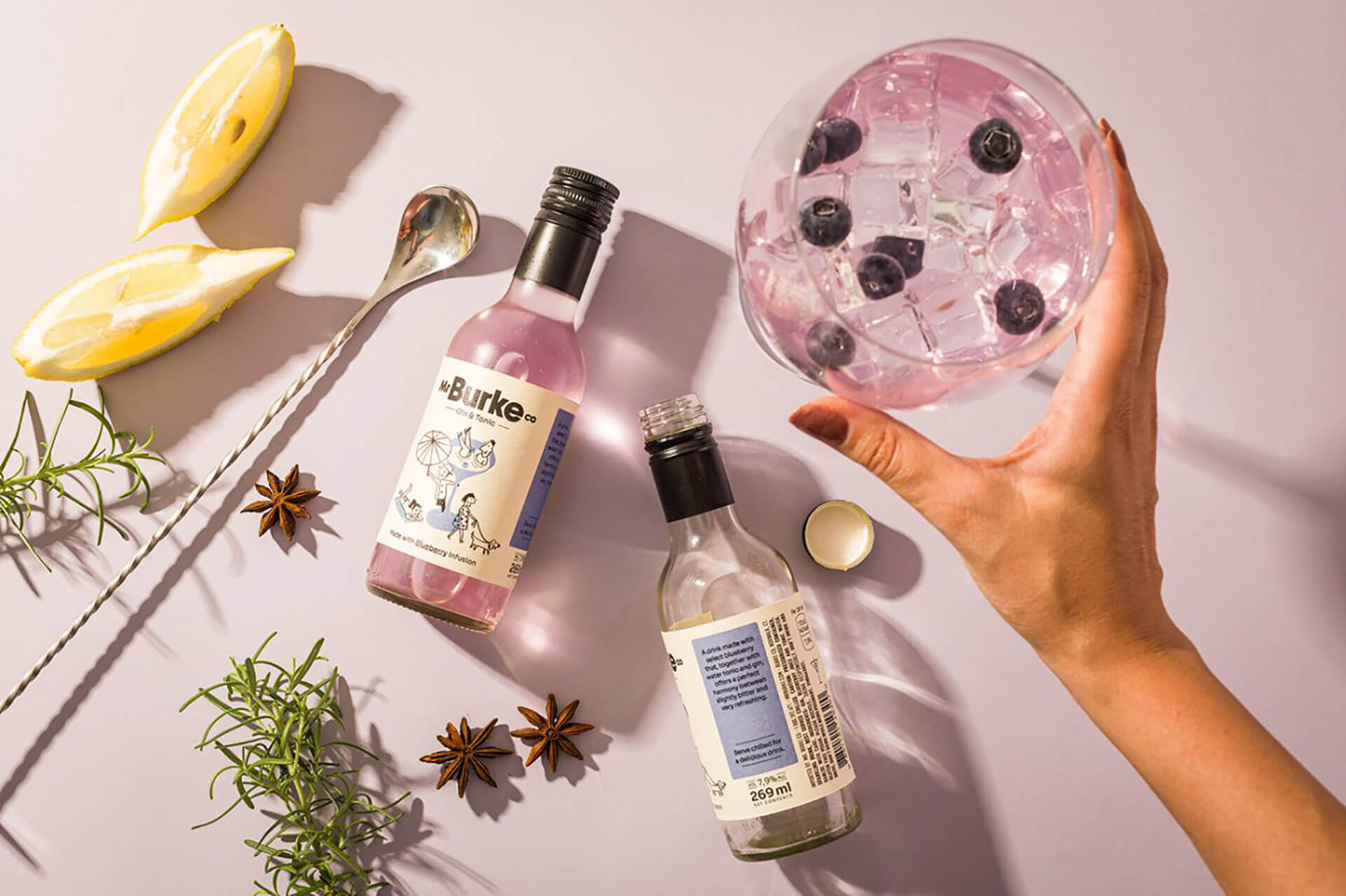
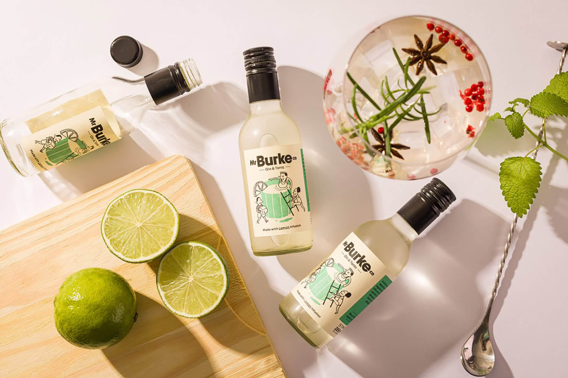
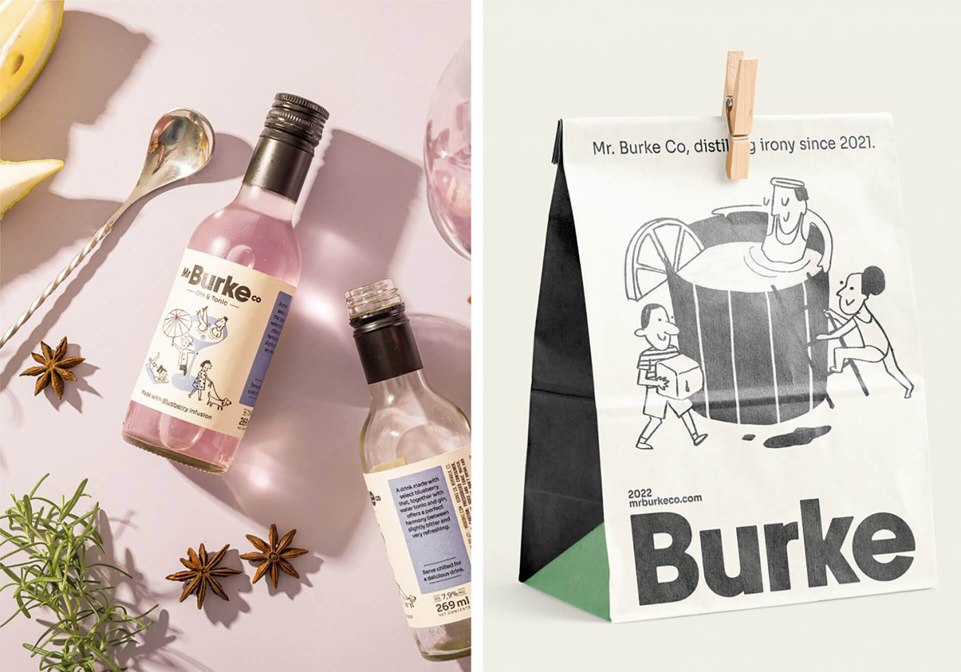
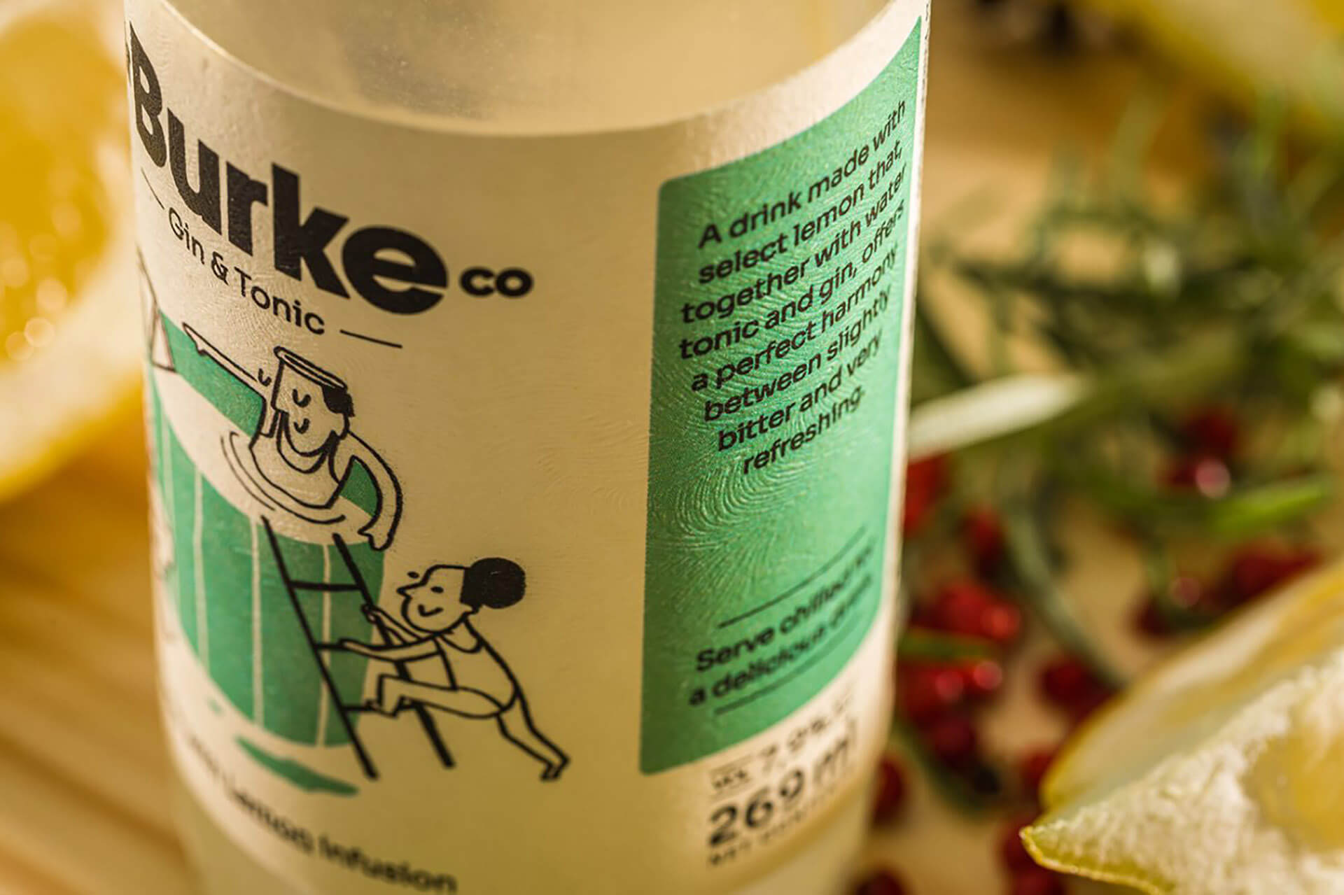
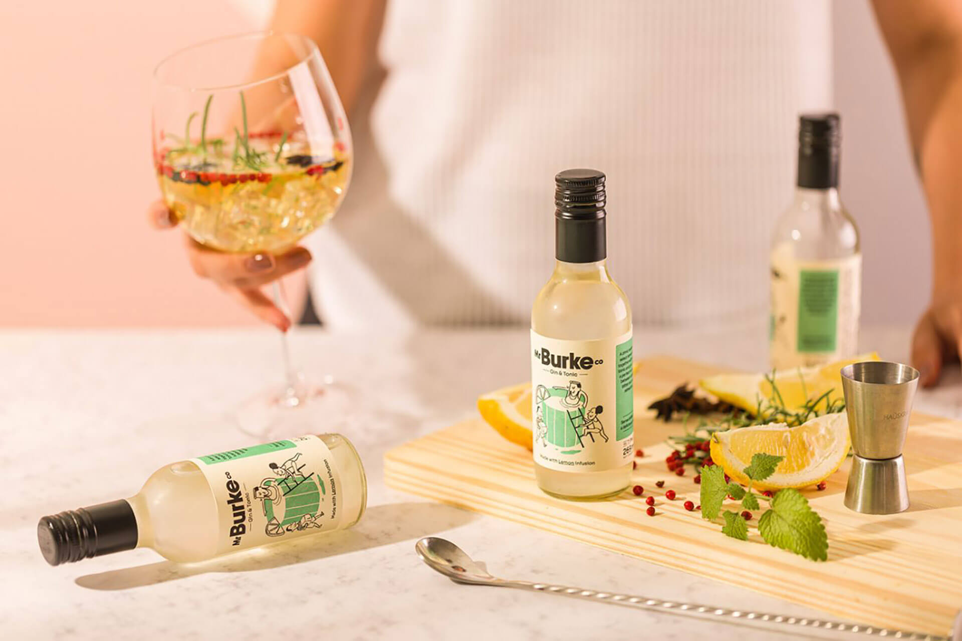
Mr Burke Co is a Gin & Tonic ready to drink. A label design project for Alcoholic Beverage Packaging. His personality is multiple, just like his identity, it is not binary. Burke travels through various social spectrums, but his bohemian profile does not hide an ironic, relaxed and sometimes sarcastic personality. Here’s the antihero. The texture of the paper made the photograph shine. It’s like a digital, the feeling that it was handmade, light, smooth. Without the claim of being expensive, automated or without personality. For this project we were able to help from the choice of the bottle to the type of paper that was printed – an egg shell style paper. Tactile experience beyond visual experience. The whole project was created to make Mr Burke authentic, and that it was very different from what we saw in the alcohol industry. Distilling irony since 2021.
Featured on Package Inspiration