
REDESIGN BEERPACKAGING // BRANDING
The packaging of beerbottles has been reinvented a lot of times already. But why is it still a problem and why doesn‘t there exist the perfect solution? Because the requirements of the customer, selling point and point of production are so opposed to eachother.
The glas bottles are very heavy, they break very easily and they can‘t be shaked much during the transport. In consequence the packaging should be confortable, flexible and stable to carry, it should consist just of one material, it should be cheap, eco-friendly, easy to produce and finally recyclable.
The common packaging uses a very small amount paper, but it has to be destroyed within the usage and can’t be used anymore after having pulled out just one bottle. Other packages are more flexible in the usage, but they are using a high amount of material and also glue.
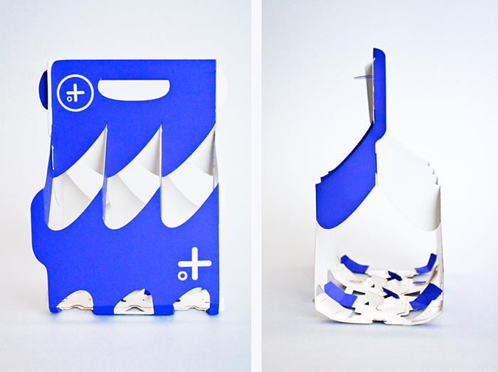
This packaging combines the advantages of both packaging concepts:
Less material, more flexibility.
THE PACKAGE
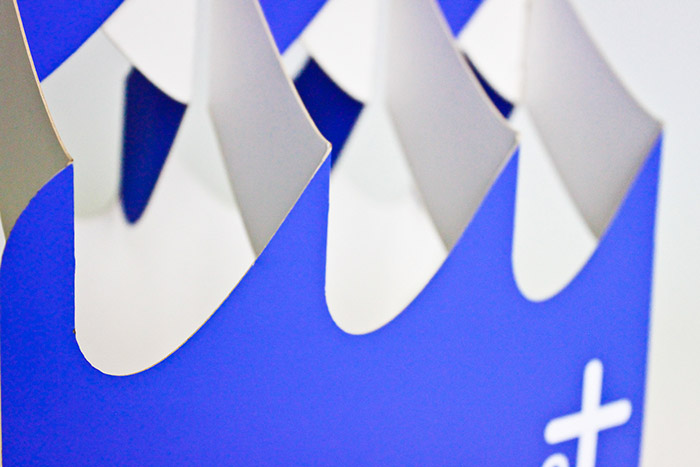
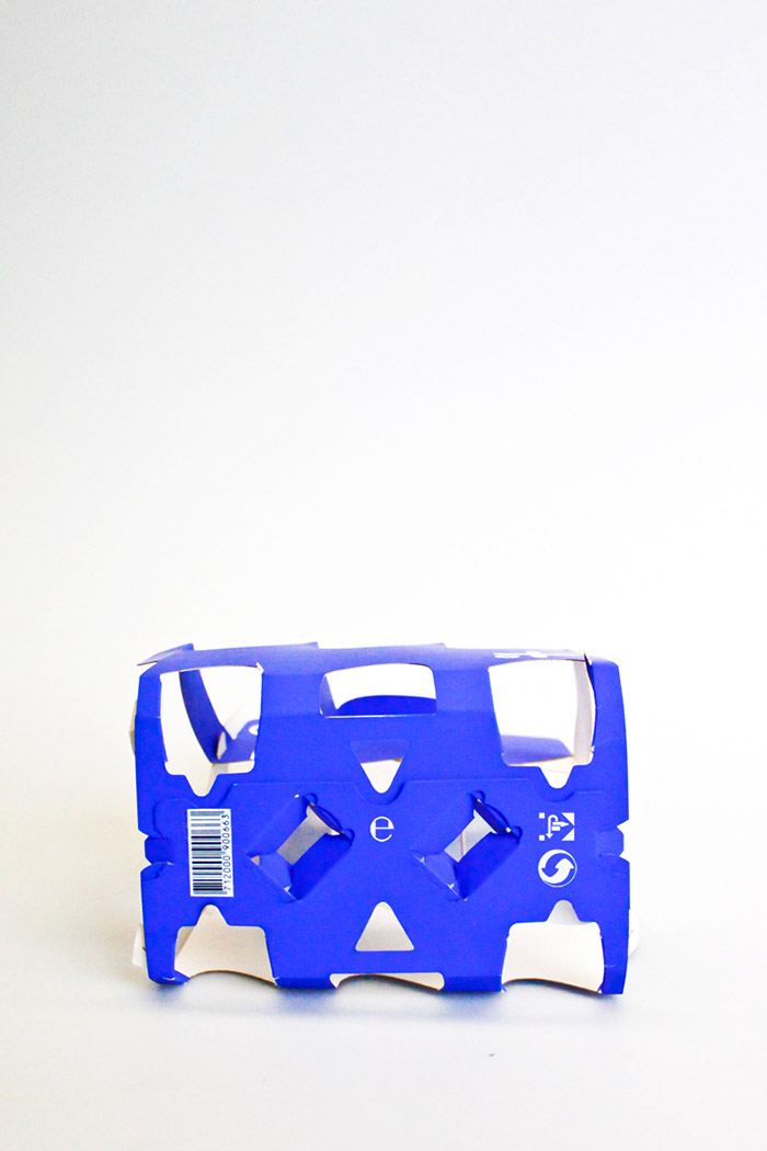
The round shape prevents the breaking of the paper in a specific point or angle. This makes the package stable, although the little amount of paper. The two parts are linked in a way that distributes the forces.
ADVANTAGES
no glue
same outline as common packages
– transport with beercrates possible
usage without destroying the package
reusable packaging
very small amount of material
THE BRAND
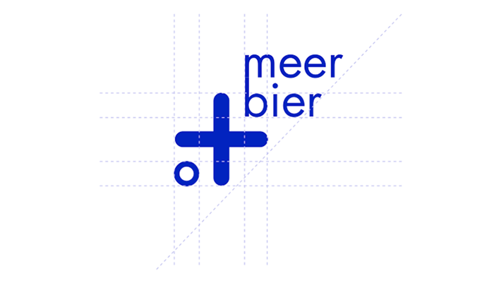
The brandname of the beer is “meerbier” which means “sea-beer” spelled like this, but the sound it has a second meaning which is “more beer”. I wanted it to represent summer, fun but also the function of the packaging, like reusability, eco-friendliness, that you can do more walks with it and thats more flexible in using it. The double meaning represents all this for me.
THE BOTTLES
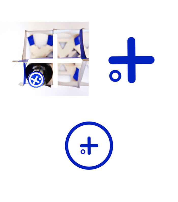
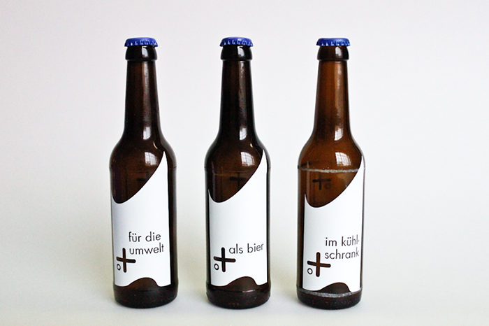
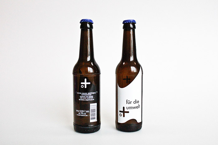
The bottledesign also plays with the double meaning of the brandname. Some slogans represent the characteristics and the mood of the package and the beer. The plus stands in lieu of the name “sea” but also for “more”. The added frases complete the slogan into statements like “sea/more .. for the environment” or “sea/more .. in your fridge”.
Designed by: Alessia Sistori, Germany.





Featured on Package Inspiration