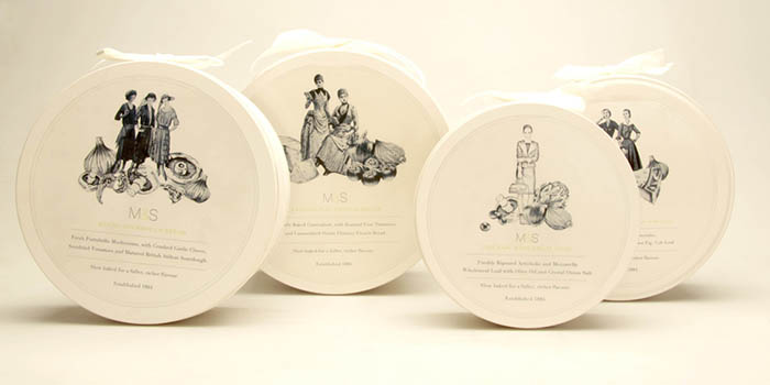
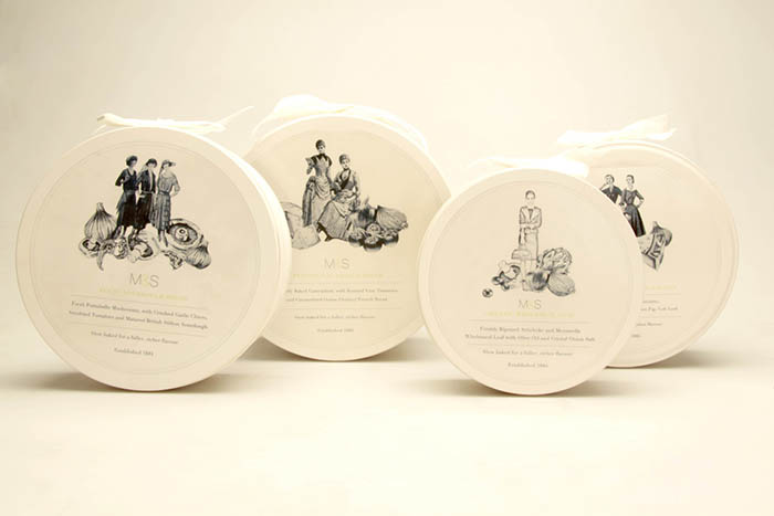
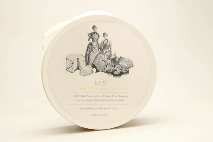
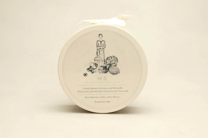
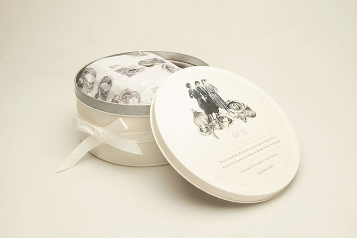
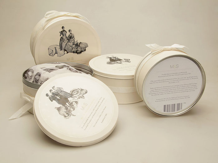
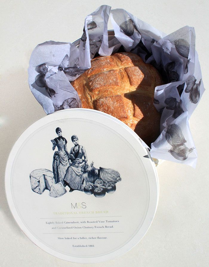
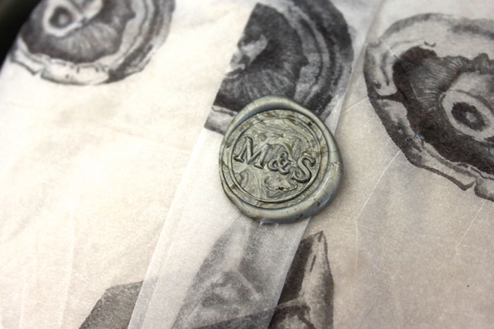
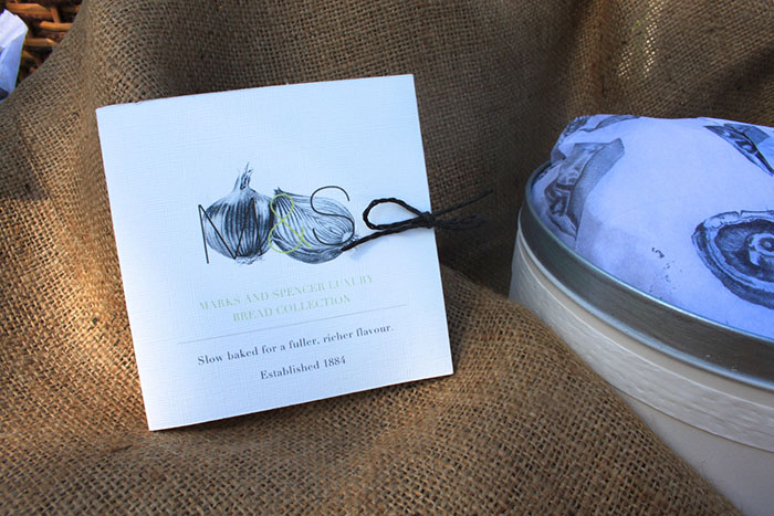
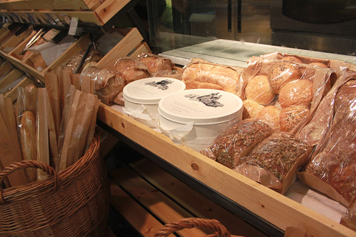
This is a live brief for Marks and Spencer’s. The Guidelines for the Marks and Spencer’s packaging brief were four different types of bread, Top tier luxury, Illustration, and two colours. From the research stage I found that in the UK 1 million breads go to waste daily. This provoked research into the methods of keeping bread fresher for longer, especially as this collection of products are top tier luxury meaning that the freshness should be of the highest standard.
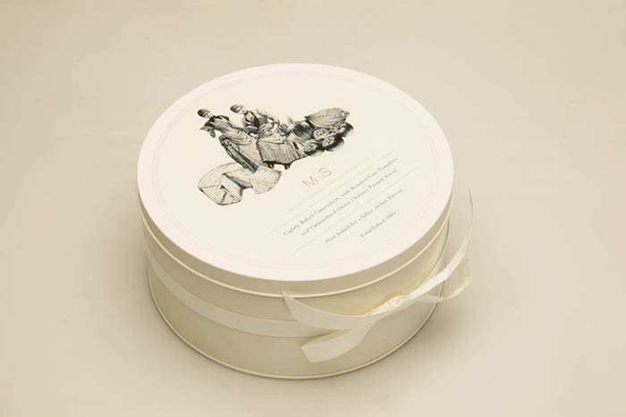
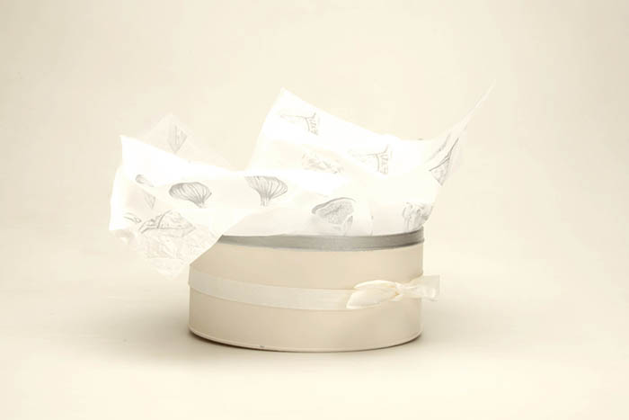
The research was focused on what materials are used to keep food fresh, and in particular what bread bins are made of. This lead me to the packaging material being a tin, which was particularly fitting as Marks and Spencer’s tins are collectables, and top selling products.
Designed by: Claudia Lloyd, United Kingdom.


Featured on Package Inspiration