Left Field Cider Co. is a family owned and operated business that produces artisanal handcrafted small-batch premium hard cider in the southern interior of British Columbia, Canada.
Approached to develop the brand strategy, brand identity and packaging for this start-up cider company, Exhibit A: Design Group positioned it as both accessible and premium, while also celebrating its unique story.
Founded in 2011, Left Field Cider Co. is the prototypical business-started-in-the-garage, only in this case the garage is a barn. Although the Garthwaite family owns and operates a very successful cattle ranch business, they’ve always had an interest in traditional apple cider. With little knowledge of cider production, they enthusiastically made their very first batch using a small apple press and the neighbour’s crabapples. The encouraging results inspired the family to learn more, and after touring popular cider houses of England and studying cider making from the best international producers, they were ready to launch a new business. They named it Left Field Cider Co., as a play on the phrase from out of left field.
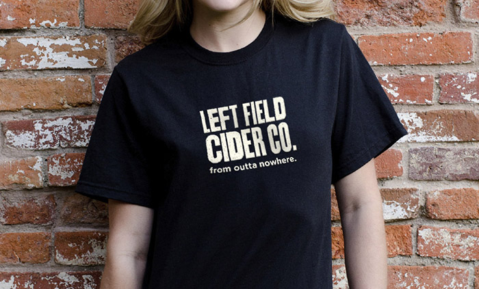
In a comprehensive brand engagement, Exhibit A: Design Group created the brand strategy, brand identity and development of the overall look, feel, and voice for Left Field Cider Co.’s brand expression across various assets, including packaging.
Our market research and trend analysis revealed an underground surge in artisan producers interested in the centuries-old tradition and techniques of craft cider production. Sales increases of up to 20% each year in Canada show hard cider popularity has the potential to mirror the success of the craft beer movement. More long-term growth is forecasted as real hard cider is discovered by the mainstream.
Demographic research showed that women are more likely to purchase and drink cider, leaving untapped market potential to better connect with male consumers. Collaborating closely with the company founders, we were all in agreement to develop a marketing platform that would appeal to both genders, greatly expanding the scope of the potential market. We set out to lure the curious craft beer drinker and designed a more masculine aesthetic, knowing that it was highly unlikely to alienate female consumers.
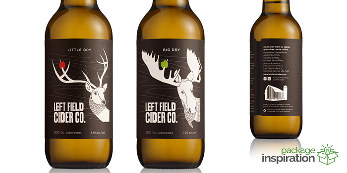
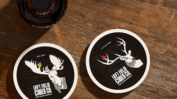
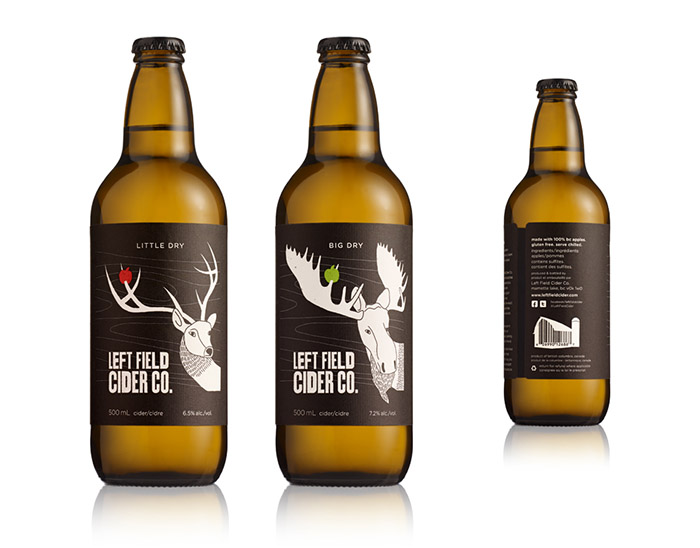
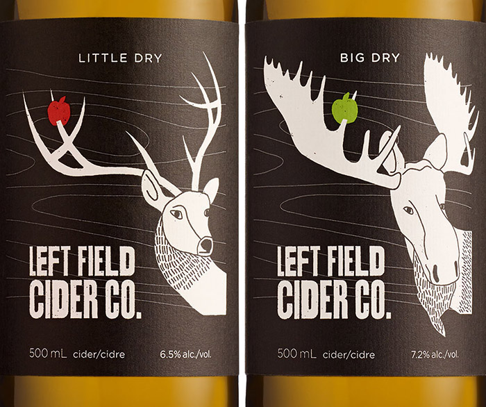
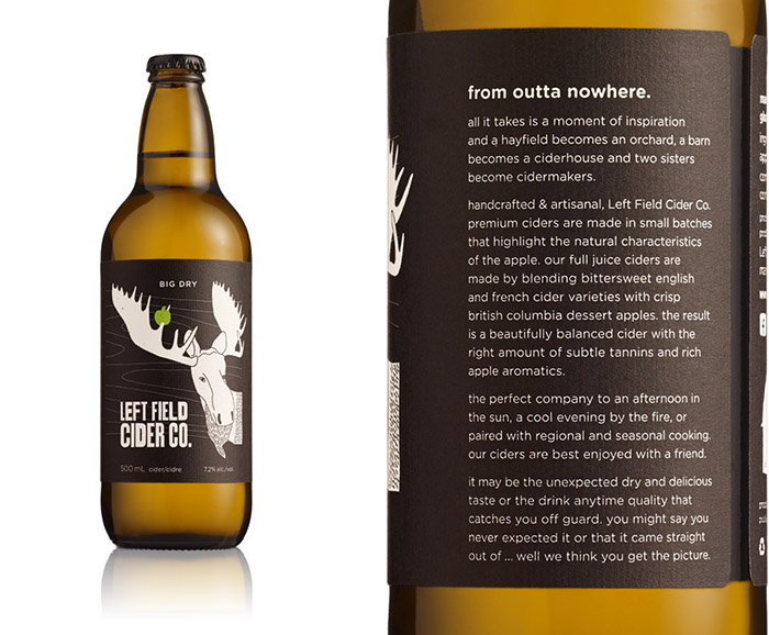
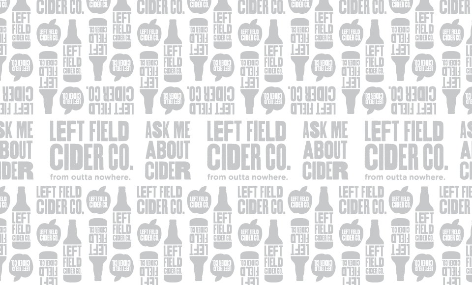
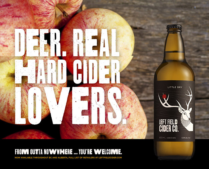
Exhibit A: Design Group’s concept direction plays off of the company name and tagline, ‘Left Field Cider Co. – From Outta Nowhere.’ Our visual storytelling approach engages consumers through an amusing narrative of a deer (and a moose) with a colourful apple stuck on its antler. The whimsical illustrations capture the consumer’s imagination, encouraging them to envision the unique and distinct setting of an apple orchard nestled along the side of a mountain.
Despite receiving approval for our concept direction from the client early on, our studio underestimated the overall complexity of the project. The biggest challenge was developing the appropriate brand expression: positioning, identity and personality. At the time, there was no other cider brand that set out to appeal to the type of consumer we were striving to influence. Added challenges included positioning the brand so that it was immediately recognized as cider and not craft beer, and achieving the appropriate unit price perception (the 500ml bottle retails for as high as $14).
During our design exploration phase, the bottle label was our blank canvas to explore aesthetic possibilities, evaluate the emotional appeal of the visual language, and measure against our objectives in the design brief. Throughout our design process, we analyzed and iterated close to 100 label combinations, sketching various illustration styles and testing multiple typographic solutions. In the end, a more rugged illustration and woodcut typographic style suited our client best. This is essentially a family of farmers who don’t mind getting their hands dirty if need be. Truly handcrafted cider.
Our studio’s rigorous attention to detail and commitment to establish a clear, consistent and differentiated brand experience has rewarded the client. Left Field Cider Co.’s products are widely purchased by both male and female consumers. The company has doubled cider production since launch to keep pace with demand growth and continues to sell out each year. Even more gratifying, consumers actively engage with the product: images of Left Field Cider Co.’s packaging are often shared on social media platforms with many comments on the overall brand story and design. The product is sold at pubs, restaurants, specialty beer stores and wine stores throughout Western Canada.
Awards & Recognition
Applied Arts Design Awards: Winner, Packaging Series, 2014
Design Edge Canada Regional Awards: Finalist, 2014
GDUSA American Package Design Awards: Winner, 2014
GDUSA American Graphic Design Awards: Packaging – Winner, 2013
Designed by: Cory Ripley(Exhibit A: Design Group), Canada.


Featured on Package Inspiration
We are young team which works to inspire packaging designers every day! Our team select the best packaging of today and shares with you.
