
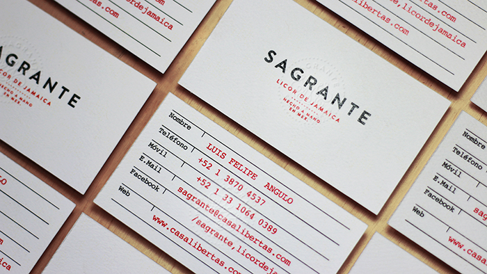
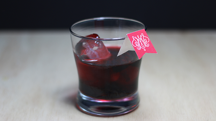
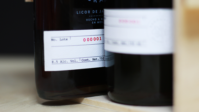
Spiritual Branding for Sagrante – Licor de Jamaica – Handcrafted and tailored, Sagrante seeks it’s own freedom by using guidance from the past, passion from the present and fulfillness from the future. Sagrante’s name is created with the intention to reflect what’s holy (lo Sagrado) and represent the passionate colour of it’s own body. The monogram represent the spirit of the brand, the hibiscus flower (Flor de Jamaica) from where the product is born. The color way is a simple abstraction of what the liqueur appears in different lightning conditions, which this lead to an honest and simple brand communication. We worked around two different typefaces to represent the strong spirit of the brand and the craftiness of it’s process. Packaging was intended to be honest and simple as well to let the product give it’s own colour palette in the different lighting conditions it can be placed. The application of the logotype on the bottle is intended to be applied by hand, which ended up being a silk screen printing on the body of the bottle and a press stamp on the label at the bottom of the product. Sagrante represents freedom, tradition and passion for what is right.
Designed by: Parallel Studio, Mexico.


Featured on Package Inspiration
We are young team which works to inspire packaging designers every day! Our team select the best packaging of today and shares with you.