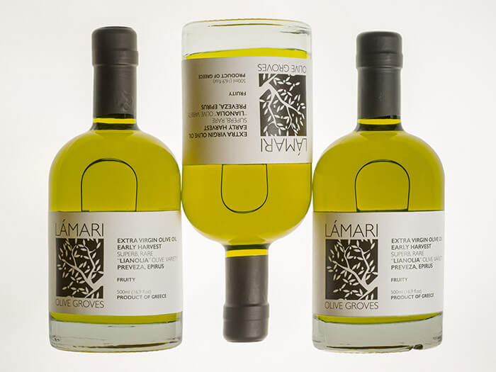
Designed by: DaDive Studio, Leonidas Bakolas, Greece.
The Client
Lamari Olive Oil is the outcome of a small independent production, having in its source the superb lianolia olive variety found in the region of Preveza, Epirus in Greece.
The primal aim is to transfer to every corner of the world passion for excellent olive oil, as a product of the Greek Land and as a result of ethical agriculture, where traditional methods and procedures are being followed and advanced by the contemporary know-how. Lamari Olive Groves’ team is dedicated to bring the finest, internationally awarded, Greek olive oil to your table, introducing to you, in the same time, their tradition and warmness.
—
The Task
We were asked to create a brand identity and digital presence of the olive oil, which was supposed to reflect its premium quality and origins. In a market with high competition, we were asked to keep simple lines and ideas regarding the label and the packaging, in order to highlight the product itself: a premium quality, extra virgin, olive oil.
—
The Solution
Firstly we experimented with the origins and the general area of Epirus, along with elements that have to do with the procedure of the oil extraction. However, we ended up to a simple rectangular shape which enclosures an olive tree branch in black and white.
We concluded to this solution, as we wanted a shape that could combine the old (the origin of the olive trees) with the new and the modern ways of olive harvesting and oil making, reflecting the premium quality of the olive oil. Moreover, the lack of colour from the logo was decided in order to draw attention to the magic gold colour of the olive oil itself.
Since we chose a transparent bottle, we used a simple wrapping paper in order to protect the valuable product and give to our packaging a sense of texturing.


Featured on Package Inspiration