UNEXPECTED DISCOVERY
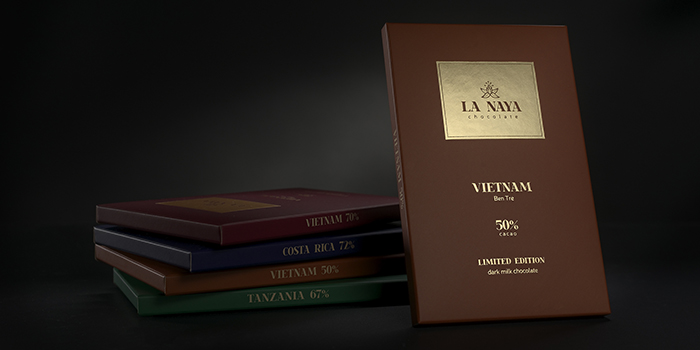
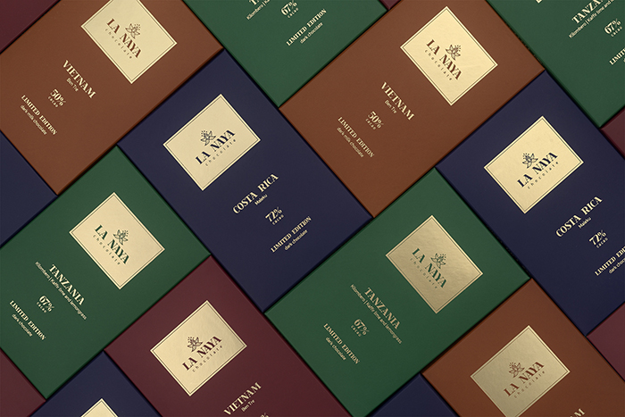
The packaging is based on the chocolate tasting – you get the impression only when you try it. Because of that, the outside packaging is minimal: bold colours and gold foil. When you open – you may find the graphics and beauty inside. What is more, each colour reflects the flavour and cocoa bean notes. It was carefully discussed with the chocolate maker till we reached the best compromise.
COMFORTABLE PACKAGING
What is more, the dielines created for this line are comfortable to pack, easy to open. It has no gluing parts and a locking in the back side, moreover, when it is open, it comes in a shape of a flower blossom to match the whole concept.
HANDMADE ILLUSTRATIONS
To emphasise the amount of work needed to make this bean to bar chocolate, we selected handmade illustration. They were created based on flavours for each chocolate bar.
SPECIALLY CREATED CHOCOLATE SHAPE
It was a long discussion about chocolate size and shape till we finally reached the dimensions we have now. It is unusual for the chocolate as it is a little bit prolonged square, not too big, not too small – comfortable to hold in the hands. As well, the shape inhance the concept of La Naya chocolate – it reflects the mountains in La Naya village.
Designed by: Gabija Platukyte, Lithuania.


Featured on Package Inspiration