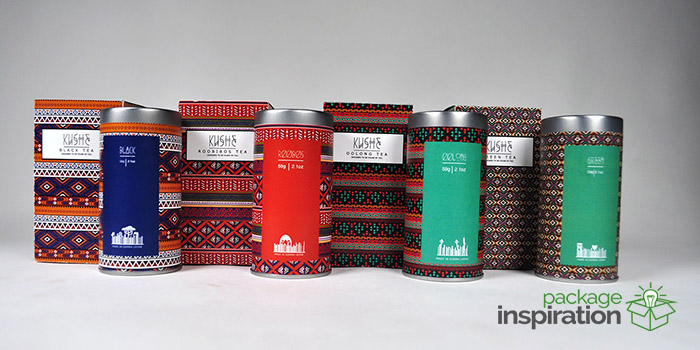
KUSHE [Koo-she] comes from the Sierra Leonian language Krio, and it means “HELLO”.
This a fictional company that I came up with for my packaging design class. For my project I really wanted to make something that was a representation of me. I decided to make a tea package because I love drinking tea, and I based the design on African prints because I was born in Sierra Leone. I also wanted to make something that represented my family. Ever since we came to Canada in 2000, my mom has never been to a museum or done the really touristy things that most people do, so when she comes to see my grad show at the end of my school year, it will be her first time in a museum-like setting. I want to make the space friendly and I want her to feel welcomed within it, so I’m basing the majority of my projects around the theme of Africa this year.
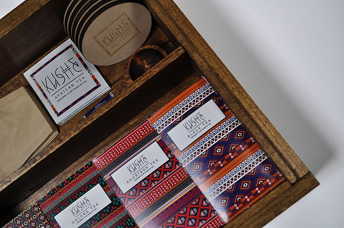
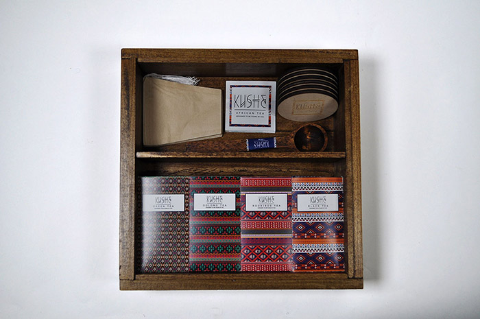
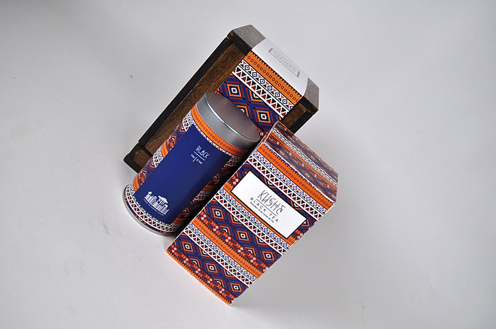
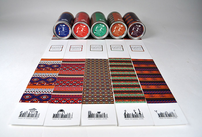
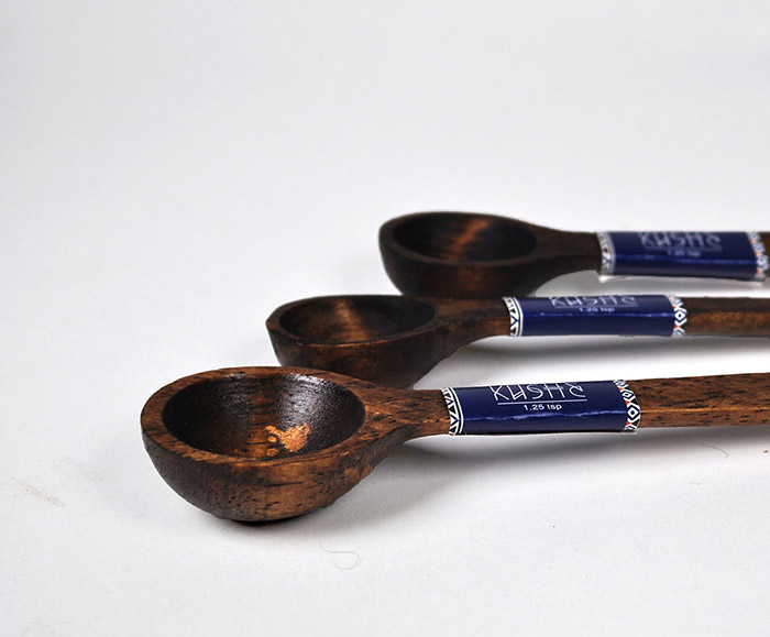
The concept of the packaging is to make each print for the tea boxes different so that no box has the same design. I want the buyer to feel like they have something unique that only belongs to them; so no box will ever be the same. I decided to make wooden boxes to hold the tea boxes in. I made wooden boxes to carry a single box of tea, in-case someone only wants a specific kind of tea. Then I made a sleeve to wrap around that box so that they know what design they’ll be getting. The sleeve also has information about the history of the company and the second life of the wooden box on the back of it. Then I made another wooden box that has all of the four flavours of tea that my company sells in-case someone wants a package set. I decided to add a wooden spoon that measures out the tea, filters, and a mini information book about tea.
All of the boxes were hand made by my grandfather, grandma and me using poplar wood. We stained the boxes after to give it an old/vintage look and used brown shoe polish to make it even rustier. The darker stain on the wood helped the bright colours of the box prints to stand out.
Designed by: Kadi Koroma, Canada.







Featured on Package Inspiration