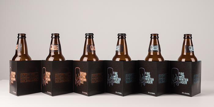
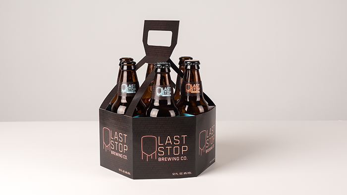
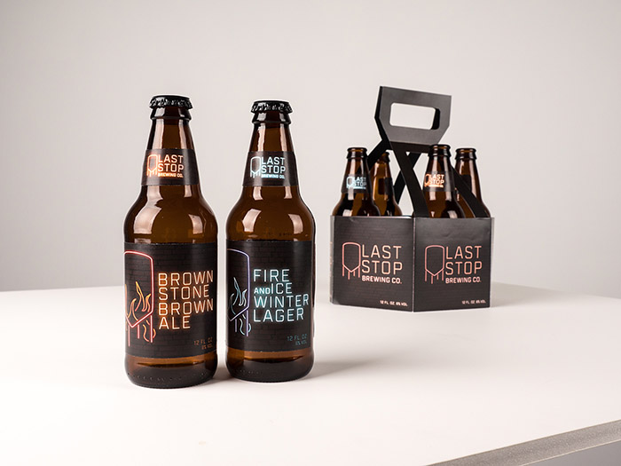
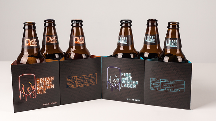
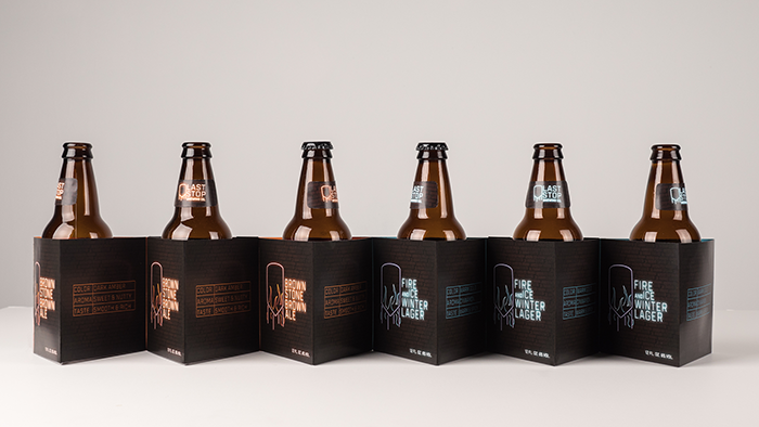
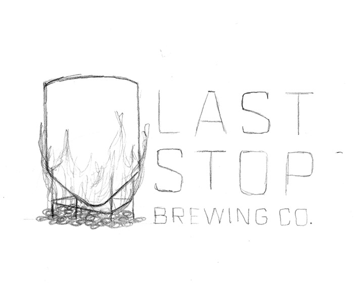
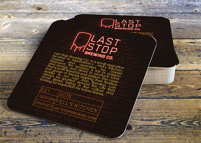
The design aesthetic for Last Stop Brewing Company was established after researching the brewery’s location of Hell’s Kitchen, New York. The vibrant neon effect found on the labels and packaging is based on the iconic neon signs found in this area while the water tower shape is a nod to the tanks found on the roofs of the area buildings as well as the vats in which the beer is brewed. A medium weight blocky typographical treatment recalls the shapes of text found on neon signs while also having an industrial feel that represents the brand well. Two brew options were designed with a variation in the color palettes for easy shelf recognition. The beer is packaged in shorter bottles as a nod to the building regulations established in this New York neighborhood that do not allow for tall buildings. A sample pack was created that features both brews with descriptive information that can be found within the packaging when it is opened. Consideration for limited storage space was made when designing the package as each portion can be removed when there is no longer a bottle held within to save space. The namesake comes from the last stop on a subway line in this neighborhood.
Designed by: Brigid Schnaue, USA.


Featured on Package Inspiration
We are young team which works to inspire packaging designers every day! Our team select the best packaging of today and shares with you.

