
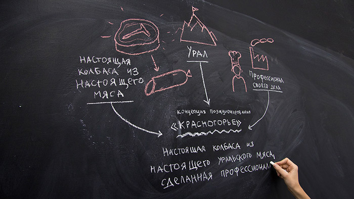
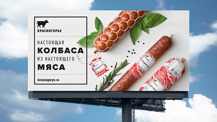
Positioning concept
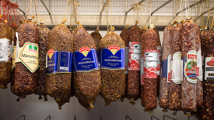
Krasnogorie (Red Mountains) is a Ural brand of meat delicacies and sausages from the Chelyabinsk meat processing plant. Krasnogorie products are sold to regular customers in small retail shops at a price slightly above average. In order to enter the national market and large retail chains, the brand required new product positioning and packaging that would reflect its high quality and the producer’s commitment.
While gathering and analyzing information, we couldn’t help but notice a common belief that Ural meat processing plants produce truly quality, natural sausages. So it seems like Krasnogorie have already met customers’ expectations.
The meat processing plant where Krasnogorie is produced is equipped with the latest German and Austrian technologies. Only natural eggs, butter, and milk from proven Russian producers are used to make sausages. There are minimum flavoring and conserving agents in the products, with the flavor being accentuated by adding Australian and German spices. Actual eco-friendly wood chips are bought to be used in the production process for sausage smoking. Krasnogorie is produced at one of the few Russian plants that don’t recycle unsold products.
We managed to come up with a simple yet honest concept for brand positioning by delving into the specifics of the production process, recipe, and the producer’s approach. Krasnogorie makes sausages from actual Ural meat. With this in mind, we began looking for a new idea for packaging design.
Packaging concept
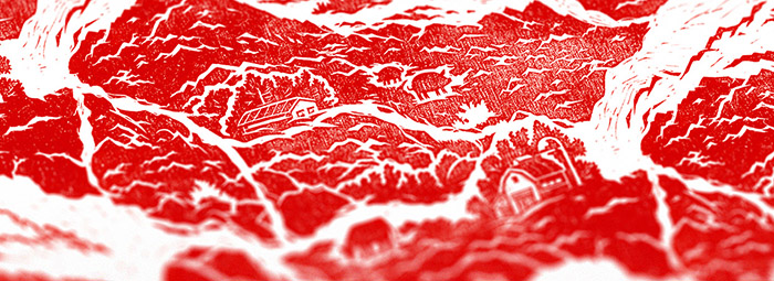
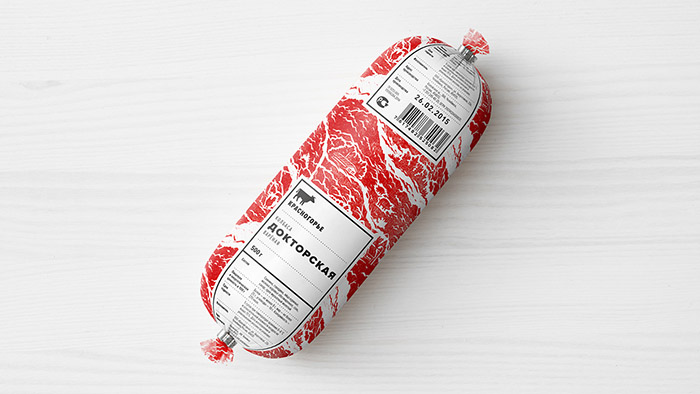
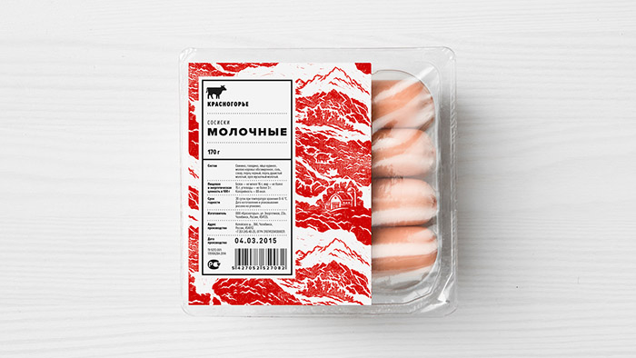
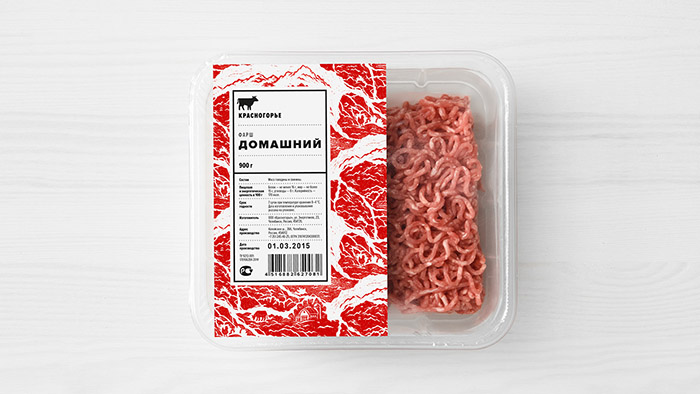
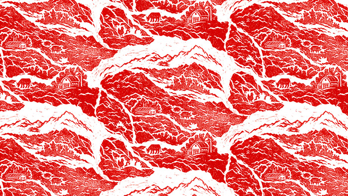
In order to underpin the naturality of products, we took the vivid image of a juicy steak as a basis for brand identity. Such ’meaty’ background is easy to discern from a distance, and it reflects the product’s characteristics perfectly.
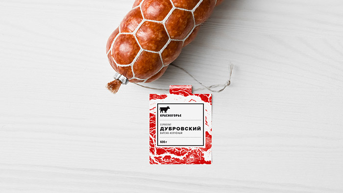
Upon a closer view, the pattern of meat fibers takes the shape of farms, villages, Ural Mountains, and free-ranging cattle. We are thus able to relate the packaging to the brand name and add peculiar details to the image, which speak not only of the quality of the raw material, but also of the producer’s approach. The complex, multi-layered background adds to a neat information label, which can be easily adjusted to fit various types of packaging within the trademark.
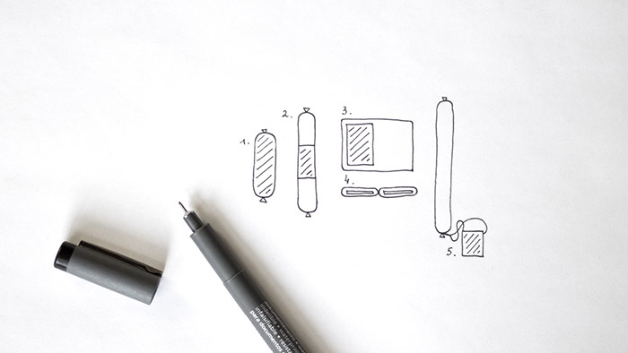
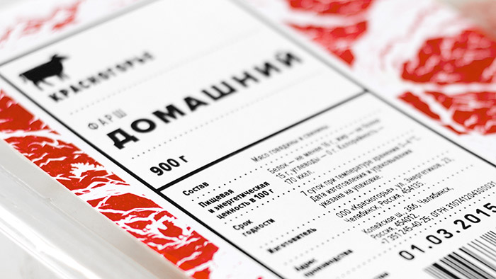
All information labels are made up using a single modular grid, where text blocks can be collated both horizontally and vertically. This way, the label can be stretched, contracted, broken, or cycled. The versatility of the modular grid and principles of composition allows us to design any type of packaging from polyamide casings to two-sided hang tags, retaining brand identity across the product line.
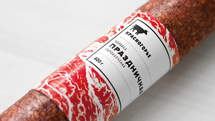
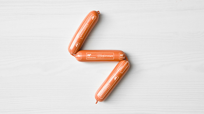
As for the color scheme, we used colors that are representative of meat products — red, white, and graphite — combining them in surprising proportions. The color scheme reiterates the conceptual solution, and the customer sees it in ’layers’: an architectural black-and-white label containing the logo, brand name, ingredients, and technical details overlaps on a complex red background. This way, the packaging retains its association with the product and stands out on the shelf thanks to the proportion and detachment of color patches.
Such approach reflects the producer’s aspiration to make their products as natural as possible (the complex ’meaty’ background) using advanced automated equipment according to modern standards (the simple geometrical label). Both the conceptual and graphical packaging solutions are based on this contrast.
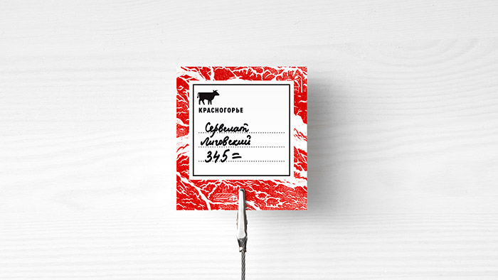
Informational and promotional materials for Krasnogorie are made up according to the same simple rules as product labels. The ascetic layout incorporates subtle graphical elements, such as black frame, dashed dividers, and spot pictograms illustrating the advantages of the company and its products. Using these elements, we achieve compositional diversity while maintaining single layout structure.
For the branded font, we chose the Proxima Nova typeface. This modern geometrical grotesque is both austere and neutral, which is exactly what a label requires. In order to make separate text blocks look sharper and more appealing, we used super-condensed and super-bold typeface.
Logo development
Driven by reasonable adequacy, we decided that the logo must be plain and simple to look well against such detailed and multi-layered background. Since the image on the packaging bears the brand name and conveys the message, the meaningful part of the logo (which itself is an image of a cow — the main source of meat for sausage production) is purely functional, making it stand out among other lettering on the front label.
Illustration development
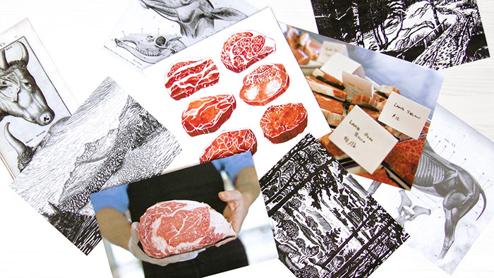
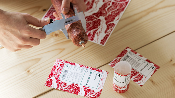
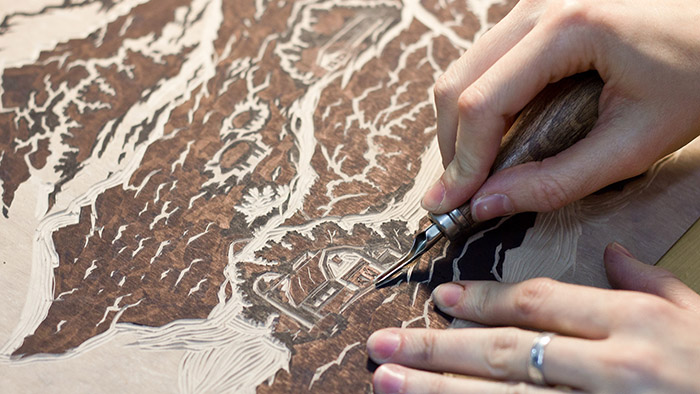
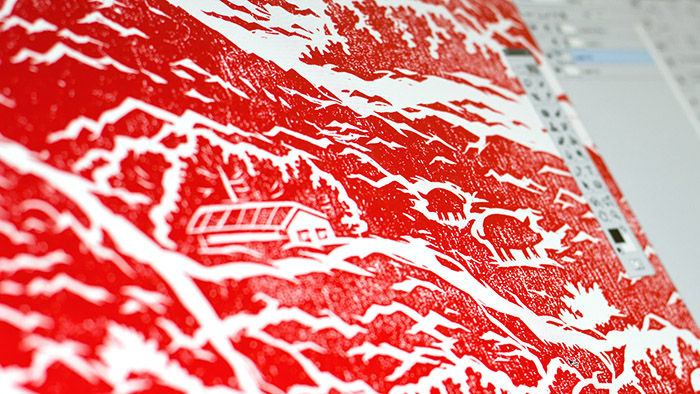
All the way since working on the concept, we’ve wanted to use the analog technique for the background illustration as it resonates with the positioning concept of sausages made from actual meat. Having gone through all possible options, we eventually picked the linocut technique.
It took us time to make the linocut right. We found all required materials and tools, drew the final sketch on paper, and then used tracing paper to render it onto homogeneous linoleum. Cutting it out took us three days of hard work.
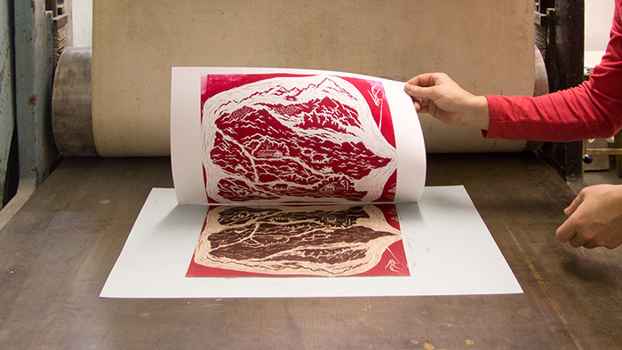
The most difficult thing was finding a printing shop with a special etching press for imprinting. We tried several paper formations, mixed and distributed the desired color, and finally got the perfect imprint.
Then we scanned it, brought to the final image in a graphic editor and created the signature pattern used across all types of packaging. The hand-made background that we created is a bit rough to the touch and makes the packaging look eye-catching, resonating well with the product itself.
Due to the distance between us and the customer, we didn’t get the chance to supervise the printing process. However, we provided guidelines for the development and production of labels for the designers and technicians at the plant.The products in the new packaging were launched in record-breaking time and can already be found in shops all over Chelyabinsk.
Designed by: Science Agency, Russia.


Featured on Package Inspiration
We are young team which works to inspire packaging designers every day! Our team select the best packaging of today and shares with you.


 is a Ural brand of meat delicacies and sausages from the Chelyabinsk meat processing plant. Krasnogorie products are sold to regular customers in small&p[url]=https://packageinspiration.com/krasnogorie/&p[images[0]=https://packageinspiration.com/wp-content/uploads/2016/06/KrasnogorieMAIN.jpg)
 is a Ural brand of meat delicacies and sausages from the Chelyabinsk meat processing plant. Krasnogorie products are sold to regular customers in small)