
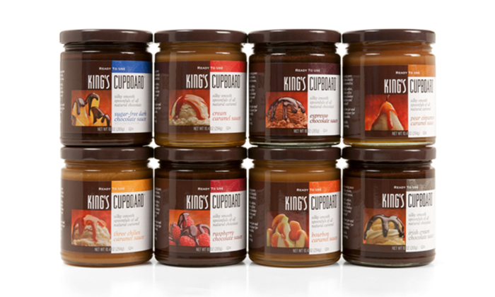
King’s Cupboard had an unusual problem. Their chocolate and caramel sauce packaging was too pretty. Designed mainly for high-end food boutiques and gourmet shops, the client felt it lacked the necessary impact to attract the consumer in regular grocery aisles, either natural or conventional. The firm asked the branding team at Mark Oliver Inc. MOI to come up with a solution that would punch up the product’s presence on the store shelf. We told them that consumers spend less than 2.5 seconds considering a product, that what works visually has to work immediately, that there are no second chances — and that differentiation is key.
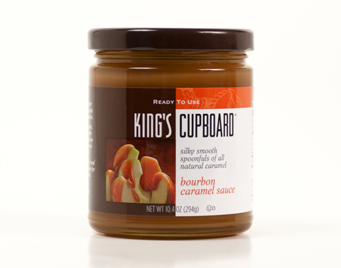
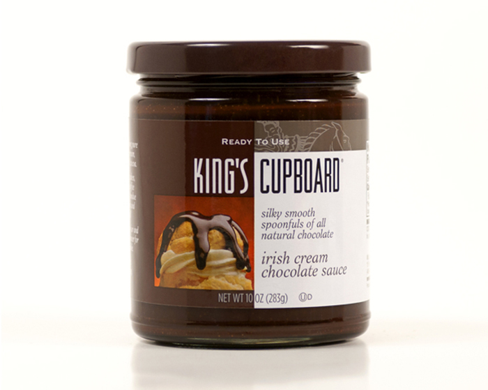
The design solution for the primary display panel was a visual narrative showing photos of the product in use, the “spoonful” copy, modified visual cues that would maintain some the old brand equities, and product color coding.
Designed by: Mark Oliver Inc, USA.
Featured on Package Inspiration
We are young team which works to inspire packaging designers every day! Our team select the best packaging of today and shares with you.

