Designed by: YG
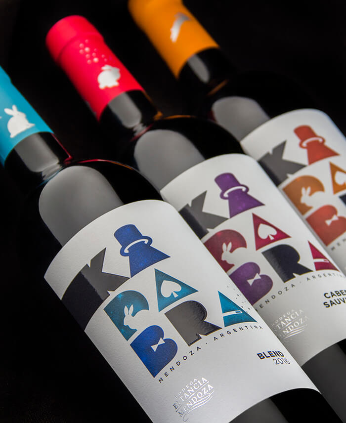
We developed this new product as part of Bodega Estancia Mendoza’s strategy to extend their range of products. This powerful new addition is associated with magic and provides an element of surprise.
The creative proposal was to come up with a colorful, innovative, eye-catching, and captivating image capable of offering endless advertising possibilities. The brand’s lettering works both as text and image because it includes elements that make reference to a world filled with magic. The capsule includes another attractive element: a rabbit running around the bottleneck.
Black serigraphy simulates hole punching without running into the technical difficulties of this technique. The final packaging is attractive and increases brand presence.


Featured on Package Inspiration