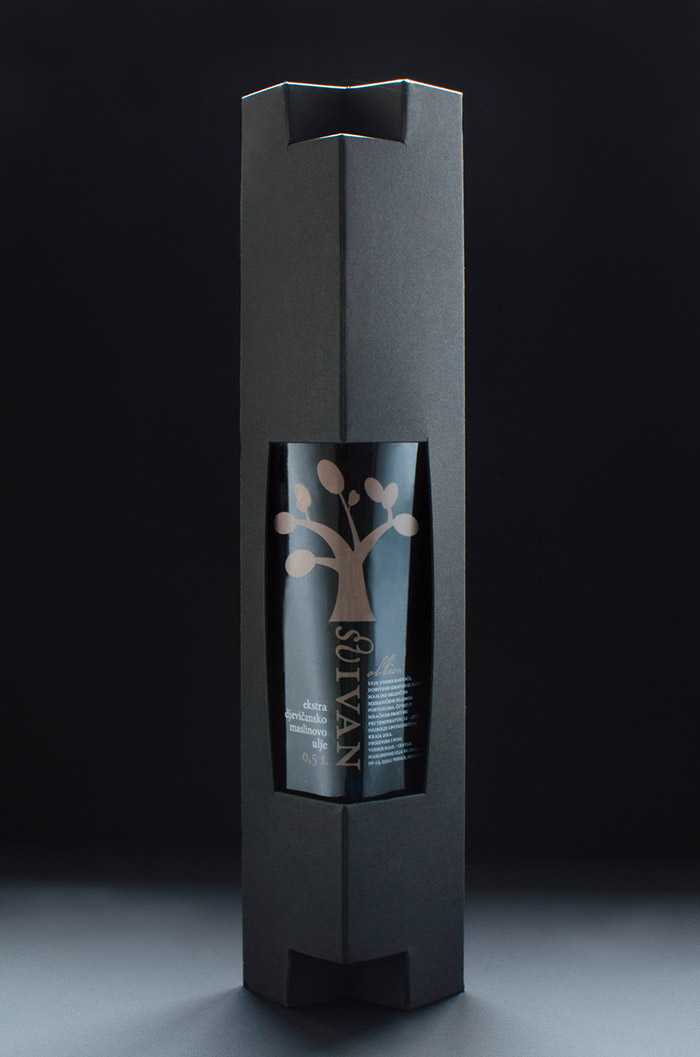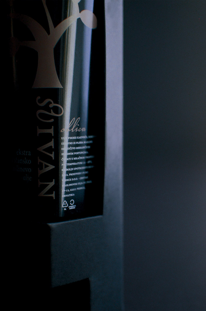
Visual identity and packaging for a new brand of extra virgin olive oil. The task was to distinguish the products as premium quality in a cost-efficient manner. Since the bottle was predetermined and is commonly used by other oil producers, the label is unconventionally positioned and the supplementary box is designed according to it. Made from paperboard, the box has an unique locking system, which is used as elevation pilars for the bottle. The combination of typographic style, illustrative identity, colour coding and the box with a sculptural feel to it, make this design elegant yet affordable.
-a collaboration of Marita Bonačić, Negra Nigoević, Katarina Perić
-received the red dot award 2011 communication design
In order to guarantee safe transportation and to increase consumer awareness, this olive oil bottle comes in a robust box with creased edges. With its harmonious colour scheme, this two-piece packaging concept has a noble appearance. The dark box frames an appealingly designed bottle label.. A graphic depiction of a stylised olive tree, the variable colours of which provide clear product distinction, has an eye-catching quality.
Designed by: Katarina Peric, Negra Nigoevic, Marita Bonacic, Croatia.


Featured on Package Inspiration