
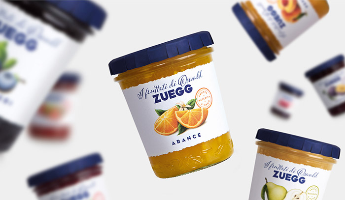
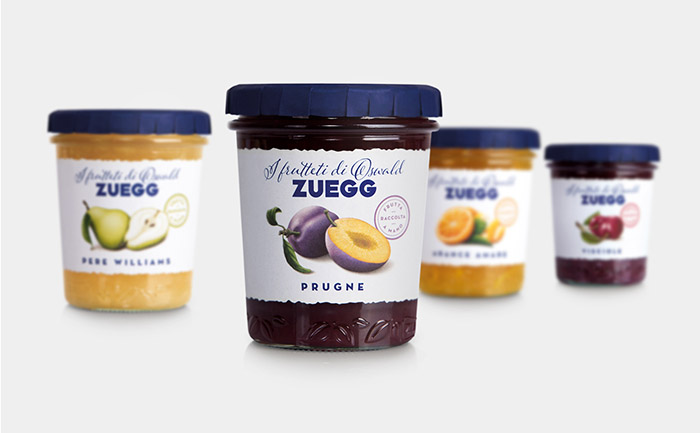
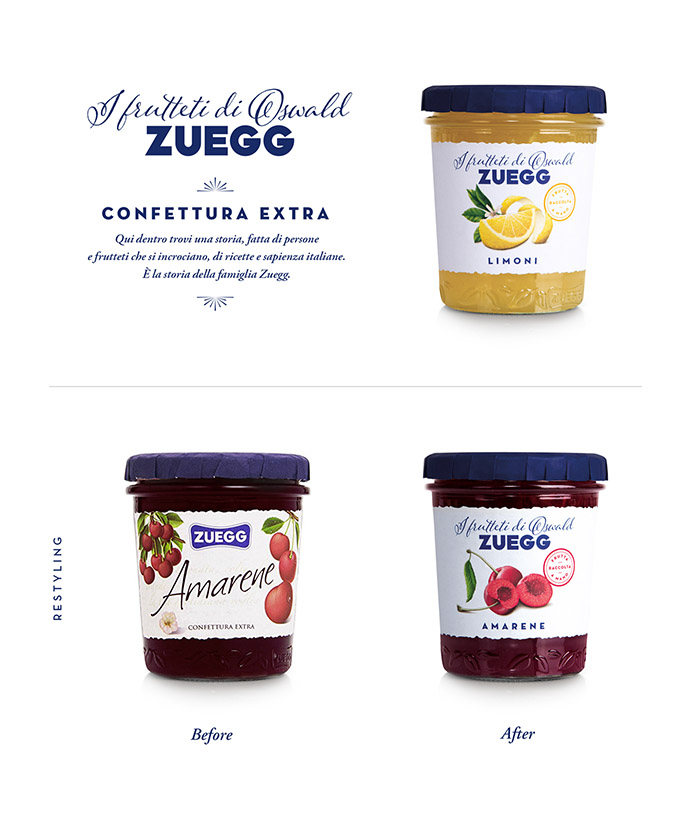
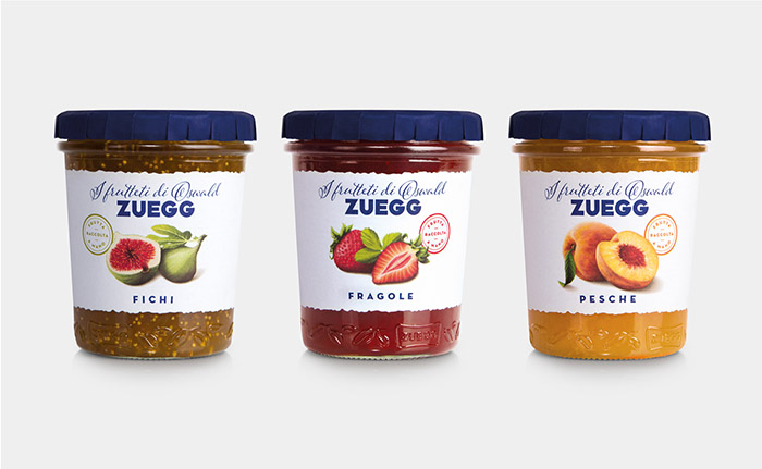
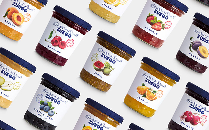
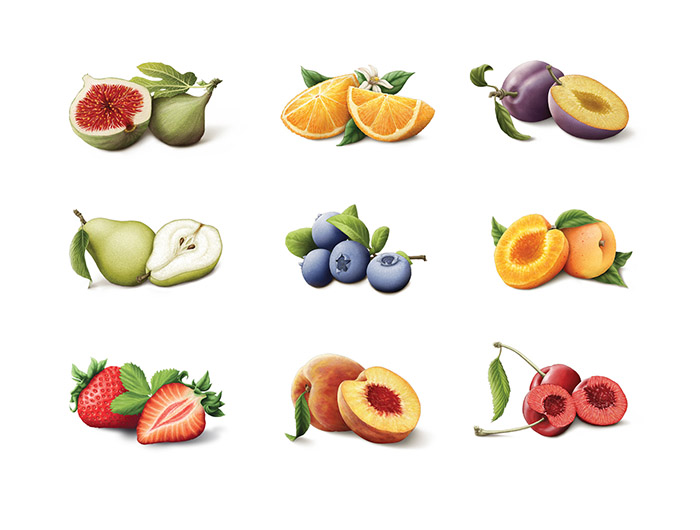
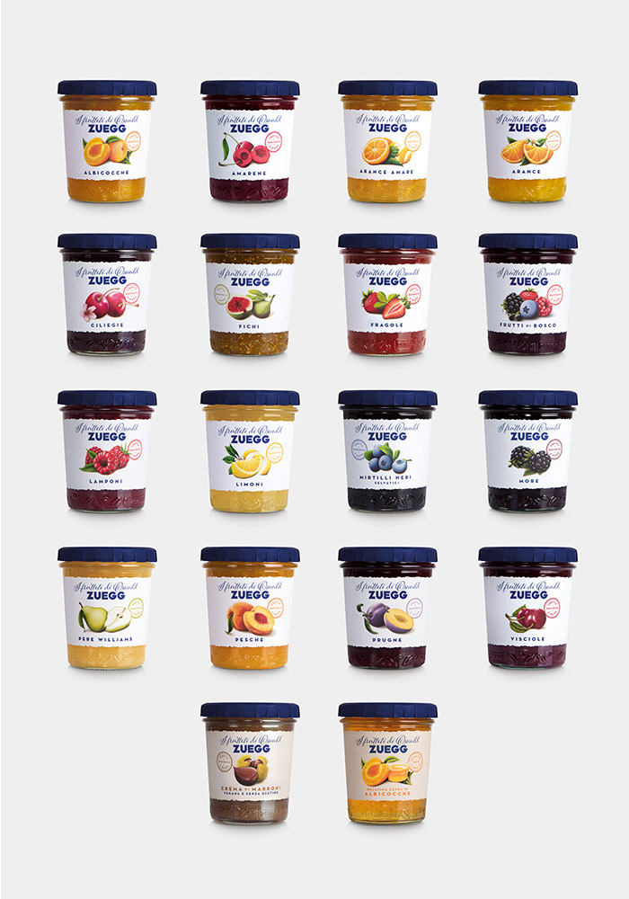
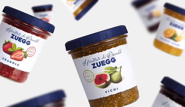
18 illustrations for the Zuegg Extra Jam labels restyling, one illustration for each fruit. The new design gives a contemporary and consistent feel to the traditional jam flavours, keeping fruit always as the core of the labels. Naming and typography highlight the reasons why the Zuegg brand is different from its competitors: Zuegg has its own orchards and all the experience of five generations of entrepreneurs and agronomists. With this restyling Zuegg is not just a brand any more but also a surname, Oswald’s one, an Italian story about family and orchards, since 1890.
Art Direction / graphic design: Davide Scarpantonio, Italy.
Illustrations: Claudia Bartoli

Featured on Package Inspiration