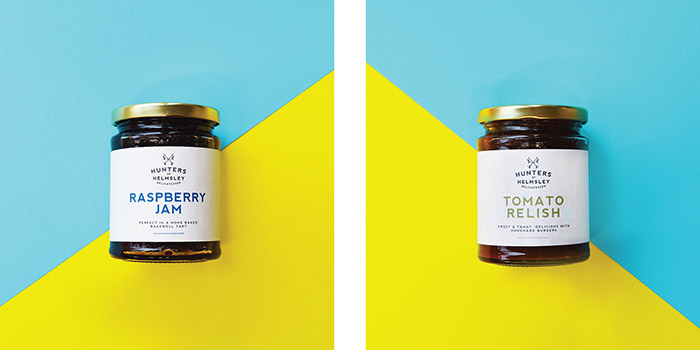
Hunters of Helmsley Delicatessen
Hunters of Helmsley was Britain’s Best Small Shop 2015. At United by Design I have created a full roll-out of packaging for over 20 products. It was imperative to remain sympathetic to the current brand-colour and shade of green within the logo. The shop signage and colour of Hunters is listed and has become synonymous with the town, so keeping the ‘Hunters green’ was imperative. We also took inspiration from 1800s woodcut images to create a set of background graphics as assets for print and internal signage. I developed a palette of colours for each range of foods which represent the natural colours and ingredients of the products. This particular challenge involved many test prints and hours of peeling off labels! The key was to make sure the colours for each product were visible when they were on the shelf in the dimly lit 1700s built building.
The logo mark is made from four key elements: crossed hunting horns, regal flags, the letter H in the centre and a date, 1990. The town of Helmsley is famous for it’s castle and has a rich history. The Ryedale area is famed for its hunting credentials and as the owners do not know why the shop is named ‘Hunters of Helmsley’, we took the initiative. We first created a brand story which brings Hunters of Helmsley to life and allows the shop to take centre stage in the town. “Many years ago, long before the existence of Hunters of Helmsley, a mysterious hunter saved the town from famine by gathering crops, wild meats and fruits from the Ryedale hills. His trumpet tooted through the streets, reassuring the townsfolk as they gathered gratefully around the area where the shop now stands. The locals coined this heroic figure the Hunter of Helmsley.”
The logo-mark was created as a lino-cut image and then vectorised. The lines are imperfect and hold a craft-like quality. I chose to create the mark like this to reference the age-old process’ such as woodcutting which the town’s craft heritage is known for. The green has been taken directly from a sample of paint used on the original shop signage.
Designed by: Tom Williams, United Kingdom.
Featured on Package Inspiration